- Főoldal

- Vászonra nyomtatás
- Albers József
- Variant/Adobe
 Megosztás
Variant/Adobe


Giclée / Műnyomat
Múzeumi minőségű giclée vagy vászonnyomat, gyors gyártással és rugalmas finomítási lehetőségekkel.


Válasszon előre meghatározott méreteink közül, amelyek megfelelnek a műalkotás eredeti arányainak.
Megadhat saját méreteket is egy konkrét kerethez vagy helyszínhez igazítva. Amennyiben a kiválasztott méret nem egyezik az eredeti kép arányokkal, a műalkotást le fogjuk vágni, vagy kiegészítjük a képet tükrözött vagy egyszínű szélekkel. A gyártás megkezdése előtt egy digitális tervezetet küldünk jóváhagyásra.
Kérjük, vegye figyelembe, hogy a képernyőn látható előnézet nem tükrözi a tényleges levágást vagy kiegészítést. Csak a tervezet mutatja pontosan a végső kompozíciót.
Bár az egyedi méretek is elérhetőek, az eredeti arányok megőrzése érdekében azt javasoljuk, hogy válasszon a előre meghatározott listából származó méretet.
Világszerte történő kiszállítás területére 2 hét alatt, a szokásos 4-5 hét helyett. 21 július

Ingyenes globális expressz szállítás

Prémium minőségű len vászon

Teljes szállítási biztosítás

Vámvisszatérítési Garancia

Tökéletes színpontosság garancia

60 napos visszaküldési lehetőség (csak gyártási hibák esetén)

100%-os pénzvisszatérítési garancia

Kedvezmény több termény esetén
 Az üvegkeretes opció csak 110 cm alatti méretben érhető el

Variant/Adobe
Giclée / Műnyomat
A reprodukció mérete
-


Összesített ár
-
Termékinformációk
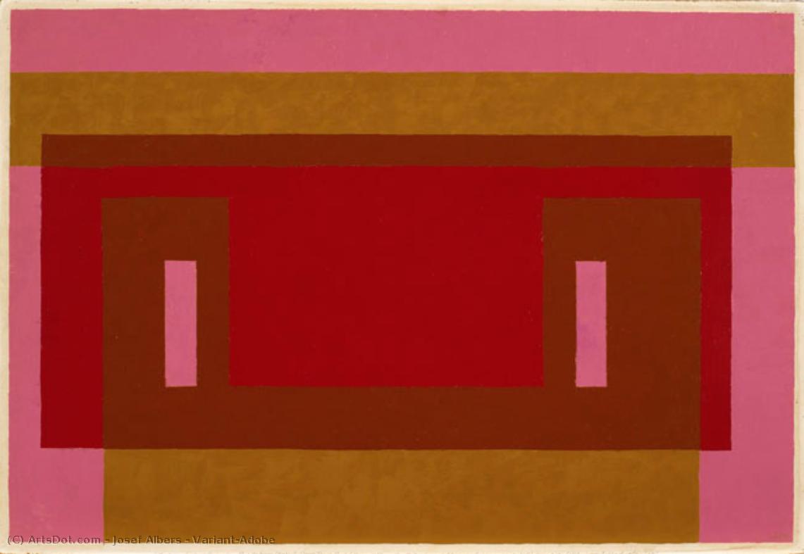
Josef Albers' "Variant/Adobe": A Study in Color Interaction
Josef Albers’ “Variant/Adobe,” created in 1948, is a captivating example of his renowned “Homage to the Square” series. This artwork isn't merely a composition; it's an exploration of color theory and perceptual phenomena, inviting viewers to contemplate how colors interact and influence one another. The piece exemplifies Albers’ commitment to understanding and demonstrating the relativity of color perception—how a color appears can be dramatically altered by its surrounding hues.
Composition and Geometric Precision
The artwork's structure is based on a precise geometric framework. A dominant red rectangle sits at the center, partially veiled by a slightly smaller brown rectangle positioned above it. These central forms are framed by horizontal bands of pink at the top and gold/yellow at the bottom, creating a layered effect. Two symmetrically placed vertical rectangles in a lighter pink shade further define the central area. The consistent use of straight lines emphasizes the artwork’s geometric precision and reinforces its sense of order. This deliberate arrangement isn't arbitrary; it's designed to create visual tension and harmony simultaneously.
Color Palette and Technique
Albers employs a restrained yet impactful color palette, primarily featuring shades of red, brown, pink, and yellow/gold. The colors are presented in their purest form—flat and unmodulated—avoiding gradients or shading techniques. This deliberate choice highlights the inherent qualities of each color and allows for a direct examination of their interaction. The technique itself is characterized by careful control; the paint appears to be applied evenly across the canvas, suggesting meticulous attention to detail and a desire to minimize textural variation. There's no visible brushwork or impasto, further emphasizing the flatness and clarity of the composition.
Historical Context and Symbolic Resonance
“Variant/Adobe” emerged from Albers’ time at Black Mountain College in the late 1940s, a period marked by experimentation and innovation in abstract art. The "Homage to the Square" series, to which this work belongs, was Albers' extended investigation into color relationships within a consistent geometric framework—the square. Symbolically, the artwork can be interpreted as representing patterns found in nature or reflecting the complexities of human perception. The repetition and variation of shapes suggest an underlying order while simultaneously acknowledging the subjective nature of visual experience. It aligns with principles of Minimalism and Concrete Art, prioritizing objective forms and emphasizing a reduction to essential elements.
Emotional Impact and Lasting Appeal
Despite its abstract nature, “Variant/Adobe” evokes a sense of calm, precision, and visual harmony. The carefully balanced composition and the deliberate color choices create a feeling of equilibrium. The artwork’s enduring appeal lies in its ability to engage viewers on both an intellectual and emotional level—it's a testament to Albers’ profound understanding of color theory and his skill in translating complex ideas into visually compelling forms.
A művész életrajza
A Life Forged in Material: The Early Years and Bauhaus Formation
Josef Albers’s artistic journey began not amidst the rarefied air of established academies, but within the pragmatic world of his father’s contracting business in Bottrop, Germany. Born in 1888, young Josef absorbed a deep respect for materials – carpentry, plumbing, house-painting – skills that would fundamentally shape his aesthetic sensibility. This wasn’t merely vocational training; it was an immersion into the very essence of making, understanding how forms materialized and the inherent qualities within each medium. He learned to appreciate the subtle nuances of wood grain, the precise balance of a plumb bob, the transformative power of color applied to walls – experiences that would later inform his abstract explorations. Before dedicating himself fully to art, Albers spent five years as a schoolteacher, honing patience and pedagogical skill—attributes that would later define his influential teaching career. Formal artistic training commenced at the Königliche Kunstschule in Berlin between 1913 and 1915, where he explored printmaking, painting, and, crucially, stained glass. His early commission, “Rosa Mystica Ora Pro Nobis” (1918), a stunning stained-glass window for a church in Germany, foreshadowed his lifelong fascination with the interplay of light and color, hinting at the abstract explorations to come. This initial work wasn’t simply decorative; it was an investigation into how light *transformed* material, a theme that would resonate throughout his career – a fundamental shift from representation to perception.The Bauhaus Crucible: Color as Subject
A pivotal moment arrived in 1922 when Albers joined the faculty of the Bauhaus, a revolutionary school seeking to unify all artistic disciplines under Walter Gropius’s visionary leadership. Initially tasked with teaching the preliminary course – *Werklehre* (workshop practice) – he immersed himself in its core principles: functionalism, geometric abstraction, and material exploration. This period proved transformative. Albers began a systematic investigation into color perception, moving away from representational art towards an increasingly abstract vocabulary. He wasn’t interested merely in *what* colors were, but *how* they interacted, how they influenced each other, and how our eyes perceived them. The influence of fellow Bauhaus masters like Paul Klee and Wassily Kandinsky is discernible in his early work, yet Albers charted a unique course, prioritizing empirical observation over metaphysical interpretation. He wasn’t seeking spiritual truths through color; he was meticulously documenting its physical effects – a scientific rigor that became the hallmark of his artistic method. This focus on perception, on how we *see*, rather than what is *seen*, set him apart and laid the groundwork for his future explorations. The Bauhaus environment fostered experimentation with unconventional materials—wire netting, matchboxes, glass shards—pushing Albers to consider the inherent properties of each substance and their impact on visual experience.Homage to the Square: A Laboratory of Perception
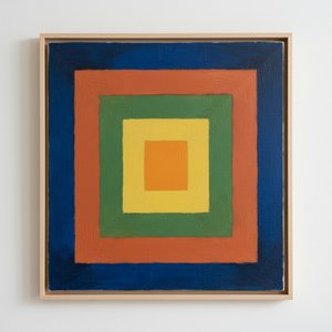
Following a period teaching at Black Mountain College – where he fostered a generation of American artists including Robert Rauschenberg and Cy Twombly – Albers embarked on what would become his most iconic series in 1949: “Homage to the Square.” This ongoing project consisted of paintings featuring nested squares within squares, each iteration exploring subtle variations in color relationships. It’s a deceptively simple premise, but one that belies an incredibly complex and rigorous investigation. Albers meticulously documented his experiments, revealing how colors aren't static entities but dynamic forces governing each other through internal logic – often misleading to the eye. A seemingly brighter square might appear to recede while a darker one advances, defying intuitive understanding. The series wasn’t intended as a celebration of geometry; rather, it was a laboratory for studying color perception. Albers’s goal was not to create beautiful pictures but to reveal the underlying mechanisms of visual experience. This research culminated in his seminal book, “Interaction of Color” (1963), a foundational text still studied by artists and designers today – a distillation of years of painstaking observation and analysis. The book isn't a treatise on color theory; it’s a series of exercises designed to demonstrate how our perception of color is relative and contextual – a testament to Albers’ belief that seeing is not passive, but an active process of interpretation.Chromatic Interactions and Legacy
Albers’s work extended beyond the “Homage to the Square” series, encompassing murals for buildings like the Corning Glass Building and the Time & Life Building in New York City, as well as explorations in glass and design. Throughout his career, he consistently sought to bridge the gap between art and craft, emphasizing the importance of material knowledge and direct experience. His teaching at Yale University from 1950 until his retirement in 1958 profoundly shaped the course of modern art education. He instilled a rigorous approach to observation, encouraging students to question assumptions and develop their own unique artistic voices. Josef Albers died on March 25, 1976, in New Haven, Connecticut, leaving behind a legacy that continues to inspire artists, designers, and educators alike – a testament to the power of observation, experimentation, and the enduring mystery of color. His influence can be seen not only in his own groundbreaking work but also in the countless artists who have been shaped by his teachings and his profound understanding of visual perception.Notable Works
- Gray Instrumentation I Prospectus (1975): A minimalist monochrome painting exemplifying geometric balance and subtle tonal variations.
- Study for Homage to the Square – Beaming (Date Unknown): A classic example of Albers’s exploration of color interaction within nested squares, evoking a sense of calm and spatial depth.
- Rosa Mystica Ora Pro Nobis (1918): His early stained-glass commission, foreshadowing his lifelong fascination with light and color.

Albers József
1888 - 1976 , Németország
Rövid tények
- Artistic Movement Or Style: Geometriai absztrakt
- Artists Or Movements Influenced By This Artist:
- Minimalizmus
- Színterületek
- Artists Who Influenced This Artist:
- Paul Klee
- Wassily Kandinsky
- Date Of Birth: 1888. március 19.
- Date Of Death: 1976. március 25.
- Full Name: Josef Albers
- Nationality: Német-amerikai
- Notable Artworks:
- Homage a Szögzet
- Szürke Műszerek I.
- Rosa Mystica
- Place Of Birth: Bottrop, Németország
Kapcsolódó cikkek

Minimalista Művészet: A Top 10 Legikonikusabb Darab a Lakberendezésben
Fedezze fel a top 10 minimalista műalkotást! Mark Rothko, Agnes Martin és más ikonikus festők letisztult világát. Inspirálódjon modern képekkel, absztrakt vászonképekkel és hozzon létre nyugtató belső teret. Prémium minőségű reprodukciók a OriginalUniqueArt.com-on!
Josef Albers: A Homage to Color Interaction & the Foundations of Visual Perception
Explore Josef Albers's groundbreaking color theory & the 'Homage to the Square' series. Discover how his work revolutionized visual perception and influenced modern art movements like Minimalism & Op Art. Learn about his Bauhaus roots & lasting legacy.

Beyond Form & Color: Geometric Abstraction's Evolution in 20th/21st Century Art
Explore the evolution of geometric abstraction from Cubism to contemporary art. Discover key artists like Malevich & Mondrian, investment insights, and expert collecting advice at OriginalUniqueArt.

Chromatic Atmospheres: Exploring the Evolution & Impact of Color Field Painting
Explore the captivating world of Color Field painting! Discover its origins, key artists like Rothko & Newman, philosophical depth, and lasting influence on modern art. Expert insights for collectors.

Rétegzett Fények: A Kortárs Absztrakt Festészet Illuminationális Transzformációi – Hogyan Változtatják a Reflektorok, Falmosók és Természetes Világítás az Érzékelést és Mélységet
Fedezze fel a kortárs absztrakt festészet lenyűgöző világát! Szakértői elemzések, művészportrék és inspiráló ötletek a fény szerepéről. Prémium minőségű reprodukciók és egyedi alkotások – OriginalUniqueArt.

