Pregledaj u stvarnoj veličini
 Podijeli
 Podijeli
 Detalji
 Vodič
Vodič

 Preuzmi datoteku
 Slični predmeti
 Rentgenska snimka
 Slide show
 Statistika
That my ship was below them


 Pročitajte više
Djelo prikazano na ovoj stranici zaštićeno je autorskim pravima, što znači da zakonski ne možemo izraditi niti prodati identičnu reprodukciju. Ova se zaštita provodi u skladu s međunarodnim sporazumima kao što su Bernska konvencija i nacionalnim zakonima, uključujući i one koji su utvrđeni u Američki zakon o autorskom pravu – Title 17.
Kao poštovana i legalna alternativa, nudimo prilagođena, ručno oslikana umjetnička djela inspirirana originalom. Naši vješti i profesionalni umjetnici pažljivo proučavaju stil, raspoloženje i umjetničku bit originala kako bi stvorili novo, jedinstveno djelo koje izaziva isti osjećaj – ostajući pritom vlastito, originalno stvaralaštvo.
Ova metoda u potpunosti je usklađena s autorskim pravima jer ne uključuje kopiranje ili dupliciranje zaštićenih umjetničkih djela. Umjesto toga, riječ je o kreativnoj reinterpretaciji – novoj slici koja je dobila utjecaj na izvornik, ali nije identična njemu.
Ručno rađena uljana reprodukcija
Ručno oslikano uljanim bojama na platnu u dimenzijama i okviru po vašem izboru, izrađeno po narudžbi od strane naših umjetnika. ( Prebacite na prodaju printova Prebacite na digitalnu prodaju slika)




P118B €10

P118H €10

P118W €10

P438Z €10

P508JH €12

P508YH €12

P805H €10

P805Z €10

P919BZ €10

P919G €10

P919XJ €10

P959ZH €10

P968JZ €12

W106C €8

W218G €10

W218JH €8

W218Y €10

W307PJ €10

W316G €10

W316PJ €8

W316Y €10

W398PJ €8

W4111J €10

W500HY €15

W500JH €15

W692G €12

W849H €8

W940BG €15

W953PJ €8




Odaberite jednu od naših unaprijed definiranih veličina koje odgovaraju izvornim proporcijama umjetničkog djela.

Unesite širinu i visinu koja vam je potrebna, kako bi odgovarali vašem okviru ili zidu. Budući da je ovo ručno oslikano djelo, umjetnik može malo proširiti rubove slike ili ih skratiti kako bi postigao željeni oblik — izbor je vaš. Prije početka slikanja poslat ćemo vam digitalni prikaz (mockup) radi potvrde. Slika prikazana na ovoj stranici ne predstavlja stvarni rezultat — samo digitalni prikaz to čini.
Nakon narudžbe, tim OriginalUniqueArt.com kontaktirat će klijenta putem e-pošte radi dobivanja uputa te dostaviti probni prikaz (mockup)
Isporuka širom svijeta () u roku od 3-4 tjedna umjesto standardnih 5 tjedana. (24 Listopad). Bez kompromisa u kvaliteti.

Besplatna ekspresna dostava širom svijeta

Visokokvalitetno laneno platno

Potpuno osiguranje transporta

Jamstvo povrata carine i uvoznih poreza

Jamstvo vjernosti boja

Politika povrata u roku od 100 dana (samo u slučaju nedostataka)

Jamstvo povrata 100% novca

Popust na više proizvoda
 Opcija stakla dostupna je samo za dimenzije manje od 110 cm

That my ship was below them
Tehnika izrade
Veličina reprodukcije
-


Ukupna cijena
€ 263
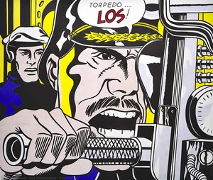
A Burst of Action: Decoding Roy Lichtenstein’s “That my ship was below them…”
“That my ship was below them…” (1964), is a quintessential example of Roy Lichtenstein's groundbreaking Pop Art style, immediately recognizable for its bold graphic language and comic-book inspired aesthetic. This work isn’t merely a depiction of military action; it’s a powerful statement on conflict, power dynamics, and the very nature of representation itself.Deconstructing the Visual Language
The artwork presents two imposing cannons unleashing fiery blasts against a light grey backdrop. Lichtenstein masterfully employs several key stylistic elements:- Bold Outlines & Flat Color: The composition is defined by thick, black outlines and areas of flat, unmodulated color – hallmarks of Lichtenstein’s technique.
- Ben-Day Dots: The iconic Ben-Day dot pattern, simulating mechanical reproduction, creates texture and shading. This wasn't an attempt to *replicate* printing flaws; it was a deliberate artistic choice that commented on mass production and the visual language of comics.
- Comic Book Narrative: The dramatic composition, coupled with the speech bubble containing the titular phrase, directly references comic book panels. This elevates everyday imagery to the realm of fine art.
- Geometric Forms: Simplified geometric shapes – cylinders for the cannons and stylized flames – contribute to the artwork’s graphic impact and sense of immediacy.
Historical Context & Artistic Innovation
Roy Lichtenstein emerged as a leading figure in the Pop Art movement of the 1960s, challenging traditional notions of artistic subject matter and technique. Rejecting the emotional intensity of Abstract Expressionism, Pop Art embraced popular culture – advertising, comic books, and everyday objects – as its source material. “That my ship was below them…”, created during a period of Cold War tension, reflects an engagement with themes of conflict and power, albeit filtered through the lens of mass media. Lichtenstein’s work wasn't about glorifying war; it was about examining *how* we perceive and consume images of violence.Symbolism & Interpretation
The phrase “THAT MY SHIP WAS BELOW THEM…” is deliberately ambiguous, hinting at a moment of realization or defeat. The artwork’s symbolism extends beyond the literal depiction of cannons firing:- Power and Destruction: The cannons represent raw power and the potential for destruction.
- Impersonal Warfare: The mechanical aesthetic – the Ben-Day dots, the flat colors – suggests a detachment from the human cost of conflict. It’s warfare as spectacle, devoid of emotional nuance.
- The Power of Narrative: The speech bubble emphasizes the importance of storytelling and how narratives shape our understanding of events.
Emotional Impact & Interior Design Considerations
Despite its seemingly detached aesthetic, “That my ship was below them…”, evokes a sense of dramatic tension and impending chaos. The bold colors and graphic composition command attention, making it a striking focal point for any space.- Modern & Contemporary Interiors: This artwork is ideally suited to modern and contemporary interiors, adding a touch of sophisticated edge.
- Statement Piece: Its large scale and impactful imagery make it an excellent statement piece for living rooms, offices, or galleries.
- Color Palette Integration: The artwork’s color palette – primarily red, yellow, black, and grey – can be echoed in surrounding furniture and décor to create a cohesive design scheme.
Pitanja i odgovori
Kakvu bojnu harmoniju prikazuje "That my ship was below them" autora Roy Fox Lichtenstein?
Koloristička harmonija djela "That my ship was below them" zabilježena je kao Softly Mixed Palette.
Koje se teme pojavljuju u djelu "That my ship was below them" autora Roy Fox Lichtenstein?
Motivi djela "That my ship was below them" su military action, explosions, comic art, war theme, bold graphics, lichtenstein style, pop culture, dynamic composition.
U kojoj je tehnici izvedeno djelo "That my ship was below them" autora Roy Fox Lichtenstein?
"That my ship was below them" je izvedeno u tehnici Oil On Canvas.
Biografija umjetnika
The Genesis of a Pop Visionary
Roy Fox Lichtenstein, born in the vibrant metropolis of New York City on October 27, 1923, indelibly altered the landscape of twentieth-century art. Emerging as a pivotal figure within the Pop Art movement, Lichtenstein didn’t simply reflect his era; he actively interrogated it, transforming commonplace imagery into compelling artistic statements. His upbringing in an upper-middle-class Jewish family fostered both a cultural awareness and an early artistic inclination. Childhood exposure to museums and concerts, coupled with a deep appreciation for jazz music, laid the groundwork for a creative spirit that would challenge conventional notions of fine art. Though initially drawn to realistic drawing and painting during his formative years, Lichtenstein’s formal training commenced at the Art Students League in 1939 under Reginald Marsh, followed by studies at Ohio State University – interrupted briefly by wartime service in the Army. These experiences provided a robust technical foundation that would later be brilliantly re-contextualized through the lens of mass culture and commercial aesthetics. The seeds of his signature style weren’t sown within the hallowed halls of artistic tradition but rather in the often-overlooked world of everyday imagery, particularly comic books and advertising.Early Influences and Artistic Exploration
Lichtenstein's formative years were marked by a fascination with European art history—particularly Rembrandt and Picasso—whose mastery of chiaroscuro and expressive brushwork profoundly impacted his artistic sensibilities. He absorbed the lessons of Reginald Marsh at OSU, embracing abstraction as a means of conveying emotion and exploring innovative compositional techniques. His early drawings demonstrated an acute sensitivity to line and form, reflecting a meticulous attention to detail that would characterize his later work. Lichtenstein’s intellectual curiosity extended beyond art; he pursued scientific studies alongside his artistic endeavors, demonstrating a holistic approach to learning and creative expression. He was deeply influenced by Allan Kaprow's proto-pop aesthetic—specifically, the concept of "chance operations"—which encouraged him to experiment with unconventional materials and processes. The American Museum of Natural History served as an enduring source of inspiration, fostering his appreciation for natural forms and stimulating his imaginative vision.The Birth of Pop Art: Comic Books and Commercial Reproduction
The pivotal moment in Lichtenstein’s artistic trajectory arrived during his tenure at Rutgers University where he encountered Allan Kaprow, whose influence reignited Lichtenstein’s interest in the burgeoning movement of Pop Art. Recognizing the potential for artistic innovation within popular culture—particularly comic books and advertising—he embarked on a radical stylistic transformation that would redefine the boundaries between “high” and “low” art. He began meticulously recreating comic strip images using techniques mimicking commercial printing processes, most notably employing Ben-Day dots – tiny colored squares that created halftone patterns—to simulate the texture of newspaper reproduction. This wasn’t merely imitation; it was a deliberate critique of mass culture and its impact on artistic expression. Lichtenstein's first major Pop painting, *Look Mickey* (1961), immediately established him as a pioneer of this new aesthetic direction. He skillfully manipulated color palettes and compositional arrangements to convey both humor and pathos—challenging traditional notions of artistic seriousness while simultaneously engaging with the visual language of popular media.Major Achievements and Artistic Legacy
Lichtenstein’s prolific output spanned decades, encompassing paintings, prints, sculptures, murals, and commissions that cemented his position as one of the most influential artists of the second half of the twentieth century. His masterful command of technique—characterized by bold outlines, vibrant colors, and meticulous attention to detail—became synonymous with Pop Art style. He achieved international recognition through groundbreaking exhibitions at galleries and museums across Europe and North America, establishing himself as a leading voice in contemporary art discourse. Lichtenstein’s work continues to inspire graphic designers, illustrators, and visual artists worldwide—a testament to the enduring power of his artistic vision. His exploration of themes such as war, romance, and societal expectations—filtered through the lens of comic book imagery—challenged conventional artistic conventions and provoked critical reflection on cultural values.- Iconic Paintings: *Whaam!*, *Drowning Girl*, *Oh, Jeff…I Love You, Too…But…*, *Masterpiece*.
- Influence on Graphic Design: His techniques profoundly impacted the visual language of advertising and illustration.

Roy Fox Lichtenstein
1923 - 1997 , Sjedinjene Američke Države
Brzi pregled
- Artistic Movement Or Style: Pop Art
- Artists Who Influenced This Artist:
- Reginald Marsh
- Allan Kaprow
- Date Of Birth: 27. listopada 1923.
- Date Of Death: 29. rujna 1997.
- Full Name: Roy Fox Lichtenstein
- Nationality: Američan
- Notable Artworks:
- Whaam!
- Drowning Girl
- Oh, Jeff…I Love You, Too…But…
- Place Of Birth: New York City, SAD.
Povezani članci
Pop Art: 10 Remek-djela koja su definirala umjetnički pokret | OriginalUniqueArt
Otkrijte 10 remek-djela koja su definirala pop art! Andy Warhol, Roy Lichtenstein i drugi umjetnici promijenili su svijet. Istražite priče iza ikoničnih djela i pronađite inspiraciju za svoj interijer na OriginalUniqueArt.com. Explore the full collection online!

The Psychology of the Palette: Decoding Roy Lichtenstein's Bold Color Theory
Explore the psychological depth of Roy Lichtenstein's color theory. An expert analysis for art students and collectors on Ben-Day dots, primary palettes, and the intersection of Pop Art with mass media history.
Beyond the Ben-Day Dots: Roy Lichtenstein's Pop Art Revolution & Enduring Legacy
Explore Roy Lichtenstein's revolutionary Pop Art! Discover the story behind Ben-Day dots, iconic works like 'Whaam!', and investment insights for collectors. Expert analysis & high-quality reproductions at OriginalUniqueArt.
Roy Lichtenstein: 25 Remek-djela Pop Arta za Vaš Dom | OriginalUniqueArt
Istražite 25 remek-djela Roya Lichtensteina, ikone pop arta! Otkrijte priče iza bend-dots tehnike, stripova i živih boja. Reprodukcije slika vrhunske kvalitete za vaš dom na OriginalUniqueArt.com.
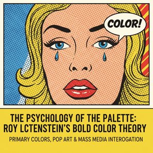
The Psychology of the Palette: Decoding Roy Lichtenstein's Bold Color Theory
Explore the profound psychological depth of Roy Lichtenstein's color theory. Discover how his use of primary colors and Ben-Day dots revolutionized modern art, transforming mass media imagery into sophisticated fine art for the discerning collector.