

 Pregledaj u stvarnoj veličini
 Podijeli
 Podijeli
 Detalji
 Vodič
Vodič

 Preuzmi datoteku
 Slični predmeti
 Rentgenska snimka
 Slide show
 Statistika
Oppositions 5, 6, 7, 8
 Acrylic On Canvas
- WallArt
- Oppositions Architecture
 1975
1975 61.0 x 61.0 cm
 Vignelli Center for Design Studies
 Pročitajte više
Djelo prikazano na ovoj stranici zaštićeno je autorskim pravima, što znači da zakonski ne možemo izraditi niti prodati identičnu reprodukciju. Ova se zaštita provodi u skladu s međunarodnim sporazumima kao što su Bernska konvencija i nacionalnim zakonima, uključujući i one koji su utvrđeni u Američki zakon o autorskom pravu – Title 17.
Ova metoda u potpunosti je usklađena s autorskim pravima jer ne uključuje kopiranje ili dupliciranje zaštićenih umjetničkih djela. Umjesto toga, riječ je o kreativnoj reinterpretaciji – novoj slici koja je dobila utjecaj na izvornik, ali nije identična njemu.
Giclée / Umjetnički otisak
Giclée tisak muzejske kvalitete ili otisak na platnu uz brzu proizvodnju i fleksibilne opcije završne obrade. ( Naručite ručno oslikano reprodukciju Prebacite na digitalnu prodaju slika)




P118B €10

P118H €10

P118W €10

P438Z €10

P508JH €12

P508YH €12

P805H €10

P805Z €10

P919BZ €10

P919G €10

P919XJ €10

P959ZH €10

P968JZ €12

W106C €8

W218G €10

W218JH €8

W218Y €10

W307PJ €10

W316G €10

W316PJ €8

W316Y €10

W398PJ €8

W4111J €10

W500HY €15

W500JH €15

W692G €12

W849H €8

W940BG €15

W953PJ €8

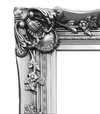

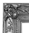
Odaberite jednu od naših unaprijed definiranih veličina koje odgovaraju izvornim proporcijama umjetničkog djela.

Unesite širinu i visinu koja vam je potrebna, kako bi odgovarali vašem okviru ili zidu. Print se može samo izrezati, nikada ne može biti veći od slike, stoga veličina s drugačijim oblikom gubi dio slike. Šaljemo vam digitalni prikaz (mockup) na odobrenje prije bilo kakve štampe. Slika prikazana na ovoj stranici ne prikazuje stvarni rez — to čini samo digitalni prikaz.
Dostava širom svijeta () u roku od 2 tjedna umjesto standardnih 4/5 tjedana. (24 Listopad)

Besplatna ekspresna dostava širom svijeta

Visokokvalitetno laneno platno

Potpuno osiguranje transporta

Jamstvo povrata carine i uvoznih poreza

Jamstvo vjernosti boja

Politika povrata u roku od 100 dana (samo u slučaju nedostataka)

Jamstvo povrata 100% novca

Popust na više proizvoda
 Opcija stakla dostupna je samo za dimenzije manje od 110 cm

Oppositions 5, 6, 7, 8
Giclée / Umjetnički otisak
Veličina reprodukcije
-


Ukupna cijena
€ 70
The Genesis of a Dialogue: Massimo Vignelli’s “Oppositions”
Massimo Vignelli's "Oppositions 5, 6, 7, 8," created in 1975 for the Institute for Architecture and Urban Studies (IAUS), isn’t merely a poster; it’s a carefully constructed visual argument. Born from a period of intense architectural theory and critique – a time grappling with the shifting landscape of urban design and the role of the architect – this work embodies the IAUS's commitment to fostering rigorous debate and challenging established norms. The piece, designed by Vignelli himself, immediately establishes a sense of controlled chaos, a deliberate juxtaposition of seemingly disparate elements that speaks volumes about the journal’s core mission: to explore the tensions and contradictions within contemporary architecture.
The design's stark simplicity is its most striking feature. A grid-based layout, dominated by bold, sans-serif typography – Vignelli’s signature choice – presents a list of book titles, each meticulously arranged against a muted background. The numbers 5 through 8 are not simply identifiers; they function as anchors, grounding the viewer within the specific issues addressed in that particular iteration of the journal. The subtle use of crossed-out books hints at critical engagement and the inherent limitations of any single perspective – a key tenet of the IAUS’s approach.
A Masterclass in Graphic Minimalism
Vignelli's genius lies not just in his aesthetic choices, but in their profound impact. The limited color palette—primarily shades of gray and white—forces the viewer to focus entirely on the content and the arrangement of the text. The geometric precision of the layout mirrors the principles of modernist architecture, reflecting a belief in clarity, functionality, and rational design. This isn’t decoration; it's an exercise in visual communication, prioritizing information delivery over superfluous embellishment. The use of Helvetica, a typeface chosen for its legibility and neutrality, further reinforces this commitment to clarity – a deliberate rejection of the ornate typography prevalent at the time.
The poster’s design also reflects Vignelli's broader philosophy regarding graphic design: that it should be invisible, serving as a vehicle for the content rather than competing with it. He famously stated, “Design is not about making things beautiful; it’s about making things useful.” This principle is perfectly embodied in "Oppositions," where the visual elements are subordinate to the intellectual discourse they represent.
Historical Context and Architectural Critique
To understand the significance of “Oppositions,” one must consider the context in which it was created. The 1970s were a turbulent period for architecture, marked by debates surrounding postmodernism, deconstructivism, and the role of the architect in shaping urban environments. The IAUS, founded by Peter Eisenman, served as a vital forum for these discussions, bringing together leading architects, theorists, and critics to challenge conventional thinking. “Oppositions” functioned as a visual representation of this intellectual ferment – a condensed distillation of the complex ideas being explored within the journal.
The inclusion of figures like Kenneth Frampton, Mario Gandelsonas, and David Morton highlights the diverse range of perspectives engaged in by the IAUS. These were architects and thinkers who questioned established hierarchies and advocated for a more critical approach to design. The crossed-out books subtly acknowledge that even within this vibrant intellectual community, there would inevitably be disagreements and competing viewpoints.
Symbolism and Enduring Legacy
Beyond its immediate function as a promotional piece, “Oppositions” carries a deeper symbolic weight. The arrangement of the book titles—each representing a specific issue—suggests a complex web of interconnected ideas. The use of numbers creates a sense of order and structure, while the crossed-out books represent the inherent contradictions and unresolved questions within architectural theory. Ultimately, the poster invites viewers to engage in their own critical analysis – to consider the challenges facing architecture and to formulate their own perspectives on the future of design.
Today, “Oppositions 5, 6, 7, 8” stands as a testament to Massimo Vignelli’s enduring legacy. His minimalist aesthetic continues to influence graphic designers worldwide, while his commitment to clarity and intellectual rigor remains remarkably relevant in an increasingly complex world. Reproductions of this iconic poster offer a powerful reminder of the importance of critical thinking and the transformative potential of design.
Pitanja i odgovori
Gdje mogu preuzeti "Oppositions 5, 6, 7, 8" autora Massimo Vignelli, Vignelli Associates?
Sliku djela "Oppositions 5, 6, 7, 8" autora Massimo Vignelli, Vignelli Associates možete preuzeti na stranici za preuzimanje ovog umjetničkog djela: Preuzimanje: preuzimanje digitalne slike visoke rezolucije.
Kako se boje djela "Oppositions 5, 6, 7, 8" međusobno povezuju?
Boje djela "Oppositions 5, 6, 7, 8" autora Massimo Vignelli, Vignelli Associates pokazuju Strong Color Unity harmoniju. Harmonija opisuje međusobni odnos boja.
Izgledaju li boje djela "Oppositions 5, 6, 7, 8" jarke ili nježne?
Boje u djelu "Oppositions 5, 6, 7, 8" autora Massimo Vignelli, Vignelli Associates imaju Vivid intenzitet.
Biografija umjetnika
Život posvećen formi: svijet Massima Vignellija
Rođen u Milanu 1931. godine, put Massima Vignellija bio je put nepokolebljive odanosti principima modernističkog dizajna. Od najranije mladosti pokazivao je urođeno razumijevanje vizualne komunikacije, započinjući svoje formalno obrazovanje u arhitekturi na Politecnico di Milano, a kasnije nastavljajući na Università Iuav di Venezia. Ipak, upravo je stažiranje kod ugledne braće Castiglioni – pionira talijanskog industrijskog dizajna – uistinu rasplamsalo njegovu strast prema oblikovanju svijeta kroz promišljeno stvaranje. To rano iskustvo u njemu je utisnulo vjerovanje u funkcionalnost, jednostavnost i moć elegantnih rješenja za svakodnevne probleme. On nije samo dizajnirao predmete; on je stvarao iskustva, pojednostavljivao interakcije i uzdizao običnu svakodnevicu u nešto nezaboravno. Ovo formativno razdoblje postavilo je temelje karijeri koja će redefinirati vizualnu kulturu na svim kontinentima.Od Italije do New Yorka: Transatlantska vizija
Vignellijev put odveo ga je u Ameriku 1966. godine, gdje je igrao ključnu ulogu u uspostavljanju newyorkskog ureda tvrtke Unimark International. To je označilo prekretnicu, ne samo za njegovu karijeru, već i za cijeli pejzaž američkog dizajna. Unimark se brzo istaknuo, a Vignellijevi doprinosi – najpoznatiji po trajanom logotipu American Airlines – učvrstili su njegov ugled majstora korporativnog identiteta. Međutim, rastuća divergencija u kreativnoj filozofiji potaknula ga je na pokretanje vlastitog poduzetništva. Godine 1971., zajedno sa svojom suprugom i doživotnom suradnicom, Lellom Vignelli, osnovao je Vignelli Associates. Ovo partnerstvo pokazalo se iznimno plodnim, postajući sinonim za sofisticirana dizajnerska rješenja koja su obuhvatila grafički dizajn, dizajn interijera, dizajn proizvoda i arhitekturu. Etos tvrtke bio je ukorijenjen u uvjerenju da dobar dizajn treba biti pristupačan, bezvremenski i izrazito koristan – principima kojima su se dosljedno posvećivali tijekom cijele svoje karijere.Ikonična stvaralaštva: Naslijeđe jasnoće
Utjecaj Massima Vignellija utkan je u samu tkaninu modernog života. Možda njegovo najprepoznatljivije postignuće je redesigniranje mape metroa New York Cityja 1932. godine. Iako je u početku izazivalo kontroverze zbog odstupanja od stroge geografske točnosti, bilo je to hrabro izjavljanje o jasnoći i upotrebljivosti. Vignelli je davao prednost čitljivosti i intuitivnoj navigaciji nad doslovnim prikazom, stvarajući diagramatsku mapu koja svakodnevno vodi milijune putnika. Ovaj projekt utjelovljuje njegovu srž dizajnerske filozofije: postavljanje komunikacije iznad svega ostalog. Osim metro mape, Vignelli Associates ostavio je neizbrisiv trag na bezbroj brendova i institucija. Njihov rad za Bloomingdale’s – uključujući ikoničnu smeđu paprenu vrećicu s jednostavnim bijelim logotipom – transformirao je iskustvo kupovine u izjavu stila. Dizajnirali su namještaj za Knoll, ambalažu za Heller i korporativne identitete koji su postali trenutno prepoznatljivi simboli kvalitete i inovacije. Njegov Heller Rainbow Dinnerware stoji kao svjedočanstvo njegove minimalističke estetike, prikazujući živopisne boje unutar čistih geometrijskih oblika. Poster Tredicesima Triennale di Milano primjer je njegove hrabre upotrebe boje i oblika, dok korica Knoll Design pokazuje njegovu sposobnost stvaranja upečatljivih vizuala za svjetski poznate brendove.Trajni utjecaj: Iznad estetike
Vignellijev utjecaj proteže se daleko izvan pojedinačnih projekata; on je temeljito promijenio način na koji doživljavamo sam dizajn. Bio je nepokolebljivi zagovornik tipografske discipline, čime je postao poznat po zagovaranju ograničene palete fontova – vjerujući da prava kreativnost ne leži u beskrajnim opcijama, već u majstorskoj izvedbi pomoću pažljivo odabranih alata. Njegova knjiga, The Vignelli Canon, postala je manifest za dizajnere, izlažući njegove principe jasnoće, jednostavnosti i trajne elegancije. On nije samo stvarao vizualno ugodne predmete; nastojao je stvoriti red iz kaosa, komunicirati učinkovito i uzdići ljudsko iskustvo kroz promišljeni dizajn. Njegov rad nastavlja inspirirati generacije dizajnera, podsjećajući ih da prava inovacija leži u uklanjanju nepotrebnog i fokusiranju na bitno. Vignelli Center for Design Studies na Rochester Institute of Technology služi kao trajni omaž njegovom naslijeđu, čuvajući opsežnu arhivu njegovog rada i poticaoći daljnje istraživanje njegovih revolucionarnih ideja. Preminuo je 2014. godine, ali njegovi dizajni ostaju snažno prisutni, oblikujući naš svijet svojom trajnom elegancijom i nepokolebljivom posvećenošću jasnoći.
Massimo Vignelli, Vignelli Associates
1931 - 2014 , Italija
Brzi pregled
- Artistic Movement Or Style: Modernizam, Minimalizam
- Date Of Birth: 10. siječnja 1931.
- Date Of Death: 27. svibnja 2014.
- Full Name: Massimo Vignelli
- Nationality: Talijana
- Notable Artworks:
- Heller Rainbow Dinnerware
- Tredicesima Triennale di Milano
- Knoll Design (naslovnica)
- Place Of Birth: Milano, Italija
Povezani članci
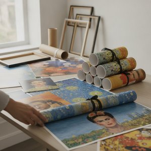
OriginalUniqueArt.com F.A.Q.: Premium Art Poster Prints – Vivid Colors & Versatile Sizing
Discover OriginalUniqueArt.com's premium art poster prints. Featuring 12-color archival pigments for vivid color fidelity and versatile sizing for bespoke decor. Expertly crafted museum-quality reproductions designed for discerning collectors and professional decorators.


