- Početna stranica

- Reprodukcija uljane slike
- Mark Rothko
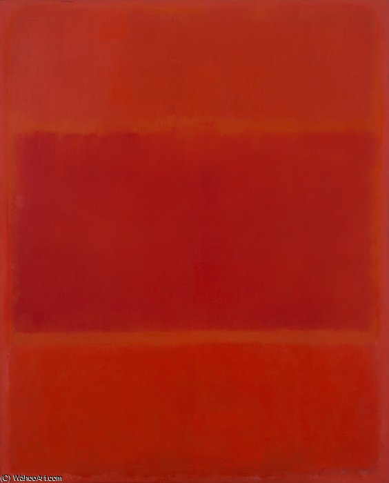
- Red and Orange
 Pošalji
Red and Orange


Ručno rađena uljana reprodukcija
Ručno oslikano uljanim bojama na platnu u dimenzijama i okviru po vašem izboru, izrađeno po narudžbi od strane naših umjetnika.


P118B $10

P118H $10

P118W $10

P438Z $10

P508JH $12

P508YH $12

P805H $10

P805Z $10

P919BZ $10

P919G $10

P919XJ $10

P959ZH $10

P968JZ $12

W106C $8

W218G $10

W218JH $8

W218Y $10

W307PJ $10

W316G $10

W316PJ $8

W316Y $10

W398PJ $8

W4111J $10

W500HY $15

W500JH $15

W692G $12

W849H $8

W940BG $15

W953PJ $8


Odaberite jednu od naših unaprijed definiranih veličina koje odgovaraju izvornim proporcijama umjetničkog djela.
Možete unijeti vlastite dimenzije kako bi odgovarale određenom okviru ili prostoru. Ako odabrana veličina ne odgovara proporcijama izvorne slike, izrezat ćemo umjetničko djelo ili proširiti sliku dodatnim ručno oslikanim elementima. Digitalni nacrt bit će vam poslan na odobrenje prije početka proizvodnje.
Imajte na umu da pregled na ekranu ne prikazuje stvarno izrezivanje ili proširivanje. Samo će nacrt točno prikazati konačni sastav.
Iako su dostupne prilagođene veličine, preporučujemo odabir dimenzije s preddefiniranog popisa kako bismo očuvali izvorne proporcije.
Nakon narudžbe, tim OriginalUniqueArt.com kontaktirat će klijenta putem e-pošte radi dobivanja uputa te dostaviti probni prikaz (mockup).
Isporuka širom svijeta () u roku od 3-4 tjedna umjesto standardnih 5 tjedana. (16 Srpanj). Bez kompromisa u kvaliteti.

Besplatna ekspresna dostava širom svijeta

Visokokvalitetno laneno platno

Potpuno osiguranje dostave

Jamstvo povrata carine i uvoznih poreza

Garancija vjernog podudaranja boja

Politika povrata u roku od 60 dana (samo u slučaju nedostataka)

Jamstvo povrata 100% novca

Popust na više proizvoda
 Opcija stakla dostupna je samo za dimenzije manje od 110 cm

Red and Orange
Tehnika reprodukcije
Veličina reprodukcije
-


Ukupna cijena
-
Opis umjetničkog djela
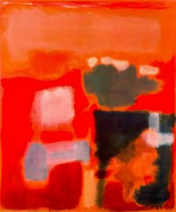
Red and Orange: A Journey Through Rothko’s Emotional Landscape
Mark Rothko, one of the towering figures of 20th-century art, didn't simply paint pictures; he crafted portals into the depths of human emotion. His work, particularly pieces like ‘Red and Orange,’ invites a profound engagement, demanding that we surrender to its quiet intensity rather than seeking immediate visual gratification. This painting, a cornerstone of his mature style, exemplifies Rothko’s revolutionary approach to color field abstraction – a deliberate move away from representational imagery towards pure feeling expressed through the luminous interaction of hues. It's a piece designed not to be ‘looked at,’ but *felt*. The genesis of ‘Red and Orange’ lies within the vibrant, yet turbulent, context of Abstract Expressionism, a movement that emerged in post-war America as artists sought new ways to grapple with the anxieties and uncertainties of the time. Rothko, however, forged his own distinct path within this broad movement. He wasn't interested in grand gestures or dramatic narratives; instead, he focused on distilling emotion into its most elemental form – color itself. His technique involved applying layers upon layers of oil paint, often mixed with turpentine to achieve a remarkable luminosity and subtle textural variations. The canvas isn’t merely a surface for pigment; it becomes an active participant in the creation of atmosphere, absorbing and reflecting light in ways that subtly shift the painting's mood throughout the day. Notice the delicate blending at the heart of the composition – a deliberate ambiguity that encourages contemplation rather than definitive interpretation. The painting’s structure is deceptively simple: two dominant rectangles of color—a rich, pulsating red on the left and an equally vibrant orange on the right—are juxtaposed within a larger field of muted tones. However, this apparent simplicity belies a complex interplay of visual and emotional forces. Rothko wasn't simply placing colors side-by-side; he was creating a dynamic tension between them, suggesting both harmony and discord. The red, often associated with passion, energy, and even danger, dominates the left portion of the canvas, while the orange—linked to warmth, optimism, and vitality—takes precedence on the right. This division isn’t rigid or absolute; rather, it creates a sense of movement and flow as the eye travels across the surface, drawn into the merging point where the two colors meet. The subtle gradations within each rectangle, achieved through meticulous layering and blending, add depth and complexity to the composition, preventing it from feeling flat or static. Rothko’s intention wasn't to depict a specific scene or object but to evoke universal human emotions – tragedy, ecstasy, doom—as he famously articulated in his writings. In ‘Red and Orange,’ the bold hues can be interpreted as symbols of these fundamental experiences. The intensity of the red might represent moments of profound sorrow or struggle, while the warmth of the orange suggests hope, joy, or a sense of transcendence. It’s important to recognize that Rothko deliberately avoided providing viewers with easy answers; he wanted them to project their own feelings and associations onto the canvas, creating a deeply personal experience. The painting becomes a mirror reflecting our own inner landscape. The legacy of ‘Red and Orange,’ and indeed of Mark Rothko's entire body of work, is undeniable. His color field paintings have profoundly influenced generations of artists, from abstract expressionists to contemporary painters exploring the expressive potential of color. Reproductions of this piece offer a remarkable opportunity to bring Rothko’s emotional intensity into any space, transforming interiors into contemplative sanctuaries. Consider how the rich hues interact with your existing décor – will they enhance the sense of warmth and tranquility, or add a touch of dramatic tension? The choice is yours, but one thing is certain: ‘Red and Orange’ remains a powerful testament to the transformative power of art.The Artistic Movement: Abstract Expressionism and Rothko's Place Within It
Rothko’s work stands as a pivotal contribution to Abstract Expressionism, a movement that fundamentally shifted the focus of American art away from representational imagery towards subjective experience and emotional expression. Emerging in the aftermath of World War II, Abstract Expressionism was characterized by its emphasis on spontaneity, gesture, and the artist's inner world. Artists like Jackson Pollock, Willem de Kooning, and Barnett Newman sought to capture the raw energy and anxieties of the post-war era through large-scale canvases and unconventional techniques. However, Rothko distinguished himself from his contemporaries with his deliberate restraint and focus on color as a primary means of communication. Unlike the gestural brushstrokes favored by Pollock or the fragmented figures of de Kooning, Rothko’s paintings are defined by their smooth, almost meditative surfaces. He rejected the notion of the artist's hand as a visible element in the work, striving instead to create an illusion of seamlessness and luminosity. This pursuit of pure color was deeply influenced by his interest in spirituality and Eastern philosophy, which he believed could provide access to profound emotional states. Rothko’s paintings aren’t about depicting something; they *are* the feeling itself – a distillation of experience rendered in pigment and light. The influence of earlier artistic traditions is also evident in Rothko's work. He drew inspiration from Byzantine icons, which are characterized by their flattened forms, luminous colors, and symbolic content. Similarly, he was fascinated by the color theories of Goethe, who proposed that colors could be understood as having specific psychological effects. Rothko’s use of complementary colors – red and orange in ‘Red and Orange,’ for example – is a deliberate attempt to create visual tension and evoke particular emotional responses. He wasn't simply arranging colors on a canvas; he was conducting an experiment in color psychology, seeking to harness the power of hue to communicate profound human experiences.The Painting: 'Red and Orange' - A Detailed Examination
‘Red and Orange’ is a prime example of Rothko’s distinctive technique and his unwavering commitment to expressing emotion through color. The painting measures approximately 39 ½ x 31 ¾ inches (100.5 x 80.6 cm), a size that allows the colors to dominate the viewer's field of vision, creating an immersive experience. As mentioned previously, the composition is built around two rectangular fields of color: a deep, saturated red on the left and a vibrant orange on the right. These rectangles are not sharply defined; rather, they bleed into one another at their edges, creating a sense of fluidity and ambiguity. The layering technique employed by Rothko is crucial to understanding the painting’s luminosity. He applied multiple thin layers of oil paint, often mixed with turpentine to achieve a translucent effect. This process allowed light to penetrate through the pigments, creating an almost ethereal glow. The texture of the canvas itself plays a significant role in this effect – it's subtly uneven and slightly rough, adding depth and complexity to the surface. Notice how the red seems to vibrate and pulsate within its rectangular frame, while the orange radiates warmth and vitality. The subtle variations in color intensity are also noteworthy. Rothko didn’t simply apply a uniform shade of red or orange; he carefully modulated the hues throughout each rectangle, creating areas of lighter and darker tones. This technique adds depth and dimension to the composition, preventing it from feeling flat or static. The blending at the point where the two colors meet is particularly intriguing – it creates a sense of ambiguity and suggests that the painting is in a state of constant flux. It’s as if the red and orange are merging and separating simultaneously, reflecting the complexities of human emotion.Emotional Resonance: Rothko's Pursuit of Universal Feeling
Rothko believed that color possessed the power to evoke profound emotional responses in viewers – tragedy, ecstasy, doom—as he himself articulated. He wasn’t interested in creating beautiful or aesthetically pleasing paintings; his primary goal was to communicate these fundamental human experiences directly and without mediation. This conviction stemmed from his belief that art could serve as a bridge between individuals, fostering empathy and understanding. The success of ‘Red and Orange,’ and indeed of Rothko's entire body of work, lies in its ability to tap into these universal emotions. The painting doesn’t require any specific interpretation or explanation; it simply *is* – a luminous field of color that invites the viewer to contemplate their own feelings and associations. It’s not uncommon for people to experience tears or a sense of profound emotion when viewing Rothko's paintings, suggesting that he has succeeded in creating works that resonate deeply with our shared human condition. Rothko’s approach was radical for its time, challenging traditional notions of art as representation and inviting viewers to engage with the work on an emotional level. His paintings are not meant to be ‘looked at’; they are meant to be *felt*. They are a testament to the transformative power of color and a profound exploration of the human psyche.Biografija umjetnika
Rane godine i začeci umjetničke vizije
Mark Rothko, rođen kao Markus Jakovljevič Rotkovič u Daugavpilsu, Latvija, 1903. godine, nosio je u sebi od samog početka osjećaj otuđenja koji je duboko oblikovao njegovu umjetničku putanju. Njegove rane godine bile su obilježene anksioznošću židovske obitelji koja je živjela unutar Pale naselja, zasjenjene progonima i političkim nemirima. Ova atmosfera ugradila mu je duboku osjetljivost na ljudsko patnju, temu koja će odjekivati kroz sve njegovo djelo. Emigracija 1913. godine u Portland, Oregon, predstavljala je ne samo geografsku promjenu, već i kulturni šok za mladog Rothka. Iako je briljirao u akademskom smislu na Sveučilištu Yale, Rothko se sve više osjećao privučen živahnom energijom New Yorka, napustivši formalno obrazovanje kako bi slijedio svoju strast prema umjetnosti na Školi za likovne umjetnosti. Te su formative godine postavile temelj za umjetničku viziju koja će u konačnici izazvati konvencionalna shvaćanja slikarstva i redefinirati emocionalnu moć boje.Od figurativnih početaka do apstraktnog ekspresionizma
Rothkove prve umjetničke istrage bile su čvrsto ukorijenjene u realizmu, prikazujući urbane scene i portrete s oštrom pozornošću na detalje. Međutim, čak i ta rana djela nagovještavala su psihološku dubinu koja će postati njegovim zaštitnim znakom. Tijekom 1940-ih, dok se svijet suočavao užasima Drugog svjetskog rata, Rothkova umjetnost doživjela je dramatičnu transformaciju. Pod utjecajem nadrealizma i mitologije, počeo je odlaziti od reprezentativne slike, tražeći umjesto toga izraziti univerzalne ljudske emocije kroz simbolične oblike. Ta je razdoblja obilježila pojavu višeslojnih slika – platna naseljena dvosmislenim, biomorfnim oblicima koji su se činili kao da lebde između figuracije i apstrakcije. Ta djela nisu bila samo eksperimenti u obliku; bili su duboko osjećajna reagiranja na anksioznost i nesigurnost svijeta u ratu. Do kraja 1940-ih Rothko je stigao do svog prepoznatljivog stila: platna velikih formata s rektangularnim blokovima boja koji su se činili kao da plutaju i odjekuju jedni s drugima. Odustao je od svih tragova prepoznatljive slike, fokusirajući se umjesto toga na čisti emocionalni utjecaj boje i oblika. To je označilo ključni trenutak u razvoju apstraktnog ekspresionizma i uspostavilo Rothka kao vodeću figuru u ovom revolucionarnom pokretu.Polje boja i potraga za transcendencijom
Rothkovo zrelo djelo definirano je onim što se kasnije nazvalo "poljem boja" – prostrane površine svjetlucave boje koje obuhvaćaju gledatelja u imersivno iskustvo. Te slike nisu o *čemu* prikazuju, već o *kako* vas osjećaju. Rothko je vjerovao da bi umjetnost trebala angažirati gledatelja visceralno, zaobilazeći intelektualnu analizu i izravno se obraćajući emocijama. Pažljivo je nanosio tanke premaze boje, stvarajući suptilne varijacije u tonu i teksturi koje su se činile kao da odišu iz platna. Rubovi njegovih rektangularnih oblika često su zamućeni, omogućujući im da se pomiješaju i međudjeluju jedni s drugima, stvarajući osjećaj dubine i pokreta. Rothko je namjerno izbjegavao naslove osim brojeva – "Br. 1", "Br. 6" – potičući gledatelje da se suoče sa slikama bez predrasuda i dopuste svojim vlastitim emocionalnim odgovorima da ih vode. Težio je stvoriti prostor za kontemplaciju, utočište u kojem bi gledatelji mogli uspostaviti vezu s nečim većim od sebe. Njegova ambicija nije bila ništa manje nego evocirati duboke duhovne iskustva jezikom boje.Značajna postignuća i trajni nasljeđ
Među Rothkovim najznačajnijim ostvarenjima su "Br. 10 (1950)", ključno djelo koje utjeljuje njegov evoluirajući stil, i Seagram Murali (1958.). Naručeni za restoran Four Seasons u New Yorku, ti su murali na kraju odbijen od Rothka, koji je smatrao da će biti ugroženi svojim namijenjenim okruženjem. Umjesto toga, donirao ih je Tate Galleryju u Londonu, gdje i dalje inspiriraju strahopoštovanje i kontemplaciju. Možda je njegov najambiciozniji projekt bila Rothko Kapela (1971.) u Houstonu, Texas – nekonfesionalna svetište koja sadrži četrnaest njegovih slika. Dizajnirana kao prostor za tiho razmišljanje, kapelica se smatra svetim mjestom mnogima, utjelovljujući Rothkovo uvjerenje u duhovnu moć umjetnosti. Rothkov je utjecaj na sljedeće generacije umjetnika bio ogroman. Pripremio je teren za minimalističku umjetnost i nastavlja inspirirati suvremene slikare koji istražuju emocionalne mogućnosti apstrakcije. Unatoč borbi s depresijom tijekom cijelog života, koja je kulminirala njegovim tragičnim samoubojstvom 1970., Mark Rothko ostaje jedan od najvažnijih i utjecajnijih umjetnika 20. stoljeća – majstor boje čije djelo nastavlja rezonirati s publikom širom svijeta.Trajna moć emocionalne resonancije
- Rothkove slike slave se svojom sposobnošću prenošenja univerzalnih ljudskih emocija - tragedije, ekstaze, očaja i nade.
- Njegovo istraživanje boje kao sredstva za izražavanje emocija revolucioniralo je apstraktno slikarstvo.
- Rothko Kapela stoji kao svjedočanstvo njegovog uvjerenja u duhovnu moć umjetnosti.
- Ostaje ključna figura u apstraktnom ekspresionizmu i veliki utjecaj na suvremene umjetnike.

Mark Rothko
1903 - 1970 , Latvija
Osnovne informacije
- Datum Rođenja: 25. rujna 1903.
- Datum Smrti: 22. veljače 1970.
- Mjesto Rođenja: Daugavpils, Latvija
- Nacionalnost: Američki
- Pokreti/Umjetnici Pod Utjecajem:
- Minimalizam
- Apstraktni ekspresionizam
- Poznata Djela:
- No. 10 (1950)
- Seagram Murali
- Rothko Kapelica
- Bijelo središte
- Puno Ime: Mark Rothko
- Umjetnički Pokret: Apstraktni ekspresionizam
Srodni članci

The Sublimity of Color: Exploring the Emotional Landscapes of Mark Rothko's Abstract Expressionism
Explore the profound emotional depth of Mark Rothko's abstract expressionism. Discover the history, techniques & lasting impact of this pivotal Color Field painter. Expert insights for collectors and art enthusiasts.

Beyond Representation: Emotional Depth & Formal Innovation in Abstract Expressionism
Explore the profound emotional depth & formal innovation of Abstract Expressionism. Discover key artists, collecting insights, and investment potential with expert guidance. Learn more now.
Desetak Remek-djela koja su Definirala Apstraktni Ekspresionizam: Uljane Slike i Moderna Dekoracija
Otkrijte 10 remek-djela koja su definirala apstraktni ekspresionizam! Jackson Pollock, Mark Rothko i drugi majstori uljane umjetnosti. Ispričajte priču svojim zidovima uz OriginalUniqueArt - vrhunske reprodukcije za vaš dom.
Beyond Representation: Exploring the Emotional Landscape of Abstract Expressionism
Explore the profound emotional world of Abstract Expressionism with OriginalUniqueArt. Discover key artists like Pollock & Rothko, learn about collecting, and find museum-quality reproductions to inspire your space.

Morris Louis: Pioneering Color Field Painting & Abstract Expressionism's Legacy
Explore the groundbreaking abstract expressionism of Morris Louis, a pioneer of Color Field painting. Discover his innovative techniques, influential series & lasting legacy in post-war American art. Learn more at OriginalUniqueArt.