Esikatselu
 Jaa teos
 Jaa
Jaa
 Tiedot
 Opas
Opas

 Lataa kuva
 Samanlaisia kohteita
 Röntgenkuvaus
 Diaesitys
 Q&A
Q&A Tilastot
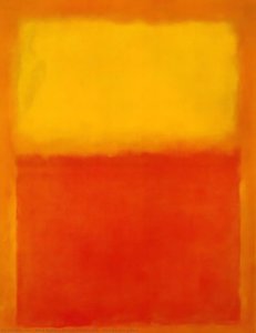
Ochre and Red on Red


 Lue lisää
Tällä sivulla esitettyä taideteosta suojaa tekijänoikeuslaki, mikä tarkoittaa, ettemme voi laillisesti luoda tai myydä täsmälleen samanlaista jäljennöstä. Tämä suoja toteutetaan kansainvälisten sopimusten, kuten esimerkiksi Berne-konventio ja kansallisilla laeilla, mukaan lukien niillä määritellyt Yhdysvaltain tekijänoikeuslaki – Luku 17. Kaikki oikeudet pidätetään. Luvaton kopiointi tai jäljittely on kielletty.
Tämä menetelmä noudattaa täysin tekijänoikeussäännöksiä, sillä se ei sisällä suojatun taideteoksen kopioimista tai jäljentämistä. Sen sijaan kyseessä on luova uudelleentulkinta – uusi maalaus, joka ammentaa vaikutteita alkuperäisestä, mutta ei ole sen identtinen kopio.
Giclée- ja taideprintit
Museolaatuisia giclée- tai kankaitaulun tulosteita nopealla tuotannolla ja joustavilla viimeistelyvaihtoehdoilla. ( Osta käsinmaalattu taideteos Siirry digitaaliseen kuvaan)




P118B €10

P118H €10

P118W €10

P438Z €10

P508JH €12

P508YH €12

P805H €10

P805Z €10

P919BZ €10

P919G €10

P919XJ €10

P959ZH €10

P968JZ €12

W106C €8

W218G €10

W218JH €8

W218Y €10

W307PJ €10

W316G €10

W316PJ €8

W316Y €10

W398PJ €8

W4111J €10

W500HY €15

W500JH €15

W692G €12

W849H €8

W940BG €15

W953PJ €8




Valitse valmiista mitoistamme sellaiset, jotka vastaavat teoksen alkuperäisiä mittasuhteita.

Syötä tarvitsemasi leveys ja korkeus, jotta tuloste sopii kehyksiisi tai seinällesi. Tulostetta voidaan vain leikata, sitä ei voida koskaan suurentaa alkuperäistä kuvaa suuremmaksi, joten eri muotoinen koko aiheuttaa osan kuvasta katoamisen. Lähetämme sinulle digitaalisen mallikuvan hyväksyttäväksi ennen kuin aloitamme tulostuksen. Tällä sivulla näkyvä kuva ei näytä lopullista rajausta — vain mallikuva näyttää sen.
Maailmanlaajuinen toimitus () 2 viikossa tavallisen 4–5 viikon sijaan. (1 marraskuu)

Ilmainen pikatoimitus ympäri maailman

Korkealaatuinen pellavakangas

Kattava kuljetusvakuutus

Tulliveron palautustakuu

Takuu täydellisestä värien vastaavuudesta

100 päivän palautusoikeus (vain valmistusvirheet)

100% rahat takaisin -takuu

Määräalennus tarjolla
 Lasivaihtoehto on saatavilla vain alle 110 cm kokoisille teoksille

Ochre and Red on Red
Giclée- ja taideprintit
Replikaatin koko
-


Kokonaishinta
€ 71
A Meditation in Color: The Luminous Essence of Ochre and Red on Red
To stand before Mark Rothko’s “Ochre and Red on Red” is to enter a realm where language fails and pure sensation takes command. Created in 1962, this masterpiece serves as a profound cornerstone of the Color Field painting movement, a period that fundamentally redefined the boundaries of modern art. Rather than presenting a recognizable subject, Rothko invites the viewer into a deep, meditative state, using the canvas not merely as a surface for pigment, but as a portal for spiritual and emotional exploration. The work embodies his radical belief that color alone possesses the power to convey the most complex human experiences, offering a sanctuary for contemplation and introspection in an increasingly noisy world.
The composition is a masterclass in deceptive simplicity. At first glance, the viewer encounters a square canvas divided into two dominant, breathing rectangles. A deep, resonant red occupies the majority of the surface, acting as a powerful, enveloping atmosphere. Nestled within this sea of crimson sits a smaller rectangle of ochre pigment, providing a subtle yet vital counterbalance to the surrounding intensity. This interplay between the warmth of the ochre and the depth of the red creates a mesmerizing visual tension, where the edges of the forms seem to bleed into one another, blurring the line between shape and space.
Technique and the Alchemy of Light
The ethereal, almost glowing quality of Ochre and Red on Red is the result of Rothko’s meticulous and labor-intensive technique. He achieved this luminous effect through the careful layering of thin, translucent washes of paint. By applying these delicate veils of color, he allowed light to penetrate the various strata of pigment, creating a sense of internal radiance that seems to emanate from within the canvas itself. This method of diffusion ensures that there are no harsh boundaries; instead, the colors transition with a soft, atmospheric grace, mimicking the way light shifts through mist or the way heat radiates from an ember.
For the collector or interior designer, this painting offers an unparalleled ability to command a space. The work does not merely decorate a wall; it transforms the very energy of a room. Its high-impact palette of reds and oranges provides a bold, energetic presence that can serve as a focal point in contemporary settings, while its soft, blurred edges allow it to integrate seamlessly into more serene, minimalist environments. It is a piece that demands attention through its quiet intensity, making it an ideal acquisition for those seeking to infuse their surroundings with a sense of profound, artistic weight and sophisticated warmth.
Kysymykset ja vastaukset
Mihin käyttöön Mark Rothko:n "Ochre and Red on Red" -teoksen reproduktio soveltuu?
Mark Rothko:n "Ochre and Red on Red"-teoksen reproduktio on suositeltava Focal. Tämä suositus perustuu teoksen aiheeseen, tunnelmaan ja väreihin.
Mistä voin nähdä esikatselun teoksesta "Ochre and Red on Red"?
"Ochre and Red on Red"-teoksen Esikatselu tilassa -sivulla voit esikatsella teosta ennen tilaamista.
Mihin tarkoitukseen ja mihin tilaan "Ochre and Red on Red" suositellaan?
"Ochre and Red on Red" sopii erinomaisesti Focal-käyttöön, ja suositeltu tila teokselle on Living Room.
Taiteilijan elämäkerta
Early Life and the Seeds of Artistic Vision
Mark Rothko, born Markus Yakovlevich Rothkowitz in Dvinsk, Latvia, in 1903, carried within him from the outset a sense of displacement that would profoundly shape his artistic journey. His early years were marked by the anxieties of a Jewish family living within the Pale of Settlement, shadowed by pogroms and political unrest. This atmosphere instilled a deep sensitivity to human suffering, a theme that would resonate throughout his oeuvre. The 1913 immigration to Portland, Oregon, represented not just a geographical shift but a cultural upheaval for the young Rothko. While his father, a pharmacist and intellectual with socialist leanings, fostered a home filled with debate and learning, the loss of Jacob Rothkowitz shortly after their arrival cast a long shadow. This early experience of loss, coupled with the challenges of assimilation, fueled a lifelong exploration of existential themes – mortality, trauma, and the search for meaning in a chaotic world. Though he excelled academically at Yale University, Rothko found himself drawn more to the vibrant energy of New York City, abandoning formal studies to pursue his passion for art at the Art Students League. These formative years laid the groundwork for an artistic vision that would ultimately challenge conventional notions of painting and redefine the emotional power of color.From Figurative Beginnings to Abstract Expressionism
Rothko’s initial artistic explorations were firmly rooted in realism, depicting urban scenes and portraits with a keen eye for detail. However, these early works already hinted at the psychological depth that would become his hallmark. As the 1940s unfolded, and the world grappled with the horrors of World War II, Rothko’s art underwent a dramatic transformation. Influenced by Surrealism and mythology, he began to move away from representational imagery, seeking instead to express universal human emotions through symbolic forms. This period saw the emergence of multi-form paintings – canvases populated by ambiguous, biomorphic shapes that seemed to hover between figuration and abstraction. These works were not merely experiments in form; they were deeply felt responses to the anxieties and uncertainties of a world at war. By the late 1940s, Rothko had arrived at his signature style: large-scale canvases featuring rectangular blocks of color that appeared to float and resonate with one another. He stripped away all vestiges of recognizable imagery, focusing instead on the pure emotional impact of color and form. This marked a pivotal moment in the development of Abstract Expressionism, and established Rothko as a leading figure in this groundbreaking movement.The Color Field and the Pursuit of Transcendence
Rothko’s mature work is defined by what came to be known as “Color Field” painting – vast expanses of luminous color that envelop the viewer in an immersive experience. These paintings are not about *what* they depict, but rather *how* they make you feel. Rothko believed that art should engage the viewer viscerally, bypassing intellectual analysis and speaking directly to the emotions. He meticulously layered thin washes of paint, creating subtle variations in tone and texture that seemed to emanate from within the canvas. The edges of his rectangular forms are often blurred, allowing them to blend and interact with one another, creating a sense of depth and movement. Rothko deliberately avoided titles beyond numbers – “No. 1,” “No. 6” – encouraging viewers to confront the paintings without preconceived notions and allow their own emotional responses to guide their experience. He sought to create a space for contemplation, a sanctuary where viewers could connect with something larger than themselves. His ambition was nothing less than to evoke profound spiritual experiences through the language of color.Major Achievements and Lasting Legacy
Among Rothko’s most significant achievements are “No. 10 (1950),” a pivotal work that exemplifies his evolving style, and the Seagram Murals (1958). Commissioned for the Four Seasons restaurant in New York City, these murals were ultimately rejected by Rothko, who felt they would be compromised by their intended environment. He instead donated them to the Tate Gallery in London, where they continue to inspire awe and contemplation. Perhaps his most ambitious project was the Rothko Chapel (1971) in Houston, Texas – a non-denominational sanctuary housing fourteen of his paintings. Designed as a space for quiet reflection, the chapel is considered a sacred place by many, embodying Rothko’s belief in the spiritual power of art. Rothko's influence on subsequent generations of artists has been immense. He paved the way for Minimalist art and continues to inspire contemporary painters who explore the emotional possibilities of abstraction. Despite struggling with depression throughout his life, culminating in his tragic suicide in 1970, Mark Rothko remains one of the most important and influential artists of the 20th century – a master of color whose work continues to resonate with audiences around the world. ## The Enduring Power of Emotional Resonance- Rothko’s paintings are celebrated for their ability to convey universal human emotions—tragedy, ecstasy, despair, and hope.
- His exploration of color as a vehicle for emotional expression revolutionized abstract painting.
- The Rothko Chapel stands as a testament to his belief in the spiritual power of art.
- He remains a pivotal figure in Abstract Expressionism and a major influence on contemporary artists.

Mark Rothko
1903 - 1970 , Latvia
Pähkinänkuoressa
- Artistic Movement Or Style: Abstrakti ekspressionismi
- Artists Or Movements Influenced By This Artist: ['Minimalismi']
- Date Of Birth: 25. syyskuuta 1903
- Date Of Death: 25. helmikuuta 1970
- Full Name: Mark Rothko
- Nationality: Venäläinen imperiumi-Amerikan kansalainen
- Notable Artworks:
- Ei. 10 (1950)
- Seagram Murals
- Rothko Chapel
- Place Of Birth: Dvinsk, Latvia
Aiheeseen liittyvät artikkelit
Color Field Painting: The Emotional Power of Pure Abstraction and Chromatic Depth
Explore the profound emotional depth of Color Field painting. Discover the history of mid-century abstraction, from Rothko to Newman, and learn how pure color transforms the viewer's experience through our expert art history guide.
The Essence of Abstraction: A Definitive Guide to the Power and History of Color Field Painting Masterpieces
Explore the profound emotional depth of Color Field painting. Our expert guide delves into the post-war origins of Abstract Expressionism, analyzing masterpieces by Rothko and Newman. Discover museum-grade, hand-painted oil reproductions that bring art history to your walls.

Mark Rothkon 25 mestariteosta: Värien syvyydessä – Taidetta kotiisi OriginalUniqueArtilta
Tutustu Mark Rothkon 25 mestariteokseen ja syvälliseen maailmaan abstraktin ekspressionismin parissa. Löydä tunteelliset väritaulut, taidehistorian helmet ja inspiraatiota kotiisi OriginalUniqueArtilta. Tutki kokoelma verkossa!
Abstraktin ekspressionismin mestariteokset: Taidetta ja inspiraatiota kotiisi
Tutustu abstraktin ekspressionismin 10 mestariteokseen! Jackson Pollock, Mark Rothko ja muut taiteilijat inspiroivat tunteellisuudellaan. Löydä upeita taidemaalauksia kotiisi OriginalUniqueArt.comista – museolaatuista laatua ja sisustusehdotuksia.
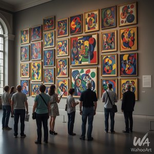
Wassily Kandinskin 25 mestariteosta: Värien ja muodon syvä maailma | OriginalUniqueArt
Tutustu Wassily Kandinskin 25 vaikuttavinta teosta! Uppoudu abstraktin taiteen maailmaan, värien symboliikkaan ja modernin ekspressionismin historiaan. Löydä inspiraatiota kodin sisustukseen OriginalUniqueArt.com:ista – laadukkaat taideprintit ja reproduktiot.