Vaata sisu
 Jaga teost
 Jaga
Jaga
 Detailid
 Õppekate juhend

 Laadi alla
 Sarnased teosed
 Röntgenuuring
 Slaidietendus
 Statistika
Forget it! Forget me!
 Acrylic On Canvas
- WallArt
- Pop Art
 1962
1962- Early Medieval
 203.0 x 172.0 cm
 Loe lähemalt
Sellel lehel kuvatav kunstiteos on kaitstud autoriõigusega, mis tähendab, et meil ei ole seaduslikku õigust luua või müüa identset reproduktsiooni. Seda kaitset rakendatakse rahvusvaheliste kokkulepete alusel, nagu näiteks Berne konventsioon ning riiklike seadustega, sealhulgas nendega, mida on sätestatud USA autoriõiguse seadus – 17. peatükk.
Austasena ja seaduslikuna alternatiivina pakume originaalist inspireeritud, käsitsi maalitud isikupärastatud teoseid. Meie osutavad ja professionalsed kunstnikud uurivad hoolikalt originaali stiili, meelemoi ja kunstilist olemust, et luua uus, ainulaadne teos, mis tekitab sama tunnet – olles samal ajal omaette originaalne looming.
See meetod järgib täielikult autoriõiguse reegleid, kuna see ei põhine kaitstud kunstiteose kopeerimisel või dupliteerimisel. Selle asemel on tegu loova reinterpreetatsiooniga – uue maaldisega, mis on algteosest inspireeritud, kuid ei ole sellest identiline.
Käsitsi valmistatud õlimaalireproduktsioon
Meie kunstnike poolt tellimusel valmistatud käsitsi maalitud õli-kainaste teos teie soovitud suuruses ja raamis. ( Lülita trükkitoodetele Ülemineku digitaalse pildi müügi kanalisse)




P118B €10

P118H €10

P118W €10

P438Z €10

P508JH €12

P508YH €12

P805H €10

P805Z €10

P919BZ €10

P919G €10

P919XJ €10

P959ZH €10

P968JZ €12

W106C €8

W218G €10

W218JH €8

W218Y €10

W307PJ €10

W316G €10

W316PJ €8

W316Y €10

W398PJ €8

W4111J €10

W500HY €15

W500JH €15

W692G €12

W849H €8

W940BG €15

W953PJ €8




Vali meie eelmääratud suurused, mis vastavad teose algupärastele proportsioonidele.

Sisestage vajalik laius ja kõrgus, et teos sobiks teie raamile või seinale. Kuna tegu on käsipainatud teosega, siis erineva kujuga suuruse korral võib kunstnik jätta pildi ümber veidi rohkem marginaali või lõigata osa ära — valik on teie. Enne maali alustamist saadame teile kinnitamiseks digitaalse näidisprojektsiooni. Sellel lehel näidatud pilt ei kajasta tegelikku tulemust — seda näitab ainult näidisprojekttsioon.
Pärast tellimust saadab OriginalUniqueArt.com meeskond kliendile e-posti juhised ning esitab eelvaate kavandi
Maailmline tarne 3–4 nädala jooksul tavalise 5 nädala asemel. (23 oktoober). Kvaliteedis kompromisse ei tehta.

Tasuta ekspresssaatmine üle maailma

Kõrgekvaliteediline lina-kangastest muld

Täielik transpordikindlustus

Tollimaksude tagastamise garantii

Värvitoime täpsuse garantii

100 päeva tagastusõigus (ainult defektide korral)

100% raha tagasi garantii

Hulgusoodustus
 Klaasivalik on saadaval ainult kuni 110 cm suuruses teostes

Forget it! Forget me!
Reproduktsiooni materjal
Reproduktsiooni mõõtmed
-


Lõppsumma
€ 263
A Frozen Moment of Disconnection: Exploring “Forget it! Forget me!”
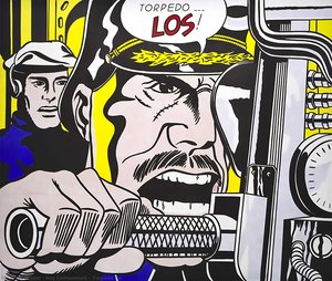
Roy Lichtenstein’s “Forget it! Forget me!”, painted in 1962, isn't merely a depiction of a comic book panel; it’s a carefully constructed meditation on the complexities of human connection and the often-disappointing reality beneath surface communication. This work, a cornerstone of the Pop Art movement, immediately grabs the viewer with its bold, almost jarring color palette – a vibrant clash of blues, yellows, and reds that feels both familiar and unsettlingly artificial. The scene itself is deceptively simple: a man in a blue shirt, seemingly engaged in a serious conversation with a woman sporting blonde hair, while a shadowy figure lurks just out of focus. Yet, within this apparent straightforwardness lies a potent sense of unease, mirroring the emotional distance that can exist even amidst spoken words.
Lichtenstein’s genius lay not in replicating reality but in distilling it to its most recognizable elements and then reassembling them with deliberate artistic intent. He deliberately chose imagery from popular culture – comic books, advertisements, everyday objects – elevating them to the status of fine art. “Forget it! Forget me!” exemplifies this perfectly; by borrowing directly from a comic book format, Lichtenstein critiques the very medium he’s utilizing, questioning its ability to truly convey genuine emotion or understanding.
The Language of Ben-Day Dots and Bold Lines
The painting's distinctive visual language is inextricably linked to Lichtenstein’s signature technique: the use of Ben-Day dots. These meticulously applied dots, mimicking the printing process used in mass-produced comic books, create a textured surface that simultaneously suggests depth and flatness. It’s a fascinating paradox – the image feels both dynamic, as if caught mid-conversation, and static, like a printed page frozen in time. The bold black outlines further emphasize this effect, defining the figures and creating a graphic, almost cartoonish quality. This deliberate simplification of form and color was revolutionary at the time, rejecting the traditional emphasis on realistic representation and embracing a more immediate, accessible style.
- Color Palette: The dominant blues and reds are deliberately heightened, amplifying their emotional impact.
- Ben-Day Dots: These create a unique textural quality and mimic the look of printed comic books.
- Bold Outlines: Define the figures and contribute to the painting’s graphic style.
A Dialogue on Communication and Disconnection
Beyond its technical brilliance, “Forget it! Forget me!” is a poignant commentary on the nature of relationships. The title itself – a dismissive declaration of abandonment – immediately sets a tone of frustration and disappointment. The woman’s attentive posture suggests she's listening, but the man’s averted gaze hints at a deeper disconnect. The shadowy figure in the background could represent unspoken anxieties or unresolved issues, adding another layer of complexity to the scene. Lichtenstein wasn’t simply depicting a conversation; he was exploring the gap between words and meaning, the potential for misunderstanding, and the vulnerability inherent in human interaction.
Considering its creation within the context of 1962, a period marked by rapid social change and increasing consumerism, “Forget it! Forget me!” can be interpreted as a reflection on the anxieties of modern life. The painting’s embrace of popular culture mirrored a broader shift in artistic sensibilities, challenging traditional notions of art and its role in society.
Bringing "Forget it! Forget me!" into Your Space
OriginalUniqueArt offers meticulously crafted hand-painted reproductions of Roy Lichtenstein's “Forget it! Forget me!”, allowing you to experience the power and beauty of this iconic artwork firsthand. Our reproductions faithfully capture the painting’s vibrant colors, distinctive Ben-Day dot technique, and emotional resonance. Available in a range of sizes, from smaller pieces suitable for individual display to larger formats that can command attention in any room, our high-quality prints are perfect for art collectors, interior designers, and anyone seeking to infuse their space with the spirit of Pop Art. Each reproduction is created by skilled artists using archival materials, ensuring its longevity and preserving the integrity of Lichtenstein’s original vision. Invest in a piece of art history – order your “Forget it! Forget me!” reproduction today.
Küsimused ja vastused
Millises tehnikas on teos „Forget it! Forget me!“, autor Roy Fox Lichtenstein valmistatud?
Roy Fox Lichtenstein kasutas teose "Forget it! Forget me!" loomisel Acrylic On Canvas tehnikat. See tehnika määrab originaalteose materjalilise olemuse.
Mis vanuses loos Roy Fox Lichtenstein teose "Forget it! Forget me!"?
Roy Fox Lichtenstein loosutas teose "Forget it! Forget me!" 39 aasta vanuses. Kunstnik on sündinud aastal 1923 ning teos on dateeritud 1962.
Millist suurust ja orientatsiooni soovitatakse teosele „Forget it! Forget me!“, autor Roy Fox Lichtenstein trükkimisel?
Large suurus, Portrait orientatsioon: see on teosele „Forget it! Forget me!“, autor Roy Fox Lichtenstein soovitatud trükkimise seadistus.
Kunstniku elulugu
The Genesis of a Pop Visionary
Roy Fox Lichtenstein, born in the vibrant metropolis of New York City on October 27, 1923, indelibly altered the landscape of twentieth-century art. Emerging as a pivotal figure within the Pop Art movement, Lichtenstein didn’t simply reflect his era; he actively interrogated it, transforming commonplace imagery into compelling artistic statements. His upbringing in an upper-middle-class Jewish family fostered both a cultural awareness and an early artistic inclination. Childhood exposure to museums and concerts, coupled with a deep appreciation for jazz music, laid the groundwork for a creative spirit that would challenge conventional notions of fine art. Though initially drawn to realistic drawing and painting during his formative years, Lichtenstein’s formal training commenced at the Art Students League in 1939 under Reginald Marsh, followed by studies at Ohio State University – interrupted briefly by wartime service in the Army. These experiences provided a robust technical foundation that would later be brilliantly re-contextualized through the lens of mass culture and commercial aesthetics. The seeds of his signature style weren’t sown within the hallowed halls of artistic tradition but rather in the often-overlooked world of everyday imagery, particularly comic books and advertising.Early Influences and Artistic Exploration
Lichtenstein's formative years were marked by a fascination with Surrealism, mirroring the dominant aesthetic currents of his time. However, this initial engagement proved transitional, propelling him toward a radical stylistic shift. A crucial encounter transpired during his tenure at Rutgers University where he connected with Allan Kaprow, whose influence rekindled Lichtenstein’s interest in proto-pop iconography. This serendipitous meeting sparked a transformative reconsideration of artistic boundaries, prompting him to question the established dichotomy between “high” and “low” art. He began venturing beyond the subjective realm of Surrealism toward the objective language of popular culture – specifically, comic books and advertising. The year 1961 witnessed a decisive breakthrough with *Look Mickey*, a work that boldly appropriated characters from Disney comics, signaling the commencement of his distinctive style. This wasn’t mere imitation; it was an act of artistic re-evaluation, elevating commonplace imagery to the stature of fine art. He didn't simply replicate comic strip scenes; he meticulously recreated them utilizing techniques mirroring commercial printing processes – a deliberate blurring of distinctions between original artwork and mass production. This appropriation wasn’t about celebrating consumerism uncritically but rather scrutinizing its pervasive dominion over American society and contesting entrenched artistic hierarchies.The Birth of Ben-Day Dots and Bold Color Palettes
Lichtenstein's artistic vocabulary swiftly gained recognition: bold, primary hues, thick black outlines, and most notably, Ben-Day dots – a technique directly borrowed from the mechanical reproduction of comic books. These dots weren’t merely decorative; they constituted integral to his conceptual framework, representing the very process of mass production and challenging the traditional emphasis on the artist's hand. His paintings frequently magnified details from comic strips to monumental scale, compelling viewers to confront the aesthetic qualities of an art form typically dismissed as trivial. Works like *Whaam!*, *Drowning Girl*, and *Oh, Jeff…I Love You, Too…But…* became emblematic representations of Pop Art, encapsulating anxieties and desires inherent in a rapidly evolving consumer culture. These weren’t simply depictions of comic book narratives; they functioned as commentaries on themes of war, romance, and societal expectations – filtered through the visual language of mass media. He aimed to liberate art from subjective expression, presenting his work as impartial reflections of American society—a mirror held up to its own manufactured reality. The deliberate flatness and absence of painterly gesture further underscored this detachment, mirroring the impersonal nature of commercial printing.Major Achievements and Artistic Legacy
Lichtenstein’s influence extended far beyond the confines of painting. His innovative utilization of commercial techniques and appropriation paved the way for subsequent generations of artists investigating themes of consumerism, media saturation, and cultural identity. The sale of *Masterpiece* in 2017 solidified his position as one of the most commercially successful American artists of all time—but his legacy transcends monetary valuation. He challenged conventional notions of artistic authorship and originality, prompting a fundamental reassessment of what constitutes “art” itself. His oeuvre continues to inspire graphic designers, illustrators, and visual artists across diverse disciplines.- Significant Contributions: Spearheaded Pop Art style; achieved international acclaim through groundbreaking exhibitions.
- Iconic Works: *Whaam!*, *Drowning Girl*, *Oh, Jeff…I Love You, Too…But…*, *Masterpiece*.
- Teaching Influence: Shaped aspiring artists at SUNY Oswego and Rutgers University.

Roy Fox Lichtenstein
1923 - 1997 , USA
Lühikest infot
- Artistic Movement Or Style: Pop Art
- Artists Who Influenced This Artist:
- Reginald Marsh
- Allan Kaprow
- Date Of Birth: October 27, 1923
- Date Of Death: September 29, 1997
- Full Name: Roy Fox Lichtenstein
- Nationality: American
- Notable Artworks:
- Whaam!
- Drowning Girl
- Oh, Jeff…I Love You, Too…But…
- Place Of Birth: New York City, USA
Sarnased artiklid
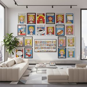
Roy Lichtensteini 25 parimat teost: popkunst ja koduseinte elegants
Avastage Roy Lichtensteini 25 parimat teost! Sukelduge popkunsti maailma, õppige maalidest ja tehnikatest. Kvaliteetsed reproduktsioonid ja interjööridisaini ideed OriginalUniqueArt.com-is. Vaadake kollektsiooni!
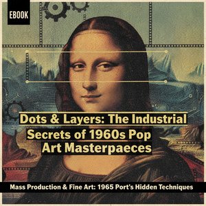
Dots & Screens: The Industrial Secrets Behind 1960s Pop Art Masterpieces
Explore the industrial secrets of 1960s Pop Art. Discover how Ben-Day dots and silk screening transformed mass media into masterpieces by Roy Lichtenstein. An in-depth look at the intersection of mechanical printing and fine art history for students and collectors.

Beyond the Dot: Exploring the Bold Impact of Ben-Day Dots in Modern Art
Dive into the vibrant world of Ben-Day dots. Explore how Roy Lichtenstein transformed mass media imagery into high art, redefining modern aesthetics through the iconic textures of Pop Art and its enduring impact on contemporary visual culture.

The Psychology of the Palette: Decoding Roy Lichtenstein's Bold Color Theory
Explore the psychological depth of Roy Lichtenstein's color theory. An expert analysis for art students and collectors on Ben-Day dots, primary palettes, and the intersection of Pop Art with mass media history.
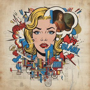
Beyond the Ben-Day Dots: Roy Lichtenstein's Pop Art Revolution & Enduring Legacy
Explore Roy Lichtenstein's revolutionary Pop Art! Discover the story behind Ben-Day dots, iconic works like 'Whaam!', and investment insights for collectors. Expert analysis & high-quality reproductions at OriginalUniqueArt.