
 Προεπισκόπηση σε πραγματική κλίμακα

 Αποστολή
 Κοινοποίηση
 Λεπτομέρειες
 Οδηγός


 Λήψη
 Παρόμοια αντικείμενα συλλογής
 Ακτινογραφία
 Παρουσίαση
 Ερωτήσεις & Απαντήσεις
 Στατιστικά
Composition

- 42.0 x 42.0cm


 Περισσότερα
Το έργο τέχνης που εμφανίζεται σε αυτή τη σελίδα προστατεύεται από τους νόμους περί πνευματικών δικαιωμάτων, γεγονός που σημαίνει ότι δεν μπορούμε νομικά να δημιουργήσουμε ή να πουλήσουμε μια ταυτόσημη αναπαραγωγή του. Αυτή η προστασία επιβάλλεται βάσει διεθνών συμφωνιών, όπως η Σύμβαση της Βέρνης καθώς και από τους εθνικούς νόμους, συμπεριλαμβανομένων αυτών που ορίζονται από το Νομοθεσία περί πνευματικών δικαιωμάτων των ΗΠΑ - Τίτλος 17. Όλα τα δικαιώματα κατοχυρωμένα. Απαγορεύεται η αναπαραγωγή χωρίς άδεια.
Αυτή η μέθοδος συμμορφώνεται πλήρως με τους κανονισμούς περί πνευματικών δικαιωμάτων, καθώς δεν περιλαμβάνει την αντιγραφή ή την αναπαραγωγή του προστατευόμενου έργου. Αντίθετα, πρόκειται για μια δημιουργική ερμηνεία — ένα νέο έργο που επηρεάζεται από το πρωτότυπο, χωρίς όμως να είναι πανομοιότυπο με αυτό.
Giclée / Εκτυπώσεις Τέχνης
Εκτύπωση giclée ή σε καμβά ποιότητας μουσείου με γρήγορη παραγωγή και ευέλικτες επιλογές φινιρίσματος. ( Αγορά χειροποίητου πίνακα Μετάβαση σε Ψηφιακή Αποτέλεσμα)
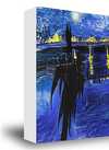
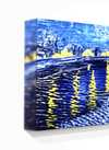
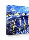
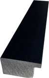
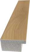
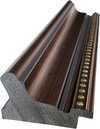
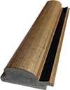
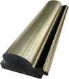
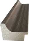
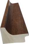
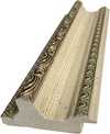
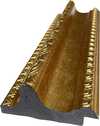
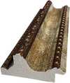
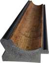
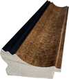
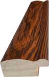
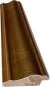
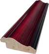
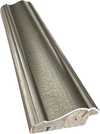
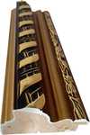
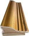
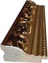
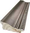
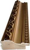
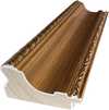
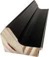
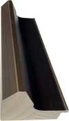
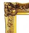
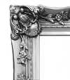
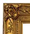
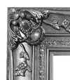
Επιλέξτε από τις προκαθορισμένες διαστάσεις μας που διατηρούν τις αρχικές αναλογίες του έργου τέχνης.

Εισάγετε το πλάτος και το ύψος που επιθυμείτε, ώστε να ταιριάζουν στο κάδሮ ή στον τοίχο σας. Μια εκτύπωση μπορεί μόνο να υποστεί κοψίμό και ποτέ να μην γίνει μεγαλύτερη από την αρχική εικόνα, επομένως η επιλογή μεγέθους με διαφορετικό σχήμα συνεπάγεται απώλεια ενός μέρους της εικόνας. Σας στέλνουμε ένα ψηφιακό mockup για έγκριση πριν προχωρήσουμε σε οποιαδήποτε εκτύπωση. Η εικόνα που εμφανίζεται σε αυτή τη σελίδα δεν δείχνει την πραγματική κοπή — μόνο το mockup την παρουσιάζει.
Παγκόσμια Αποστολή () σε 2 εβδομάδες αντί για τις συνήθεις 4/5 εβδομάδες. (20 Νοέμβριος)

Δωρεάν γρήγορη διεθνής αποστολή

Κάμβας από Λινό Υψηλής Ποιότητας

Πλήρης ασφάλιση μεταφοράς

Εγγύηση επιστροφής δασμών και φόρων εισαγωγής

Εγγύηση Απόλυτης Ομοιότητας Χρωμάτων

Πολιτική Επιστροφής 100 Ημερών (Μόνο σε περίπτωση ελαττωμάτων)

Εγγύηση επιστροφής 100% των χρημάτων

Προσφορά για πολλαπλές παραγγελίες
 Η επιλογή με γυαλί είναι διαθέσιμη μόνο για μεγέθη κάτω από 110 εκ.

Composition
Giclée / Εκτυπώσεις Τέχνης
Διαστάσεις Αναπαραγωγής
-


Τελική Τιμή
€ 72
Βιογραφικό Καλλιτέχνη
The light through the glass
In the workshops of Utrecht, the days began with the careful handling of colored glass. Before he was a painter, Bart van der Leck spent years as an apprentice, learning how light passes through bounded planes of color. This early work in stained glass left a mark on his hands and his eyes. He learned to see the world not as a collection of soft edges, but as a series of distinct, unmodulated shapes. When he eventually moved to Amsterdam to study at the State School of Arts and Crafts and the Rijksakademie van Beeldende Kunsten, he brought this discipline with him.
His early paintings focused on the heavy, tangible reality of Dutch life. He looked closely at washerwomen, dockworkers, and the families of fishermen. These figures were not mere subjects; they were shapes to be distilled. He stripped away the unnecessary, leaving behind flattened forms and primary colors set against neutral backgrounds. There was a certain weight to his compositions, even as he moved toward abstraction.
The geometry of De Stijl
In 1917, a new way of seeing began to take shape through the magazine De Stijl. Alongside Theo van Doesburg and Piet Mondrian, Van der Leck helped establish a movement that sought to find order in the chaos of modern life. While others pushed toward a total disappearance of the subject, Van der and his peers worked with the tension between the visible world and pure form. He did not abandon the recognizable; instead, he transformed it. A mine in Spain or a simple group of people could be reduced to a series of rectangles and primary hues.
His approach was often more grounded than that of Mondrian. Even as his style became increasingly geometric, a link to the physical world remained. He used:
- Primary colors like red, blue, and yellow
- White or neutral backgrounds to create space
- Rectilinear shapes that suggested structure
- A sense of integration between painting and the architecture around it
Design and the printed word
The boundaries of his work often dissolved into the everyday. He did not stay confined to the canvas, finding utility in ceramics, textiles, and posters. In 1930, a commission for the Dutch department store Metz & Co. brought his geometric sensibilities to branding and window packaging. This period saw him developing a specific, constructed alphabet. By 1941, this lettering became a typeface for the magazine Flax, a design that later found new life in digital forms like Architype van der Leck.
He lived much of his life away from the larger cultural centers, settling in Blaricum. He was a man who kept to himself, often avoiding the noise of group exhibitions and international travel. Much of what he created remained within the Netherlands, held in collections like the Kröller-Müller Museum. His work remains a study in how much can be taken away from an image before it loses its connection to the earth.

Bart van der Leck
1876 - 1958 , Netherlands
Γρήγορα στοιχεία
- Artistic Movement Or Style: De Stijl, Neo-Plasticism, Dutch Modernism
- Artists Or Movements Influenced By This Artist: ['De Stijl']
- Artists Who Influenced This Artist:
- Piet Mondrian
- Theo van Doesburg
- Full Name: Bart van der Leck
- Nationality: Dutch
- Notable Artworks:
- Triptych
- Composition
- Place Of Birth: Utrecht, Netherlands
- Date Of Birth: 1876
- Date Of Death: 1958
Σχετικά άρθρα

The Architecture of Form: How Compositional Logic Governs the Human Figure in Art
Master the structural secrets of Renaissance and Modern composition. Explore the science behind the human form today.
Jan Hendrik Weissenbruch: A Master of Dutch Realism & Atmospheric Light
Explore the captivating world of Jan Hendrik Weissenbruch, a master of Dutch Realism. Discover his atmospheric landscapes, influences, and legacy within the Hague School. Learn about this 19th-century artist's unique style & enduring impact.
Piet Mondrian: Deconstructing Reality – A Study of Neo-Plasticism & Universal Harmony
Explore the revolutionary art of Piet Mondrian and the principles of Neo-Plasticism. Discover De Stijl's influence, iconic compositions like 'Composition with Red, Yellow and Blue,' and Mondrian’s lasting legacy on modern design.
Abraham Hendricksz van Beyeren: Pioneering Dutch Still Life & the Banquet Tradition
Explore the captivating world of Dutch Golden Age still life with Abraham van Beyeren. Discover his innovative techniques, symbolic banquet scenes & lasting influence on art history. Learn about collecting these masterpieces.

The Unspoken Exchange: Decoding the Nuanced Language of Human Connection in Art
Explore the profound psychological depth of masters like Mondrian and Kandinsky. Decode the silent language of art with our expert analysis.