- Hjem

- Reproduktion af oliemaleri
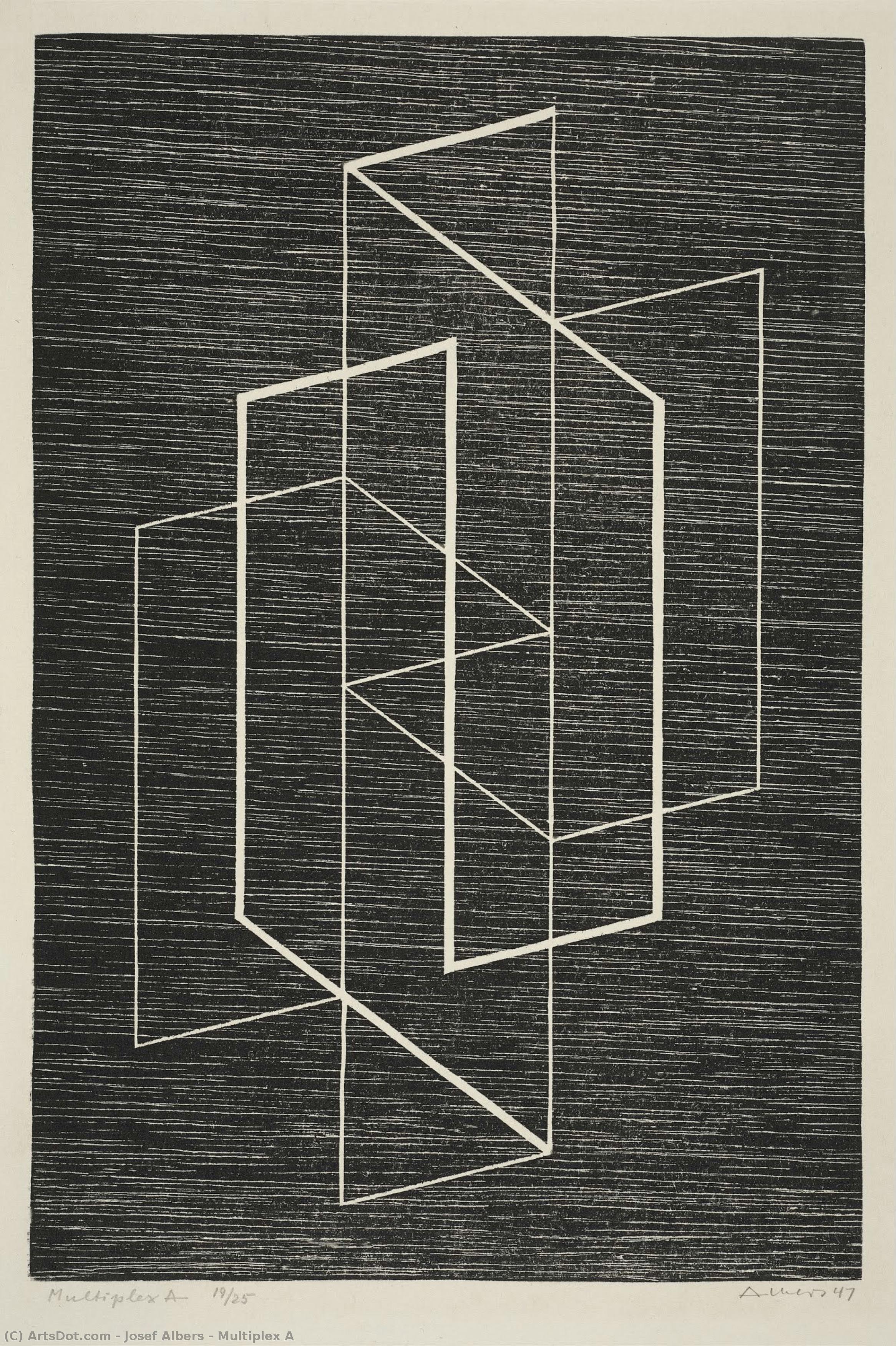
- Josef Albers
- Multiplex A
 Del
Del
Multiplex A
 Geometric Abstraction
 1947
1947 30.0 x 20.0 cm
 Museum of Fine Arts
Håndlavet oliereproduktion
Håndmalet olie på lærred i din valgte størrelse og ramme, udført efter bestilling af vores kunstnere.


P118B $10

P118H $10

P118W $10

P438Z $10

P508JH $12

P508YH $12

P805H $10

P805Z $10

P919BZ $10

P919G $10

P919XJ $10

P959ZH $10

P968JZ $12

W106C $8

W218G $10

W218JH $8

W218Y $10

W307PJ $10

W316G $10

W316PJ $8

W316Y $10

W398PJ $8

W4111J $10

W500HY $15

W500JH $15

W692G $12

W849H $8

W940BG $15

W953PJ $8


Vælg mellem vores forudindstillede størrelser, der matcher kunstværkets originale proportioner.
Du kan indtaste dine egne mål for at passe til en bestemt ramme eller plads. Hvis den valgte størrelse ikke stemmer overens med det originale billedes proportioner, vil vi enten beskære kunstværket eller udvide maleriet med yderligere håndmalede elementer. En digital skitse sendes til din godkendelse, før produktionen påbegyndes.
Bemærk venligst, at forhåndsvisningen på skærmen ikke afspejler den faktiske beskæring eller udvidelse. Kun skitsen vil nøjagtigt vise den endelige komposition.
Selvom specialmål er mulige, anbefaler vi at vælge en dimension fra den foruddefinerede liste for at bevare de originale proportioner.
Efter bestilling vil OriginalUniqueArt.com team sende en e-mail til kunden for at få instruktioner og levere et udkast til en skitse.
Levering i hele verden () på 3/4 uger i stedet for de standard 5 uger. (18 juli). Ingen kompromiser med kvaliteten.

Gratis ekspresforsendelse til hele verden

Lærred af linned i høj kvalitet

Fuld transportforsikring

Garanti for refusion af told og importafgifter

Garanti for præcis farvegengivelse

60 dages returret (kun ved fabrikationsfejl)

100% Tilfredshedsgaranti

Mængderabat tilgængelig
 Glasmulighed er kun tilgængelig i størrelser under 110 cm

Multiplex A
Reproduktionsmetode
Størrelse på reproduktion
-


Samlet pris
-
Beskrivelse af kunstværket
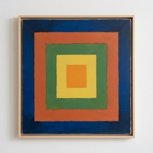
Josef Albers’s “Multiplex A”: A Geometric Meditation on Perception
“Multiplex A,” created in 1947 by the visionary artist Josef Albers, is more than just a woodcut; it's an invitation to contemplate the very nature of visual perception. Born in Bottrop, Germany, and deeply influenced by his early experiences with craftsmanship – from carpentry to glass engraving – Albers’s artistic journey was fundamentally shaped by a profound understanding of materials and their inherent qualities. His time at the Bauhaus, a crucible of modern art and design, further solidified this approach, pushing him to explore abstraction and challenge conventional notions of representation. “Multiplex A” stands as a culmination of these influences, a meticulously constructed exploration of color interaction and spatial relationships that continues to resonate with viewers today.
The artwork’s visual language is deceptively simple yet profoundly complex. Albers employs a restricted palette – primarily black and white – to create a dynamic interplay of geometric forms: triangles, squares, and rectangles are arranged in a seemingly random order, yet within this apparent chaos lies a carefully orchestrated balance. The precision of the woodcut technique—a method demanding meticulous detail and control—is crucial to conveying the artwork’s intellectual rigor. Each line is deliberate, each shape precisely rendered, contributing to an overall sense of ordered complexity. Albers wasn't simply creating a decorative pattern; he was designing a visual experiment, a tangible manifestation of his theories on color perception.
The Foundations of Color Theory
Albers’s work is inextricably linked to his groundbreaking book, “Interaction of Colors,” published in 1963. This seminal text explored the ways in which colors influence and modify each other when placed adjacent to one another. "Multiplex A" serves as a visual demonstration of these principles. The overlapping shapes create areas of simultaneous contrast, where colors appear to shift and change depending on their surrounding hues. Albers’s meticulous documentation of these color interactions—the precise shades he used and the resulting effects—became a cornerstone of modern color theory, influencing generations of artists and designers.
The artwork's design is rooted in Albers’s concept of “homage,” a deliberate tribute to the fundamental elements of art. He sought not to create something entirely new but rather to explore and illuminate existing artistic conventions. "Multiplex A" can be seen as an homage to the principles of geometry, color theory, and the very act of seeing. It’s a quiet assertion that beauty and meaning can be found in the simplest of forms and relationships.
Symbolism and Emotional Resonance
While Albers deliberately avoided overt symbolism in his work, “Multiplex A” possesses a subtle emotional depth. The geometric precision evokes a sense of order and control, while the overlapping shapes suggest ambiguity and uncertainty. The stark contrast between black and white creates a visual tension that mirrors the complexities of human perception. Some viewers interpret the artwork as a meditation on duality—the interplay of light and dark, order and chaos, certainty and doubt.
Beyond its intellectual rigor, “Multiplex A” also possesses an undeniable aesthetic appeal. The carefully balanced composition, combined with the rich texture of the woodcut print, creates a visually engaging experience. It’s a work that rewards repeated viewing, revealing new nuances and subtleties with each encounter. The artwork invites contemplation, prompting viewers to question their own assumptions about color, space, and perception.
A Legacy in Art and Design
Josef Albers' influence extends far beyond the art world. His teaching methods at Black Mountain College profoundly shaped the development of American art education, emphasizing hands-on experimentation and critical thinking. “Multiplex A” stands as a testament to his enduring legacy—a work that continues to inspire artists, designers, and anyone interested in exploring the mysteries of visual perception. Reproductions of this iconic piece offer a unique opportunity to bring Albers’s groundbreaking ideas into your home or studio, serving as a constant reminder of the power of art to illuminate our understanding of the world around us.
Kunstnerens biografi
A Life Forged in Material: The Early Years and Bauhaus Formation
Josef Albers’s artistic journey began not amidst the rarefied air of established academies, but within the pragmatic world of his father’s contracting business in Bottrop, Germany. Born in 1888, young Josef absorbed a deep respect for materials – carpentry, plumbing, house-painting – skills that would fundamentally shape his aesthetic sensibility. This wasn't merely vocational training; it was an immersion into the very essence of making, understanding how forms materialized and the inherent qualities within each medium. He learned to appreciate the subtle nuances of wood grain, the precise application of paint, the structural integrity of brickwork—experiences that instilled in him a profound awareness of material properties. Before dedicating himself fully to art, Albers spent five years as a schoolteacher, honing patience and pedagogical skill—attributes that would later define his influential teaching career. Formal artistic training commenced at the Königliche Kunstschule in Berlin between 1913 and 1915, where he explored printmaking, painting, and, crucially, stained glass. His early commission, “Rosa Mystica Ora Pro Nobis” (1918), a stunning stained-glass window for a church in Berlin, foreshadowed his lifelong fascination with the interplay of light and color, hinting at the abstract explorations to come. This initial work wasn’t simply decorative; it was an investigation into how light *transformed* material, a theme that would resonate throughout his career – a delicate balance between form and illumination.The Bauhaus Crucible: Color as Subject
A pivotal moment arrived in 1922 when Albers joined the faculty of the Bauhaus, a revolutionary school seeking to unify all artistic disciplines under Walter Gropius’s visionary leadership. Initially tasked with teaching the preliminary course – *Werklehre* (workshop practice) – he immersed himself in its core principles: functionalism, geometric abstraction, and material exploration. This period proved transformative. Albers began a systematic investigation into color perception, moving away from representational art towards an increasingly abstract vocabulary. He wasn’t interested merely in *what* colors were, but *how* they interacted, how they influenced each other, and how our eyes perceived them. The influence of fellow Bauhaus masters like Paul Klee and Wassily Kandinsky is discernible in his early work, yet Albers charted a unique course, prioritizing empirical observation over metaphysical interpretation. He wasn’t seeking spiritual truths through color; he was meticulously documenting its physical effects – a scientific rigor that became the hallmark of his artistic method. This focus on perception, on how we *see*, rather than what is *seen*, set him apart and laid the groundwork for his future explorations. The Bauhaus environment fostered experimentation with new materials and techniques, pushing Albers to explore glass, ceramics, and even photography – all viewed through the lens of color theory.Homage to the Square: A Laboratory of Perception
Following a period teaching at Black Mountain College – where he fostered a generation of American artists including Robert Rauschenberg and Cy Twombly – Albers embarked on what would become his most iconic series in 1949: “Homage to the Square.” This ongoing project consisted of paintings featuring nested squares within squares, each iteration exploring subtle variations in color relationships. It’s a deceptively simple premise, but one that belies an incredibly complex and rigorous investigation. Albers began with a single square, then added another, and so on, creating increasingly intricate arrangements. The series wasn't intended as a celebration of geometry; rather, it was a laboratory for studying color perception. He meticulously documented his experiments, revealing how colors aren’t static entities but dynamic forces governing each other through internal logic – often misleading to the eye. A seemingly brighter square might appear to recede while a darker one advances, defying intuitive understanding. This research culminated in his seminal book, “Interaction of Color” (1963), a foundational text still studied by artists and designers today. The book isn’t a treatise on color theory; it's a series of exercises designed to demonstrate how our perception of color is relative and contextual – a testament to Albers’ belief that seeing is not passive, but an active process of interpretation. The meticulous documentation accompanying the paintings—detailed notes on pigments, varnishes, and proportions—further emphasized the scientific nature of his work.Legacy and Enduring Influence
Josef Albers’s impact extends far beyond his paintings. His tenure as head of the design department at Yale University, from 1950 until his retirement in 1958, cemented his reputation as a profoundly influential teacher. He emphasized hands-on experimentation, critical observation, and relentless questioning of assumptions. Students weren't simply taught *what* to paint; they were taught *how* to see – to analyze, to deconstruct, and to understand the underlying principles governing visual experience. His pedagogical approach fostered independent thinking and encouraged students to develop their own unique artistic voices. Albers’s work continues to be exhibited internationally, and his book “Interaction of Color” remains a cornerstone of art education, shaping how generations understand color relationships. He is now recognized as a key figure in the development of abstract art, particularly geometric abstraction and minimalist aesthetics. Albers died on March 25, 1976, in New Haven, Connecticut, leaving behind a legacy that continues to inspire and challenge artists, designers, and educators alike – a testament to the power of observation, experimentation, and the enduring mystery of color.Notable Works
- Gray Instrumentation I Prospectus (1975): A minimalist monochrome painting exemplifying geometric balance and subtle tonal variations.
- Study for Homage to the Square – Beaming (Date Unknown): A classic example of Albers’s exploration of color interaction within nested squares, evoking a sense of calm and spatial depth.
- Rosa Mystica Ora Pro Nobis (1918): His early stained-glass commission, foreshadowing his lifelong fascination with light and color.

Josef Albers
1888 - 1976 , Tyskland
Kort om kunstneren
- Artistic Movement Or Style: Geometrisk abstraktion
- Artists Or Movements Influenced By This Artist:
- Minimalisme
- Farvefeltmaleri
- Artists Who Influenced This Artist:
- Paul Klee
- Wassily Kandinsky
- Date Of Birth: 19. marts 1888
- Date Of Death: 25. marts 1976
- Full Name: Josef Albers
- Nationality: Tysk-Amerikansk
- Notable Artworks:
- Homage til Kvadrater
- Grå Instrumentering I
- Rosa Mystica
- Place Of Birth: Bottrop, Tyskland
Relaterede artikler
Geometrisk Abstraktion: Top 10 Kunstværker der Definerede Bevægelsen | OriginalUniqueArt.dk
Oplev de 10 mest ikoniske værker inden for geometrisk abstraktion! Fra Kandinsky til Mondrian – lær historierne bag disse banebrydende kunstnere og deres farverige malerier. Find museumskvalitets reproduktioner & inspiration til din indretning på OriginalUniqueArt.dk.
Kandinskys 25 Mesterværker: En Rejse Ind i Abstrakt Kunst | OriginalUniqueArt.com
Oplev Kandinskys 25 mest ikoniske værker! Dyk ned i abstrakt kunst, ekspressionisme og farvernes sprog. Find luksus reproduktioner af berømte malerier som 'Komposition VIII' på OriginalUniqueArt.com – inspiration til din vægkunst & indretning.
Farvens Mestre: Top 10 Kunstværker der Definerer Emotion og Stil | OriginalUniqueArt
Oplev farvens magi i kunsten! Udforsk top 10 ikoniske malerier fra Monet, Van Gogh & Picasso. Lær om teknikker og inspiration bag berømte værker. Find museumskvalitets kunsttryk til dit hjem på OriginalUniqueArt.com.

Chromatic Harmonies & Discord: A History of Color Theory in Art
Explore the fascinating evolution of color theory in art history! Discover Impressionism, Neo-Impressionism & beyond with expert insights for collectors and enthusiasts. Learn about Seurat's techniques & the psychology of color.
Josef Albers: A Homage to Color Interaction & the Foundations of Visual Perception
Explore Josef Albers's groundbreaking color theory & the 'Homage to the Square' series. Discover how his work revolutionized visual perception and influenced modern art movements like Minimalism & Op Art. Learn about his Bauhaus roots & lasting legacy.

