
 Se i rummet
 Del som kort
 Del
Del
 Detaljer
 Guide
Guide

 Download
 Lignende værker
 Røntgenundersøgelse
 Diasshow
 Spørgsmål og svar
 Statistikker
Interaction of Color


 Vis mere
Kunstværket vist på denne side er beskyttet af ophavsretsloven, hvilket betyder, at vi ikke lovligt kan skabe eller sælge en identisk reproduktion. Denne beskyttelse håndhæves i henhold til internationale aftaler som f.eks. den Bernerkonventionen og af nationale love, herunder de bestemmelser, der er fastlagt i Amerikansk ophavsretslov - Titel 17.
Denne metode overholder fuldt ud ophavsretsreglerne, da den ikke indebærer kopiering eller duplikering af det beskyttede kunstværk. I stedet er der tale om en kreativ nytolkning – et nyt maleri, som er inspireret af det oprindelige, men ikke identisk med det.
Giclée / Kunsttryk
Giclée- eller lærredstryk i museumskvalitet med hurtig produktion og fleksible muligheder for finish. ( Køb håndmalet maleri Skift til digitalt billede)




P118B Dkr10

P118H Dkr10

P118W Dkr10

P438Z Dkr10

P508JH Dkr12

P508YH Dkr12

P805H Dkr10

P805Z Dkr10

P919BZ Dkr10

P919G Dkr10

P919XJ Dkr10

P959ZH Dkr10

P968JZ Dkr12

W106C Dkr8

W218G Dkr10

W218JH Dkr8

W218Y Dkr10

W307PJ Dkr10

W316G Dkr10

W316PJ Dkr8

W316Y Dkr10

W398PJ Dkr8

W4111J Dkr10

W500HY Dkr15

W500JH Dkr15

W692G Dkr12

W849H Dkr8

W940BG Dkr15

W953PJ Dkr8
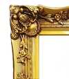
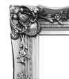

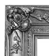
Vælg mellem vores forudindstillede størrelser, der matcher kunstværkets originale proportioner.

Indtast den bredde og højde, du har brug for, så det passer til din ramme eller din væg. Et print kan kun beskæres, aldrig gøres større end selve billedet, så en størrelse med et andet format vil medføre, at dele af motivet går tabt. Vi sender dig en digital mockup til godkendelse, før vi printer noget. Billedet vist på denne side viser ikke den faktiske beskæring — det er kun mockuppen, der gør.
Verdensomspændende levering () på 2 uger i stedet for de sædvanlige 4/5 uger. (4 november)

Gratis ekspresforsendelse til hele verden

Lærred af linned i høj kvalitet

Fuld transportforsikring

Garanti for refusion af told og importafgifter

Garanti for præcis farvegengivelse

100 dages returret ved fabrikationsfejl

100% fuld returret

Mængderabat ved flere køb
 Glasmulighed er kun tilgængelig i størrelser under 110 cm

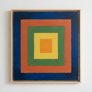
Interaction of Color
Giclée / Kunsttryk
Størrelse på reproduktion
-


Samlet pris
Dkr 538
A Dance of Perception: Exploring Josef Albers' "Interaction of Color"
Josef Albers’s “Interaction of Color,” far more than just a painting, is an invitation—a meticulously crafted experiment in visual perception. This seemingly simple composition, featuring a yellow square punctuated by a brown dot amidst a field of blues, belies a profound exploration of color theory that has captivated artists and thinkers for decades. Created during the mid-20th century, a period marked by burgeoning abstraction and a renewed focus on formal elements within art, Albers’s work stands as a testament to the power of observation and the subjective nature of visual experience. It's not about what colors *are*, but how they *relate*—a revolutionary concept at the time, and one that continues to resonate with contemporary audiences. The piece isn’t meant to be passively viewed; it demands engagement, a willingness to actively participate in the unfolding optical illusion.The Bauhaus Legacy and Albers's Unique Approach
Albers’s artistic journey is inextricably linked to the Bauhaus school, a German institution that championed functional design and interdisciplinary collaboration. Having fled Nazi Germany in 1933, he brought his pedagogical approach—and his fascination with color—to Black Mountain College in North Carolina, where he profoundly influenced generations of artists. “Interaction of Color” emerged directly from this teaching practice. It wasn't conceived as a standalone artwork initially but rather as a visual aid for students to understand the relativity of color – how a hue shifts and changes depending on its surroundings. This is why the work feels less like a finished product and more like an ongoing investigation, a series of carefully orchestrated relationships between pigments. The deliberate simplicity of the forms—the stark geometry of squares and circles—serves not as an end in itself but as a vehicle for exploring the nuances of color interaction. He wasn't interested in representing external reality; he was focused on revealing the inner workings of perception itself.Symbolism Beyond Representation: Color as Subject
While seemingly devoid of traditional symbolic content, “Interaction of Color” operates on a deeper level. The colors themselves—the vibrant yellow, the grounding brown, and the cool blues—evoke associations with nature, earth, and sky. However, Albers deliberately avoids any narrative or representational element. Instead, he elevates color to the status of subject matter itself. The brown dot within the yellow square isn't a symbol *of* something; it’s simply a point of chromatic contrast, an anchor that intensifies the surrounding yellow. This focus on pure form and color relationships aligns with the broader trends in abstract art during this period, which sought to move away from mimetic representation towards a more conceptual exploration of artistic materials. The repetition of blue squares creates a rhythmic visual pulse, further emphasizing the interplay between hues and shapes.Emotional Resonance: A Quiet Meditation on Perception
Despite its intellectual rigor, “Interaction of Color” possesses a surprising emotional depth. The carefully calibrated color relationships create a sense of quiet contemplation, inviting viewers to slow down and engage in a mindful observation of their own visual experience. There’s a subtle tension between the stability of the geometric forms and the dynamic interplay of colors, creating a feeling of both order and movement. The work doesn't shout for attention; it whispers, drawing the viewer into its intricate world of perceptual nuances. It is an exercise in humility—a reminder that our perception is not objective but rather shaped by context and influenced by countless subtle factors. Ultimately, “Interaction of Color” offers a profound meditation on the nature of seeing itself, leaving a lasting impression long after the initial encounter.Spørgsmål og svar
Kan jeg se "Interaction of Color" af Josef Albers under forskellig belysning?
"Interaction of Color" kan undersøges lag for lag på værkets Røntgenoptagelse-side, en interaktiv viewer inspireret af en konservators lysbænk med elleve optiske lag af billedet.
Hvor kendt er "Interaction of Color" af Josef Albers?
Popularitetsniveauet for "Interaction of Color" af Josef Albers er Iconic.
Kan jeg se "Interaction of Color" som et diasshow i fuld skærm?
Se diaporamabillederne af "Interaction of Color" på værkets side Billedserie.
Kunstnerbiografi
A Life Forged in Material: The Early Years and Bauhaus Formation
Josef Albers’s artistic journey began not amidst the rarefied air of established academies, but within the pragmatic world of his father’s contracting business in Bottrop, Germany. Born in 1888, young Josef absorbed a deep respect for materials – carpentry, plumbing, house-painting – skills that would fundamentally shape his aesthetic sensibility. This wasn't merely vocational training; it was an immersion into the very essence of making, understanding how forms materialized and the inherent qualities within each medium. He learned to appreciate the subtle nuances of wood grain, the precise application of paint, the structural integrity of brickwork—experiences that instilled in him a profound awareness of material properties. Before dedicating himself fully to art, Albers spent five years as a schoolteacher, honing patience and pedagogical skill—attributes that would later define his influential teaching career. Formal artistic training commenced at the Königliche Kunstschule in Berlin between 1913 and 1915, where he explored printmaking, painting, and, crucially, stained glass. His early commission, “Rosa Mystica Ora Pro Nobis” (1918), a stunning stained-glass window for a church in Berlin, foreshadowed his lifelong fascination with the interplay of light and color, hinting at the abstract explorations to come. This initial work wasn’t simply decorative; it was an investigation into how light *transformed* material, a theme that would resonate throughout his career – a delicate balance between form and illumination.The Bauhaus Crucible: Color as Subject
A pivotal moment arrived in 1922 when Albers joined the faculty of the Bauhaus, a revolutionary school seeking to unify all artistic disciplines under Walter Gropius’s visionary leadership. Initially tasked with teaching the preliminary course – *Werklehre* (workshop practice) – he immersed himself in its core principles: functionalism, geometric abstraction, and material exploration. This period proved transformative. Albers began a systematic investigation into color perception, moving away from representational art towards an increasingly abstract vocabulary. He wasn’t interested merely in *what* colors were, but *how* they interacted, how they influenced each other, and how our eyes perceived them. The influence of fellow Bauhaus masters like Paul Klee and Wassily Kandinsky is discernible in his early work, yet Albers charted a unique course, prioritizing empirical observation over metaphysical interpretation. He wasn’t seeking spiritual truths through color; he was meticulously documenting its physical effects – a scientific rigor that became the hallmark of his artistic method. This focus on perception, on how we *see*, rather than what is *seen*, set him apart and laid the groundwork for his future explorations. The Bauhaus environment fostered experimentation with new materials and techniques, pushing Albers to explore glass, ceramics, and even photography – all viewed through the lens of color theory.Homage to the Square: A Laboratory of Perception
Following a period teaching at Black Mountain College – where he fostered a generation of American artists including Robert Rauschenberg and Cy Twombly – Albers embarked on what would become his most iconic series in 1949: “Homage to the Square.” This ongoing project consisted of paintings featuring nested squares within squares, each iteration exploring subtle variations in color relationships. It’s a deceptively simple premise, but one that belies an incredibly complex and rigorous investigation. Albers began with a single square, then added another, and so on, creating increasingly intricate arrangements. The series wasn't intended as a celebration of geometry; rather, it was a laboratory for studying color perception. He meticulously documented his experiments, revealing how colors aren’t static entities but dynamic forces governing each other through internal logic – often misleading to the eye. A seemingly brighter square might appear to recede while a darker one advances, defying intuitive understanding. This research culminated in his seminal book, “Interaction of Color” (1963), a foundational text still studied by artists and designers today. The book isn’t a treatise on color theory; it's a series of exercises designed to demonstrate how our perception of color is relative and contextual – a testament to Albers’ belief that seeing is not passive, but an active process of interpretation. The meticulous documentation accompanying the paintings—detailed notes on pigments, varnishes, and proportions—further emphasized the scientific nature of his work.Legacy and Enduring Influence
Josef Albers’s impact extends far beyond his paintings. His tenure as head of the design department at Yale University, from 1950 until his retirement in 1958, cemented his reputation as a profoundly influential teacher. He emphasized hands-on experimentation, critical observation, and relentless questioning of assumptions. Students weren't simply taught *what* to paint; they were taught *how* to see – to analyze, to deconstruct, and to understand the underlying principles governing visual experience. His pedagogical approach fostered independent thinking and encouraged students to develop their own unique artistic voices. Albers’s work continues to be exhibited internationally, and his book “Interaction of Color” remains a cornerstone of art education, shaping how generations understand color relationships. He is now recognized as a key figure in the development of abstract art, particularly geometric abstraction and minimalist aesthetics. Albers died on March 25, 1976, in New Haven, Connecticut, leaving behind a legacy that continues to inspire and challenge artists, designers, and educators alike – a testament to the power of observation, experimentation, and the enduring mystery of color.Notable Works
- Gray Instrumentation I Prospectus (1975): A minimalist monochrome painting exemplifying geometric balance and subtle tonal variations.
- Study for Homage to the Square – Beaming (Date Unknown): A classic example of Albers’s exploration of color interaction within nested squares, evoking a sense of calm and spatial depth.
- Rosa Mystica Ora Pro Nobis (1918): His early stained-glass commission, foreshadowing his lifelong fascination with light and color.

Josef Albers
1888 - 1976 , Tyskland
Kort om kunstneren
- Artistic Movement Or Style: Geometrisk abstraktion
- Artists Or Movements Influenced By This Artist:
- Minimalisme
- Farvefeltmaleri
- Artists Who Influenced This Artist:
- Paul Klee
- Wassily Kandinsky
- Date Of Birth: 19. marts 1888
- Date Of Death: 25. marts 1976
- Full Name: Josef Albers
- Nationality: Tysk-Amerikansk
- Notable Artworks:
- Homage til Kvadrater
- Grå Instrumentering I
- Rosa Mystica
- Place Of Birth: Bottrop, Tyskland
Relaterede artikler
Beyond Form & Color: Geometric Abstraction's Enduring Legacy in Art History
Explore the captivating world of geometric abstraction! Discover its origins, key artists like Malevich & Mondrian, and why this movement remains highly valued by art collectors today. Expert insights at OriginalUniqueArt.
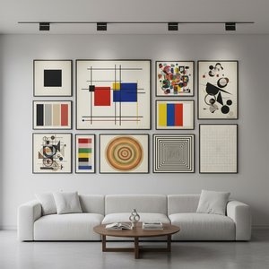
Geometrisk Abstraktion: Top 10 Kunstværker der Definerede Bevægelsen | OriginalUniqueArt.dk
Oplev de 10 mest ikoniske værker inden for geometrisk abstraktion! Fra Kandinsky til Mondrian – lær historierne bag disse banebrydende kunstnere og deres farverige malerier. Find museumskvalitets reproduktioner & inspiration til din indretning på OriginalUniqueArt.dk.
Josef Albers: A Homage to Color Interaction & the Foundations of Visual Perception
Explore Josef Albers's groundbreaking color theory & the 'Homage to the Square' series. Discover how his work revolutionized visual perception and influenced modern art movements like Minimalism & Op Art. Learn about his Bauhaus roots & lasting legacy.
Neo-Abstract Art: The High-Impact Evolution of Modern Visual Energy and Geometric Sophistication
Discover the power of Neo-Abstract art. Explore how bold geometric forms and high-impact visual energy are redefining modern design. Learn to curate sophisticated, high-energy spaces with the latest trends in contemporary abstraction and structural color.
Beyond Form & Color: Geometric Abstraction's Evolution in 20th/21st Century Art
Explore the evolution of geometric abstraction from Cubism to contemporary art. Discover key artists like Malevich & Mondrian, investment insights, and expert collecting advice at OriginalUniqueArt.