
 Náhled v interiéru
 Sdílet
 Sdílet
 Podrobnosti o díle
 Průvodce

 Stáhnout
 Podobné položky
 Rentgenové snímky
 Slideshow
 Otázky a odpovědi
 Statistiky
Interaction of Color


 Zobrazit více
Umělecké dílo zobrazené na této stránce je chráněno autorským zákonem, což znamená, že nemůžeme legálně vytvářet ani prodávat jeho identickou reprodukci. Tato ochrana je vymáhána na základě mezinárodních dohod, jako například Berberská úmluva a národními zákony, včetně těch stanovených v Americký autorský zákon – Díl 17. Všechna práva vyhrazena.
Tato metoda je plně v souladu s autorským právem, protože nezahrnuje kopírování ani duplikování chráněného díla. Jde o kreativní reinterpretaci – nový obraz, který je inspirován originálem, ale není s ním identický.
Giclée / Umělecký tisk
Giclée nebo plátěný tisk muzeální kvality s rychlou výrobou a širokou nabídkou povrchových úprav. ( Koupit ručně malovaný obraz Přepnout na digitální obraz)




P118B Kč10

P118H Kč10

P118W Kč10

P438Z Kč10

P508JH Kč12

P508YH Kč12

P805H Kč10

P805Z Kč10

P919BZ Kč10

P919G Kč10

P919XJ Kč10

P959ZH Kč10

P968JZ Kč12

W106C Kč8

W218G Kč10

W218JH Kč8

W218Y Kč10

W307PJ Kč10

W316G Kč10

W316PJ Kč8

W316Y Kč10

W398PJ Kč8

W4111J Kč10

W500HY Kč15

W500JH Kč15

W692G Kč12

W849H Kč8

W940BG Kč15

W953PJ Kč8
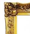
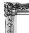

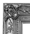
Vyberte si z našich přednastavených velikostí, které odpovídají původním proporcím díla.

Zadejte šířku a výšku, které potřebujete pro váš rám nebo stěnu. Tisk lze pouze oříznout, nikdy však nelze zvětšit obraz nad jeho původní rozměr, proto při výběru jiného formátu dochází ke ztrátě části obrazu. Před samotným tiskem vám zašleme digitální náhled k schválení. Obraz zobrazený na této stránce nenabízí skutečný výřez — ten uvidíte pouze v náhledu.
Celosvětové doručení () do 2 týdnů namísto standardních 4/5 týdnů. (4 listopad)

Zdarma celosvětová expresní doprava

Vysoce kvalitní lněné plátno

Kompletní pojištění přepravy

Záruka vrácení celního poplatku

Záruka věrného barevného souladu

100dení lhůta pro vrácení zboží (pouze při vadách výroby)

100% záruka vrácení peněz

Sleva při více objednávkách
 Skleněná varianta je dostupná pouze u rozměrů menších než 110 cm

Interaction of Color
Giclée / Umělecký tisk
Rozměry reprodukce
-


Celková cena za vybrané možnosti reprodukcí
Kč 1756
A Dance of Perception: Exploring Josef Albers' "Interaction of Color"
Josef Albers’s “Interaction of Color,” far more than just a painting, is an invitation—a meticulously crafted experiment in visual perception. This seemingly simple composition, featuring a yellow square punctuated by a brown dot amidst a field of blues, belies a profound exploration of color theory that has captivated artists and thinkers for decades. Created during the mid-20th century, a period marked by burgeoning abstraction and a renewed focus on formal elements within art, Albers’s work stands as a testament to the power of observation and the subjective nature of visual experience. It's not about what colors *are*, but how they *relate*—a revolutionary concept at the time, and one that continues to resonate with contemporary audiences. The piece isn’t meant to be passively viewed; it demands engagement, a willingness to actively participate in the unfolding optical illusion.The Bauhaus Legacy and Albers's Unique Approach
Albers’s artistic journey is inextricably linked to the Bauhaus school, a German institution that championed functional design and interdisciplinary collaboration. Having fled Nazi Germany in 1933, he brought his pedagogical approach—and his fascination with color—to Black Mountain College in North Carolina, where he profoundly influenced generations of artists. “Interaction of Color” emerged directly from this teaching practice. It wasn't conceived as a standalone artwork initially but rather as a visual aid for students to understand the relativity of color – how a hue shifts and changes depending on its surroundings. This is why the work feels less like a finished product and more like an ongoing investigation, a series of carefully orchestrated relationships between pigments. The deliberate simplicity of the forms—the stark geometry of squares and circles—serves not as an end in itself but as a vehicle for exploring the nuances of color interaction. He wasn't interested in representing external reality; he was focused on revealing the inner workings of perception itself.Symbolism Beyond Representation: Color as Subject
While seemingly devoid of traditional symbolic content, “Interaction of Color” operates on a deeper level. The colors themselves—the vibrant yellow, the grounding brown, and the cool blues—evoke associations with nature, earth, and sky. However, Albers deliberately avoids any narrative or representational element. Instead, he elevates color to the status of subject matter itself. The brown dot within the yellow square isn't a symbol *of* something; it’s simply a point of chromatic contrast, an anchor that intensifies the surrounding yellow. This focus on pure form and color relationships aligns with the broader trends in abstract art during this period, which sought to move away from mimetic representation towards a more conceptual exploration of artistic materials. The repetition of blue squares creates a rhythmic visual pulse, further emphasizing the interplay between hues and shapes.Emotional Resonance: A Quiet Meditation on Perception
Despite its intellectual rigor, “Interaction of Color” possesses a surprising emotional depth. The carefully calibrated color relationships create a sense of quiet contemplation, inviting viewers to slow down and engage in a mindful observation of their own visual experience. There’s a subtle tension between the stability of the geometric forms and the dynamic interplay of colors, creating a feeling of both order and movement. The work doesn't shout for attention; it whispers, drawing the viewer into its intricate world of perceptual nuances. It is an exercise in humility—a reminder that our perception is not objective but rather shaped by context and influenced by countless subtle factors. Ultimately, “Interaction of Color” offers a profound meditation on the nature of seeing itself, leaving a lasting impression long after the initial encounter.Otázky a odpovědi
Mohu si prohlédnout „Interaction of Color“ od Josef Albers pod jiným osvětlením?
Dílo „Interaction of Color“ lze prohlížet vrstvu po vrstvě na stránce Rentgenové snímky, která funguje jako interaktivní prohlížeč inspirovaný světelnou lavicí restaurátora a nabízí jedenáct optických nálezů obrazu.
Jak je známé dílo "Interaction of Color" od Josef Albers?
Úroveň popularity zaznamenaná pro „Interaction of Color“ od Josef Albers je Iconic.
Mohu si prohlédnout "Interaction of Color" v celoplátno formátu slideshow?
Diaporama díla „Interaction of Color“ si můžete prohlédnout na stránce Slideshow.
Biografie umělce
A Life Forged in Material: The Early Years and Bauhaus Formation
Josef Albers, born in Bottrop, Germany, in 1888, wasn’t destined for the world of art from the outset. His early life was deeply rooted in the practicalities of his father's contracting business – a world of carpentry, plumbing, and house-painting. This immersion in materials, in understanding how forms materialized through tangible means, would profoundly shape his artistic sensibility, laying the groundwork for an approach that prioritized direct experience and observation above all else. He wasn’t simply inheriting a trade; he was absorbing a fundamental respect for craftsmanship and the inherent qualities of each medium. Before dedicating himself fully to art, Albers spent five years as a schoolteacher in Bottrop and surrounding areas, honing his patience and pedagogical skills – attributes that would later prove invaluable in his role as an influential educator. His formal artistic training began in 1913 at the Königliche Kunstschule (Royal Art School) in Berlin, where he explored printmaking, painting, and crucially, stained glass. This early work, particularly his commission for “Rosa Mystica Ora Pro Nobis” in 1918 – a breathtaking stained-glass window – already hinted at his lifelong fascination with the transformative power of light and color, suggesting an abstract exploration that was yet to fully unfold. It wasn’t merely decorative; it was a deliberate investigation into how light *transformed* material, a theme that would become central to his artistic vision.The Bauhaus Crucible: Color as Subject
A watershed moment arrived in 1922 when Albers joined the faculty of the Bauhaus, the revolutionary school founded by Walter Gropius, seeking to unify all art and design disciplines. Initially assigned to the *Werklehre* (workshop practice) course – a foundational program designed to instill practical skills – he quickly immersed himself in the core principles of the Bauhaus: functionalism, geometric abstraction, and an unwavering focus on material exploration. This period proved transformative, fundamentally altering his artistic trajectory. Albers began a systematic investigation into color perception, moving decisively away from representational art towards increasingly abstract forms. He wasn’t interested in simply *what* colors were; he was driven by a desire to understand *how* they interacted, how they influenced each other, and how our eyes perceived them. The influence of fellow Bauhaus masters like Paul Klee and Wassily Kandinsky is readily apparent in his early work, yet Albers forged his own distinct path, prioritizing empirical observation over purely theoretical or metaphysical interpretations. He wasn’t seeking spiritual truths through color; instead, he meticulously documented its physical effects – a rigorous scientific approach that would become the defining characteristic of his artistic method. This focus on perception—on *how* we see—rather than what is *seen* set him apart and laid the foundation for his later explorations into the complexities of visual experience.Homage to the Square: A Laboratory of Perception
Following a period teaching at Black Mountain College in North Carolina – where he fostered a generation of American artists including Robert Rauschenberg and Cy Twombly – Albers embarked on what would become his most enduring and iconic series: “Homage to the Square” (1949-1967). This seemingly simple project, consisting of paintings featuring nested squares within squares, each iteration exploring subtle variations in color relationships, belies an incredibly complex and rigorous investigation into perceptual phenomena. It wasn’t intended as a celebration of geometry; rather, it was a meticulously designed laboratory for studying how our eyes perceive color – a process far more nuanced than intuitive understanding suggests. Albers painstakingly documented his experiments, revealing that colors aren't static entities but dynamic forces governing each other through internal logic, often misleading to the eye. A seemingly brighter square might appear to recede while a darker one advances, defying conventional expectations. This systematic approach culminated in his seminal book, *Interaction of Color* (1963), a foundational text still widely studied by artists and designers today. The book isn’t a treatise on color theory; it's a series of exercises designed to demonstrate how our perception of color is relative and contextual – a testament to Albers’ belief that seeing is not passive, but an active process of interpretation.Legacy and Enduring Influence
Josef Albers’s impact extends far beyond his paintings. His tenure as head of the design department at Yale University, from 1950 until his retirement in 1958, cemented his reputation as a profoundly influential teacher. He emphasized hands-on experimentation, critical observation, and relentless questioning of assumptions. Students weren't simply taught *what* to paint; they were taught *how* to see – to analyze, to deconstruct, and to understand the underlying principles governing visual experience. His pedagogical approach fostered independent thinking and encouraged students to develop their own unique artistic voices. *Interaction of Color* continues to be a cornerstone of art education, shaping how generations understand color relationships. Albers is now recognized as a key figure in the development of abstract art, particularly geometric abstraction and minimalist aesthetics. His “Homage to the Square” series remains iconic for its exploration of perceptual phenomena, demonstrating that even within seemingly simple forms, there exists an infinite complexity waiting to be discovered. He died on March 25, 1976, in New Haven, Connecticut, leaving behind a legacy that continues to inspire and challenge artists, designers, and educators alike – a testament to the power of observation, experimentation, and the enduring mystery of color.Notable Works
- Gray Instrumentation I Prospectus (1975): A minimalist monochrome painting exemplifying geometric balance and subtle tonal variations.
- Study for Homage to the Square – Beaming (Date Unknown): A classic example of Albers’s exploration of color interaction within nested squares, evoking a sense of calm and spatial depth.
- Rosa Mystica Ora Pro Nobis (1918): His early stained-glass commission, foreshadowing his lifelong fascination with light and color.

Josef Albers
1888 - 1976 , Německo
Rychlé informace o umělci
- Artistic Movement Or Style: Geometrická abstrakce
- Artists Or Movements Influenced By This Artist:
- Minimalismus
- Barvy
- Artists Who Influenced This Artist:
- Paul Klee
- Wassily Kandinsky
- Date Of Birth: 19. března 1888
- Date Of Death: 25. března 1976
- Full Name: Josef Albers
- Nationality: Německý-Americký
- Notable Artworks:
- Homage k čtverci
- Rosa Mystica
- Place Of Birth: Bottrop, Německo
Související články
Beyond Form & Color: Geometric Abstraction's Enduring Legacy in Art History
Explore the captivating world of geometric abstraction! Discover its origins, key artists like Malevich & Mondrian, and why this movement remains highly valued by art collectors today. Expert insights at OriginalUniqueArt.
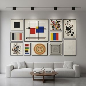
Geometrická abstrakce: 10 mistrovských děl, které změnily umění | OriginalUniqueArt.cz
Prozkoumejte 10 ikonických děl geometrické abstrakce od Mondriana, Maleviče a Kandinského. Objevte příběhy umělců, techniky a historii tohoto revolučního hnutí. Najděte inspiraci pro moderní dekorace a luxusní reprodukce obrazů na OriginalUniqueArt.com.
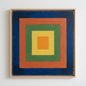
Josef Albers: A Homage to Color Interaction & the Foundations of Visual Perception
Explore Josef Albers's groundbreaking color theory & the 'Homage to the Square' series. Discover how his work revolutionized visual perception and influenced modern art movements like Minimalism & Op Art. Learn about his Bauhaus roots & lasting legacy.
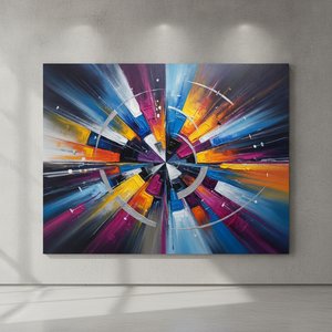
Neo-Abstract Art: The High-Impact Evolution of Modern Visual Energy and Geometric Sophistication
Discover the power of Neo-Abstract art. Explore how bold geometric forms and high-impact visual energy are redefining modern design. Learn to curate sophisticated, high-energy spaces with the latest trends in contemporary abstraction and structural color.

Beyond Form & Color: Geometric Abstraction's Evolution in 20th/21st Century Art
Explore the evolution of geometric abstraction from Cubism to contemporary art. Discover key artists like Malevich & Mondrian, investment insights, and expert collecting advice at OriginalUniqueArt.