Превключване към принт
 Прочети повече







































 За произведения на изкуството или репродукции, чийто размер е над 105 см (приблизително 41 инча) във всяка страна, рамката ще бъде изпратена в разглобен вид като комплект за сглобяване. Този метод гарантира безопасна доставка и предотвратява повреди по време на транспортиране.


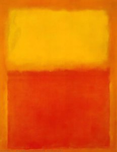
A Symphony of Crimson and Amber
In the quiet, profound realm of Abstract Expressionism, few works command the soul quite like Mark Rothko’s Ochre and Red on Red. Created in 1954, this square composition serves as a masterful testament to the artist's lifelong pursuit of distilling the most complex human emotions into the purity of color. The painting immediately arrests the viewer with its striking, dualistic nature; a rich, terracotta ochre anchors the left side of the canvas, standing in powerful contrast against a field of fiery crimson. From the right, a luminous amber radiates a sense of warmth, creating a visual dialogue that feels both ancient and immediate. It is not merely a painting of pigment on canvas, but a meditative window into a deeper psychological state.
The technique employed here is a hallmark of the Color Field movement, where Rothko eschewed representational imagery to focus entirely on emotional resonance. Through the meticulous layering of thin, translucent washes of pigment, he achieved a velvety surface that seems to absorb light rather than reflect it. These soft, blurred boundaries between the blocks of color allow the hues to hover and breathe, creating an ethereal depth that invites the eye to wander endlessly. This method creates a sense of meditative stillness, where the edges of the shapes appear to vibrate against one another, pulling the spectator into a hypnotic rhythm.
Symbolism and the Human Experience
Beyond its visual splendor, Ochre and Red on Red is laden with profound symbolic weight. The deliberate juxtaposition of red and orange serves as a landscape of human consciousness. The deep reds evoke passion, vitality, and the primal intensity of life’s most visceral emotions—echoes of the artist's own experiences with loss and displacement. Conversely, the amber and ochre tones embody warmth, spiritual illumination, and a sense of optimism. Within this square format, these opposing forces—desire and serenity, suffering and hope—interact in a dynamic tension that reflects the inherent complexities of our existence.
For the collector or the interior designer, this artwork offers an unparalleled opportunity to introduce depth and emotional gravity into a space. Its muted yet vibrant palette lends itself beautifully to creating sanctuaries for contemplation, such as bedrooms or meditation rooms. When placed within a minimalist setting, perhaps paired with neutral tones like beige or gray, the painting acts as a focal point of profound introspection. To possess a high-quality reproduction of this work is to bring a piece of eternity into the home, allowing the transformative power of Rothko’s vision to resonate through the walls of one's private environment.
Въпроси и отговори
Колко наситени са цветовете в „Ochre and Red on Red“ на Марк Ротко?
Интензивността на цветовете в „Ochre and Red on Red“ е Vivid. Интензивността описва колко наситени изглеждат цветовете.
Коя е датата на създаване на „Ochre and Red on Red“ на Марк Ротко?
Създаването на „Ochre and Red on Red“ на Марк Ротко датира от 1954.
Към кое художествено направление принадлежи „Ochre and Red on Red“ на Марк Ротко?
„Ochre and Red on Red“ е произведение от Abstract Expressionism. Това направление определя художествената традиция, към която принадлежи творбата.




 Преглед в реален мащаб
 Изпрати
 Сподели
 Детайли
 Ръководство

 Изтегляне
 Подобни артикули
 Рентгенова снимка
 Слайдшоу
 Q&A
Q&A Статистика