De Stijl · 1923
Composition (تيو فان دوسبورخ, 1923)
أبدع تيو فان دوسبورخ (1883–1931) في Composition. يعود تاريخها إلى 1923. تنتمي إلى حركة De Stijl. صُنعت من Oil On Canvas. أبعادها 41 × 33 cm
- 1923
- Oil On Canvas
- 41 × 33 cm

 معاينة الحجم الواقعي

 لوحة زيتية مرسومة يدوياً
 مشاركة
 مشاركة
 دليل


 تحميل الملف
 قطع مشابهة
 الأشعة السينية
 عرض شرائح
 الأسئلة والأجوبة

 الإحصائيات
Composition: أهم المعلومات
- العنوان
- Composition
- الفنان
- تيو فان دوسبورخ (1883–1931)
- تاريخ ميلاد الفنان
- أترخت, هولندا
- التاريخ
- 1923
- الوسيط الفني
- Oil On Canvas
- الأبعاد
- 41 × 33 cm
- الحركة
- De Stijl
- الحقبة
- Modern
- الموضوع
- red, blue, yellow, black, white, rectangles
ماذا يصور Composition؟
Identification of Composition by Theo van Doesburg
The canvas known as Composition emerges from the mind of Theo van Doesburg, a work that captures a specific moment in 1923. This piece exists as a precise arrangement of form and color, born from a period of intense creative focus. The artist, Theo van Doesburg, brings a sense of equilibrium to the surface, translating abstract thought into a tangible presence. It is a work that demands attention through its structural clarity and its commitment to the principles of the De Stijl movement.
The history of this object is tied to a specific circle of thinkers and patrons. Antony Kok commissioned the work, setting it on its path through the hands of those who shaped the modern era. From there, the painting finds its way into the hands of Bart de Ligt (1883–1938), who becomes its first owner. This transition marks the beginning of a long lineage of stewardship, as the work moves from the artist's studio into a private collection where its presence remains constant.
Every line and color choice within Composition reflects the artist's pursuit of a universal visual language. As we observe the work, we see the direct result of a vision that seeks to strip away the unnecessary to find a fundamental truth. The painting remains a vital part of the history of abstraction, holding the weight of its 1923 origins in every carefully placed rectangle and primary hue.
Visual Composition and Geometric Elements
The canvas unfolds as a precise grid of rectangles, where vertical and horizontal lines intersect to dictate the movement of the eye. There is a profound sense of equilibrium achieved through this arrangement, as non-representational forms find their place within a structured, rhythmic order. The eye moves across the surface, guided by the intersections of these straight lines, finding balance in the way the shapes occupy the space. It is a study in pure geometry, where the subject matter is stripped of any external reference, leaving only the essence of form and relation.
Color acts as the primary force within this structured environment. The palette relies on the fundamental strength of red, yellow, and blue, which anchor the composition. These primary hues interact with a supporting cast of black, white, and grey, creating a tension between the boldest tones and the more neutral shades. The colors appear solid and flat, avoiding any blending or shading, which emphasizes the stark, clean nature of the geometric arrangement. Each rectangle holds its own weight, contributing to a visual language that seeks a universal harmony through simplicity.
Provenance and History of the Object
The history of this work begins in the creative atmosphere of Paris, where it finds its way from the artist's studio into the hands of Bart de Ligt. This acquisition likely occurs in late 1923, marking the start of a long and steady lineage. De Ligt, a man deeply connected to the avant-garde circles of the time, holds the piece within his personal collection until his passing in 1938.
From that moment, the painting enters a quiet, private chapter. It remains within the same family, passing through the hands of descendants for nearly a century. This continuity preserves the work's integrity, keeping it sheltered within a single domestic line since 1923. The colors and forms remain as they were when they first left the artist's side, held in a state of careful preservation through the decades.
Documented Interpretations and Artistic Debates
The canvas captures a moment of profound transition, acting as a key work within the artist's entire oeuvre. It reveals a growing complexity within his purist style, where the rigid logic of geometry begins to dance with a more nuanced sense of equilibrium. One senses the tension between the absolute and the evolving, as the lines and colors find a new, sophisticated rhythm. This evolution suggests a mind moving beyond simple shapes toward a more intricate visual language.
A deep connection between the realm of architecture and the act of painting pulses through the work. The composition feels less like a mere arrangement of pigment and more like a blueprint for a structured reality. This link is no accident; the artist himself articulated the concept behind its creation in the magazine Architectura on 17th July 1923. The painting exists as a bridge, where the spatial logic of built environments meets the spiritual pursuit of pure abstraction.
Related Works by the Same Artist
The evolution of this geometric language unfolds through several other pieces that trace the artist's shifting focus. One can look back to Composition XX from 1920 to see the early movements of these shapes. Nearby in the timeline, the 1923 work Study for a Composition offers a glimpse into the creative process behind these structured arrangements. These works exist as part of a continuous search for balance and order within the frame.
As the years progress, the compositions grow more complex and dynamic. The 1925 Counter composition XIV introduces a different energy to the grid. Later, the Simultaneous Counter-Composition from 1929–1930 pushes the boundaries of the aesthetic even further. Each piece captures a specific moment in a lifelong pursuit of a new visual language, moving from the rigid to the more fluid and experimental.
Composition بدقة عالية
تيو فان دوسبورخ, Composition (1923). ملك عام
يقوم خبير رقمي بمطابقة الألوان مع اللوحة الأصلية وإعادة ضبط الملف، مع الحفاظ على دقة لمسات فرشاة الفنان.
شراء الصورة عالية الدقةأسئلة حول Composition
ما هي الاستخدامات الموصى بها لنسخة مطبوعة من "Composition" للفنان تيو فان دوسبورخ؟
يُقترح استخدام "Composition" للفنان تيو فان دوسبورخ لـ Geometry، كما يمكن توظيفه لأغراض أخرى أيضاً.
هل ألوان "Composition" للفنان تيو فان دوسبورخ مشبعة أم خافتة؟
تتميز لوحة "Composition" للفنان تيو فان دوسبورخ بدرجة تشبع تبلغ Balanced Soft.
إلى أي حقبة زمنية تنتمي "Composition" للفنان تيو فان دوسبورخ؟
تعود لوحة "Composition" للفنان تيو فان دوسبورخ إلى حقبة Modern، وهي الحقبة التي تمنح العمل الفني سياقه التاريخي.
ما هي أبعاد العمل الأصلي "Composition" للفنان تيو فان دوسبورخ؟
أبعاد العمل الفني المسجلة لـ "Composition" للفنان تيو فان دوسبورخ هي 41 x 33 cm. يمكن طلب نسخ مطابقة بأحجام أخرى مع الحفاظ على نفس النسب.
ما هي الغرفة المقترحة لـ "Composition" للفنان تيو فان دوسبورخ؟
تتناسب نسخة من "Composition" بشكل رائع مع Office.
ما هو حجم الطباعة المناسب لـ "Composition" للفنان تيو فان دوسبورخ في الغرفة الموصى بها؟
لغرفة Office، نوصي بطباعة "Composition" للفنان تيو فان دوسبورخ بحجم Small.
كم كان عمر تيو فان دوسبورخ عند إبداع "Composition"؟
أبدع تيو فان دوسبورخ لوحة "Composition" وهو في سن 40. وُلد الفنان في 1883 ويعود تاريخ هذا العمل إلى 1923.
ما مدى قوة الألوان في "Composition" للفنان تيو فان دوسبورخ؟
تتميز شدة ألوان "Composition" بأنها Balanced؛ حيث تعبر هذه الشدة عن مدى قوة ووضوح الألوان.
ما هي إعدادات الطباعة المقترحة لـ "Composition" للفنان تيو فان دوسبورخ؟
يُنصح بطباعة "Composition" للفنان تيو فان دوسبورخ بحجم Small وبوضعية Portrait.
عن الفنان، تيو فان دوسبورخ

1883–1931, هولندا
تيو فان دوسبورخ
مهندس التجريد: حياة في تناغم هندسي ثيو فان دوسبرغ، وُلد كريستيان إميل ماري كوبر عام 1883 في أوتريخت بهولندا، لم يكن مجرد رسام؛ بل كان قوة ثورية أعادت تشكيل الأسس العميقة للفن الحديث. بدأت رحلته وسط أصداء الانطباعية وما بعد الانطباعية المترددة، عاكسًا في البداية أنماطًا تذكر بفينسنت فان جوخ – سواء من حيث الموضوع أو الشدة العاطفية. ومع ذلك، كانت هذه المرحلة المبكرة بمثابة تمهيد حاسم، خطوة ضرورية نحو التحول الجذري الذي سيعرّف إرثه الدائم. جاءت لحظة محورية في عام 1913 مع لقائه بكتابات فاسيلي كاندينسكي *Rückblicke*.
وأيضاً لـ تيو فان دوسبورخ
 Counter composition XV1925
 Rhythm of a Russian Dance
 Troelstra1910
 Study for Composition VIII (The Cow)1918
مقالات حول Composition
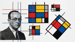 Theo van Doesburg: Pioneering De Stijl & the Evolution of Neo-PlasticismExplore the revolutionary De Stijl movement & Neo-Plasticism with our expert guide. Discover Piet Mondrian, Theo van Doesburg, and the last…
 Dutch artworks of the 1910sDutch modernism in the 1910s features the iconic works of Piet Mondrian, Kees van Dongen, and Isaac Israëls. Find museum-quality art on Ori…
 The Geometry of Balance: Decoding Equilibrium and Rhythm in Mondrian’s Neo-PlasticismMaster the logic of Mondrian's Neo-Plasticism through expert analysis of balance and rhythm. Decode the geometry of modern art today.