

 إرسال
إرسال مشاركة
 عرض التفاصيل
 دليل الأعمال الفنية للطلاب

 تحميل
تحميل
 قطع مشابهة
 عرض شرائح متتابع
 الإحصائيات
Architecture in Japan
 Digital
- Digital
- Postmodernism
 1984
1984- Contemporary
 55.0 x 55.0 cm
 Vignelli Center for Design Studies
 اقرأ المزيد
إن العمل الفني المعروض في هذه الصفحة محمي بموجب قوانين حقوق الطبع والنشر، مما يعني أنه لا يحق لنا قانوناً إنشاء أو بيع نسخ مطابقة له. وتُطبق هذه الحماية بموجب الاتفاقيات الدولية مثل الـ اتفاقية برن ووفقاً للقوانين الوطنية، بما في ذلك تلك المنصوص عليها في قانون حقوق الطبع والنشر في الولايات المتحدة - الباب 17.
تتوافق هذه الطريقة تماماً مع لوائح حقوق النشر لأنها لا تتضمن نسخ أو تكرار العمل الفني المحمي، بل هي إعادة تفسير إبداعية؛ أي أنها لوحة جديدة مستوحاة من الأصل ولكنها ليست مطابقة له.
طباعة جيلي / مطبوعات فنية
طباعة جيكلي أو كانفاس بجودة المتاحف، مع سرعة في التنفيذ وخيارات متنوعة للتشطيب. ( اطلب نسخة مرسومة يدويًا التحويل إلى الصورة الرقمية)



































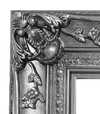
اختر من بين أحجامنا المُعدّة مسبقاً والتي تتوافق مع النسب الأصلية للعمل الفني.

أدخل العرض والارتفاع اللذين تحتاجهما، ليتناسب مع إطارك أو جدارك. يمكن قص المطبوعة فقط، ولا يمكن أبداً جعلها أكبر من الصورة الأصلية، لذا فإن أي مقاس بشكل مختلف سيؤدي إلى فقدان جزء من الصورة. سنرسل لك نموذجاً رقمياً تجريبياً لاعتماده قبل البدء في عملية الطباعة. الصورة المعروضة في هذه الصفحة لا توضح القص الفعلي — النموذج التجريبي فقط هو ما يظهر ذلك.
توصيل عالمي إلى خلال أسبوعين بدلاً من المدة القياسية البالغة 4/5 أسابيع. (22 أكتوبر)

شحن سريع ومجاني لجميع أنحاء العالم

قماش كتان فاخر

تأمين شامل على الشحن

ضمان استرداد الرسوم الجمركية

ضمان دقة مطابقة الألوان

سياسة الإرجاع خلال 100 يوم (في حالات العيوب فقط)

ضمان استرداد نقدي بنسبة 100%

عرض خصم الكميات
 خيار الزجاج متاح فقط للمقاسات التي تقل عن 110 سم

Architecture in Japan
طباعة جيلي / مطبوعات فنية
مقاس النسخة المطبوعة
-


إجمالي السعر
E£ 4131
A Visionary Intersection of Typography and Structure
In the realm of graphic design, few works capture the profound dialogue between cultural heritage and modern abstraction as elegantly as Michael Bierut’s Architecture in Japan. Created in 1984, this striking piece serves as more than just a promotional poster for an architectural program; it is a masterclass in visual communication that bridges the gap between the structural rigidity of the built environment and the fluid grace of typographic expression. The artwork presents a captivating interplay of light and shadow, utilizing a bold, high-contrast palette that commands immediate attention. Through his meticulous arrangement of red lettering against a deep, dark background, Bierut invites the viewer into a space where language and form become indistinguishable, echoing the very essence of architectural design—where structure meets meaning.
The composition is a testament to the influence of the Swiss Style, a movement that prioritizes clarity, geometric precision, and the functional beauty of sans-serif typography. As a prominent figure at Pentagram, Bierut utilizes these principles to create a sense of rhythmic movement across the canvas. The red lettering does not merely sit upon the surface; it dances through the composition, acting as both information and ornament. This technique mirrors the way architectural elements—beams, pillars, and eaves—interact with space in Japanese design. There is a profound sense of balance achieved here, where the weight of the typography provides a structural anchor, much like the foundation of a temple, while the negative space allows the viewer's eye to wander through an imagined landscape of modern and traditional forms.
To possess a reproduction of this work is to bring a piece of design history into one's personal sanctuary. For the discerning collector or interior designer, Architecture in Japan offers a sophisticated focal point that complements both minimalist and contemporary interiors. The stark contrast and vibrant crimson accents provide a rhythmic energy that can breathe life into a neutral-toned room, while its intellectual depth provides a conversation starter for any guest. It is an evocative piece that evokes the spirit of the avant-garde, reminding us of a time when design was at the forefront of architectural discourse. Whether displayed in a professional studio or a private gallery, this artwork stands as a timeless tribute to the enduring beauty of structural harmony and the power of the graphic line.
الأسئلة والأجوبة
ما هي أبعاد العمل الأصلي "Architecture in Japan"؟
تبلغ أبعاد العمل الأصلي "Architecture in Japan" للفنان Michael Bierut 55 x 55 cm.
هل توجد ورقة حقائق حول "Architecture in Japan" للفنان Michael Bierut مخصصة للطلاب؟
تقدم صفحة دليل تعليمي الخاصة بـ "Architecture in Japan" للفنان Michael Bierut ورقة حقائق قابلة للطباعة ومكونة من ورقتين: العمل الفني مع جدول بياناته، وشريط زمني يضعه ضمن الحقبة التي عاش فيها الفنان، وأعمال أخرى للفنان نفسه، ولوحة الألوان المقاسة، بالإضافة إلى مراجع جاهزة للاقتباس بأربعة أساليب مختلفة.
ما تاريخ وتصميم "Architecture in Japan" للفنان Michael Bierut؟
يعود تاريخ "Architecture in Japan" للفنان Michael Bierut إلى عام 1984 وينتمي إلى Postmodernism.
نبذة عن الفنان
Michael Bierut: Clarity and Helvetica – Shaping Visual Culture
Michael Bierut (b. 1957) stands as a towering figure in contemporary graphic design, recognized globally for his unwavering commitment to clarity, masterful use of typography—particularly Helvetica—and astute contributions to the field’s critical discourse. Born in the United States, Bierut's artistic journey began with an early fascination for visual communication and evolved into a distinguished career at Pentagram, one of America’s leading design firms since 1990. This partnership has yielded an astonishing portfolio encompassing branding identities, editorial layouts, packaging designs, and monumental public artworks, cementing his reputation as a visionary innovator. His formative years were marked by exposure to influential designers like Josef Müller-Brockmann and Armin Hofmann, whose principles of Swiss Style—characterized by geometric precision, sans-serif fonts, and restrained color palettes—deeply resonated with Bierut’s aesthetic sensibilities. These influences instilled in him a belief that design should serve as a conduit for conveying information effectively while simultaneously elevating its visual impact. This philosophy is evident throughout his work, where simplicity reigns supreme alongside meticulous attention to detail. Bierut's breakthrough came with the iconic 2016 logo for Hillary Clinton’s presidential campaign—a project lauded for its understated elegance and strategic use of Helvetica. The design prioritized readability and conveyed a sense of calm confidence amidst the turbulent political landscape, demonstrating Bierut’s ability to harness typography as a tool for shaping perception. Beyond client commissions, Bierut has actively championed design education and criticism, lecturing extensively at Yale School of Art since 1989 and fostering a generation of designers who embrace intellectual rigor alongside creative experimentation. Throughout his career, Bierut has garnered numerous awards recognizing his exceptional talent and dedication to the craft—a testament to his enduring influence on the field. He’s been honored by organizations like AIGA (American Institute of Graphic Arts) for his contributions to design excellence and continues to inspire artists worldwide with his unwavering belief in the power of thoughtful visual communication. His work transcends mere aesthetics; it embodies a profound understanding of how design can shape culture and communicate complex ideas with grace and precision.- Notable Achievements: Pentagram Partner (1990-Present), Logo Design for Hillary Clinton Campaign (2016)
- Education: Yale School of Art Lecturer (Since 1989)
- Affiliations: Alliance Graphique Internationale, American Institute of Graphic Arts

Michael Bierut
1957 - , United States of America
لمحة سريعة
- Artistic Movement Or Style: Swiss Style
- Artists Or Movements Influenced By This Artist: ['Graphic Design']
- Artists Who Influenced This Artist: ['Helvetica']
- Date Of Birth: 1957
- Full Name: Michael Bierut
- Nationality: American
- Notable Artworks:
- IDCNY welcomes the 1988 AIA Convention
- Architecture in Japan
- Place Of Birth: United States of America
مقالات ذات صلة
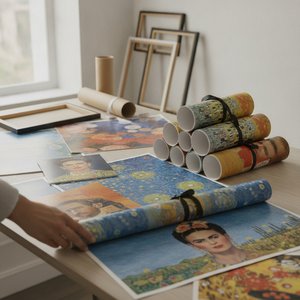
OriginalUniqueArt.com F.A.Q.: Premium Art Poster Prints – Vivid Colors & Versatile Sizing
Discover OriginalUniqueArt.com's premium art poster prints. Featuring 12-color archival pigments for vivid color fidelity and versatile sizing for bespoke decor. Expertly crafted museum-quality reproductions designed for discerning collectors and professional decorators.