التبديل إلى المطبوعات
 اقرأ المزيد







































 بالنسبة للأعمال الفنية أو النسخ المطبوعة التي يتجاوز طول أي من أضلاعها 105 سم (حوالي 41 بوصة)، سيتم شحن الإطار كمجموعة مفككة. تضمن هذه الطريقة سلامة التوصيل وتمنع حدوث أي أضرار أثناء النقل.


A Meditation in Color: The Luminous Essence of Ochre and Red on Red
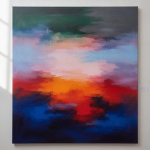
To stand before Mark Rothko’s “Ochre and Red on Red” is to enter a realm where language fails and pure sensation takes command. Created in 1962, this masterpiece serves as a profound cornerstone of the Color Field painting movement, a period that fundamentally redefined the boundaries of modern art. Rather than presenting a recognizable subject, Rothko invites the viewer into a deep, meditative state, using the canvas not merely as a surface for pigment, but as a portal for spiritual and emotional exploration. The work embodies his radical belief that color alone possesses the power to convey the most complex human experiences, offering a sanctuary for contemplation and introspection in an increasingly noisy world.
The composition is a masterclass in deceptive simplicity. At first glance, the viewer encounters a square canvas divided into two dominant, breathing rectangles. A deep, resonant red occupies the majority of the surface, acting as a powerful, enveloping atmosphere. Nestled within this sea of crimson sits a smaller rectangle of ochre pigment, providing a subtle yet vital counterbalance to the surrounding intensity. This interplay between the warmth of the ochre and the depth of the red creates a mesmerizing visual tension, where the edges of the forms seem to bleed into one another, blurring the line between shape and space.
Technique and the Alchemy of Light
The ethereal, almost glowing quality of Ochre and Red on Red is the result of Rothko’s meticulous and labor-intensive technique. He achieved this luminous effect through the careful layering of thin, translucent washes of paint. By applying these delicate veils of color, he allowed light to penetrate the various strata of pigment, creating a sense of internal radiance that seems to emanate from within the canvas itself. This method of diffusion ensures that there are no harsh boundaries; instead, the colors transition with a soft, atmospheric grace, mimicking the way light shifts through mist or the way heat radiates from an ember.
For the collector or interior designer, this painting offers an unparalleled ability to command a space. The work does not merely decorate a wall; it transforms the very energy of a room. Its high-impact palette of reds and oranges provides a bold, energetic presence that can serve as a focal point in contemporary settings, while its soft, blurred edges allow it to integrate seamlessly into more serene, minimalist environments. It is a piece that demands attention through its quiet intensity, making it an ideal acquisition for those seeking to infuse their surroundings with a sense of profound, artistic weight and sophisticated warmth.
الأسئلة والأجوبة
ما هي الاستخدامات الموصى بها لنسخة مطبوعة من "Ochre and Red on Red" للفنان مارك روثكو؟
يُنصح باستخدام نسخة مُعاد إنتاجها من "Ochre and Red on Red" للفنان مارك روثكو لغرض Focal؛ حيث يأتي هذا الاقتراح تماشياً مع موضوع العمل الفني وأجوائه وألوانه.
أين يمكنني مشاهدة معاينة لـ "Ochre and Red on Red"؟
تتيح لك صفحة معاينة الخاصة بـ "Ochre and Red on Red" معاينة العمل الفني قبل الطلب.
ما هو المكان والغرض الموصى به لـ "Ochre and Red on Red"؟
يُقترح استخدام "Ochre and Red on Red" لـ Focal، والمساحة الموصى بها هي Living Room.
 معاينة الحجم الواقعي
 إرسال
إرسال مشاركة
 عرض التفاصيل
 دليل الأعمال الفنية للطلاب

 تحميل
تحميل
 قطع مشابهة
 الأشعة السينية
 عرض شرائح متتابع
 Q&A
Q&A الإحصائيات