Перейти до друку
 Розгорнути текст







































 Для творів мистецтва або репродукцій, розмір яких перевищує 105 см (приблизно 41 дюйм) з будь-якого боку, рама доставляється у вигляді розібраного комплекту. Такий метод гарантує безпечну доставку та запобігає пошкодженням під час транспортування.


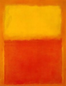
A Symphony of Color: Exploring Mark Rothko’s ‘No. 5/No. 22’
Mark Rothko's *No. 5/No. 22* (1949-1950) stands as a monumental achievement in Abstract Expressionism, cementing Rothko's place among the titans of 20th-century art. More than just pigment on canvas—it’s an invitation to confront profound questions about existence and emotion through pure abstraction. Currently residing within the hallowed halls of MoMA (Museum of Modern Art), this artwork continues to mesmerize viewers with its understated grandeur and enduring enigma, prompting contemplation long after initial observation.From Figuration to Feeling: Rothko’s Artistic Journey
Rothko's artistic evolution was marked by a deliberate rejection of representational imagery. Beginning his career with landscapes and portraits imbued with subtle detail, he gradually dismantled these conventions, driven by an unwavering desire to express fundamental human experiences directly—to capture the essence of feeling without resorting to recognizable forms. The *Multiform* series (1947-1949) served as a crucial stepping stone on this path, preparing him for the monumental rectangular canvases that define his mature style. *No. 5/No. 22*, born from this formative period, embodies this transformative shift—a decisive move away from depicting the external world to channeling its inner turmoil into luminous color fields.Technique and Texture: A Deliberate Spontaneity
What distinguishes *No. 5/No. 22* is Rothko’s groundbreaking application of paint. Unlike many Color Field painters who favored smooth, blended surfaces—a technique intended to achieve visual serenity—Rothko embraced a textured surface achieved by gouging into the layers of cadmium red pigment with a blunt instrument. These deliberate marks aren't merely decorative; they are integral to the painting's expressive power. They disrupt the illusion of flatness, introducing subtle white lines that generate tension and dynamism. The composition features dominant blocks of yellow, orange, and particularly striking shades of crimson—applied in multiple layers—creating an interplay of hues that transcends mere color perception. This technique isn’t about replicating reality; it's about *experiencing* color itself – its weight, its warmth, its ability to resonate within the viewer’s psyche.Emotional Resonance: Tragedy, Ecstasy, and Beyond
Rothko wasn’t interested in crafting aesthetically pleasing artworks designed solely for visual gratification. His ambition was far more ambitious—to provoke visceral emotional responses—to evoke feelings of sorrowful contemplation alongside moments of ecstatic wonder. He believed that color relationships alone were insufficient to elicit these profound sensations; it was the *interaction* between hues, their luminosity, and their scale that triggered these emotions within the human spirit. In *No. 5/No. 22*, the rectangles don’t simply exist on the canvas; they seem to breathe—to pulsate with an inner life—enhancing the painting's visual impact through chromatic afterimage effects – where perceiving one color influences how we perceive those adjacent to it. This subtle phenomenon underscores Rothko’s masterful manipulation of perception, inviting viewers into a dialogue with their own emotions.Historical Context & Legacy
Created in the immediate aftermath of World War II—a period marked by pervasive anxiety and existential uncertainty—*No. 5/No. 22* reflects a broader cultural preoccupation with confronting mortality and grappling with profound philosophical questions. Abstract Expressionism emerged as an artistic response to these turbulent times, offering a new visual language for articulating experiences beyond the confines of rational thought. Rothko’s unwavering commitment to emotional honesty—to conveying feelings without resorting to representational clichés—established him as a pivotal figure in modern art history. His influence extends far beyond his own lifetime, inspiring generations of artists to explore similar avenues of expression and challenging conventional notions of artistic beauty.Integrating Rothko into Your Space
- For Collectors: Acquiring a high-quality reproduction of *No. 5/No. 22* represents an investment in artistic heritage—bringing a touch of contemplative grandeur to any curated collection.
- For Interior Designers: This artwork’s rich chromatic palette and serene mood make it ideally suited for creating tranquil and sophisticated interiors—particularly living rooms and meditation spaces. Pairing it with neutral tones like beige or gray amplifies its impact, establishing a focal point that stimulates visual interest without overwhelming the senses.
- For Art Lovers: Allow yourself to immerse fully in *No. 5/No. 22*'s atmosphere—observing how the colors shift and interact over time. Consider placing it in a room with natural light, maximizing its chromatic afterimage effects and fostering a connection with Rothko’s profound vision of human emotion.
Питання та відповіді
Яка кольорова гама використана у творі "Номер 5 / Номер 22"?
Палітра «Номер 5 / Номер 22» роботи Марк Ротко описується як Яскраві. Це стислий опис кольорової гами твору.
Яка яскравість твору «Номер 5 / Номер 22» роботи Марк Ротко?
Зафіксована яскравість для «Номер 5 / Номер 22» роботи Марк Ротко становить Загальна яскравість.
Який формат і орієнтацію друку рекомендується для «Номер 5 / Номер 22» роботи Марк Ротко?
Розмір Великий формат, орієнтація Квадрат: рекомендовані параметри друку для «Номер 5 / Номер 22» роботи Марк Ротко.
 Переглянути в інтер'єрі
 Надіслати як листівку
 Поділитися
 Деталі витвору
 Посібник

 Завантажити
 Схожі екземпляри
 Рентгенівське дослідження
 Слайд-шоу
 Q&A
Q&A Статистика