De Stijl · 1923
Composition (Theo Van Doesburg, 1923)
Composition, Theo Van Doesburg (1883–1931) tarafından yapıldı. 1923 yılına aittir. De Stijl akımına aittir. Oil On Canvas ile yapılmıştır. Boyutları 41 × 33 cm'dir.
- 1923
- Oil On Canvas
- 41 × 33 cm

 Gerçek Boyutta Önizle

 El Yapımı Yağlı Boya Tablo
 Paylaş
 Paylaş
 Rehber


 İndir
 Benzer ürünler
 X-Işını
 Slayt Gösterisi
 Soru & Cevap

 İstatistikler
Composition: temel bilgiler
- Başlık
- Composition
- Sanatçı
- Theo Van Doesburg (1883–1931)
- Sanatçının doğum yeri
- Utrecht, Hollanda
- Tarih
- 1923
- Teknik
- Oil On Canvas
- Boyutlar
- 41 × 33 cm
- Akım
- De Stijl
- Dönem
- Modern
- Konu
- red, blue, yellow, black, white, rectangles
Composition neyi betimliyor?
Identification of Composition by Theo van Doesburg
The canvas known as Composition emerges from the mind of Theo van Doesburg, a work that captures a specific moment in 1923. This piece exists as a precise arrangement of form and color, born from a period of intense creative focus. The artist, Theo van Doesburg, brings a sense of equilibrium to the surface, translating abstract thought into a tangible presence. It is a work that demands attention through its structural clarity and its commitment to the principles of the De Stijl movement.
The history of this object is tied to a specific circle of thinkers and patrons. Antony Kok commissioned the work, setting it on its path through the hands of those who shaped the modern era. From there, the painting finds its way into the hands of Bart de Ligt (1883–1938), who becomes its first owner. This transition marks the beginning of a long lineage of stewardship, as the work moves from the artist's studio into a private collection where its presence remains constant.
Every line and color choice within Composition reflects the artist's pursuit of a universal visual language. As we observe the work, we see the direct result of a vision that seeks to strip away the unnecessary to find a fundamental truth. The painting remains a vital part of the history of abstraction, holding the weight of its 1923 origins in every carefully placed rectangle and primary hue.
Visual Composition and Geometric Elements
The canvas unfolds as a precise grid of rectangles, where vertical and horizontal lines intersect to dictate the movement of the eye. There is a profound sense of equilibrium achieved through this arrangement, as non-representational forms find their place within a structured, rhythmic order. The eye moves across the surface, guided by the intersections of these straight lines, finding balance in the way the shapes occupy the space. It is a study in pure geometry, where the subject matter is stripped of any external reference, leaving only the essence of form and relation.
Color acts as the primary force within this structured environment. The palette relies on the fundamental strength of red, yellow, and blue, which anchor the composition. These primary hues interact with a supporting cast of black, white, and grey, creating a tension between the boldest tones and the more neutral shades. The colors appear solid and flat, avoiding any blending or shading, which emphasizes the stark, clean nature of the geometric arrangement. Each rectangle holds its own weight, contributing to a visual language that seeks a universal harmony through simplicity.
Provenance and History of the Object
The history of this work begins in the creative atmosphere of Paris, where it finds its way from the artist's studio into the hands of Bart de Ligt. This acquisition likely occurs in late 1923, marking the start of a long and steady lineage. De Ligt, a man deeply connected to the avant-garde circles of the time, holds the piece within his personal collection until his passing in 1938.
From that moment, the painting enters a quiet, private chapter. It remains within the same family, passing through the hands of descendants for nearly a century. This continuity preserves the work's integrity, keeping it sheltered within a single domestic line since 1923. The colors and forms remain as they were when they first left the artist's side, held in a state of careful preservation through the decades.
Documented Interpretations and Artistic Debates
The canvas captures a moment of profound transition, acting as a key work within the artist's entire oeuvre. It reveals a growing complexity within his purist style, where the rigid logic of geometry begins to dance with a more nuanced sense of equilibrium. One senses the tension between the absolute and the evolving, as the lines and colors find a new, sophisticated rhythm. This evolution suggests a mind moving beyond simple shapes toward a more intricate visual language.
A deep connection between the realm of architecture and the act of painting pulses through the work. The composition feels less like a mere arrangement of pigment and more like a blueprint for a structured reality. This link is no accident; the artist himself articulated the concept behind its creation in the magazine Architectura on 17th July 1923. The painting exists as a bridge, where the spatial logic of built environments meets the spiritual pursuit of pure abstraction.
Related Works by the Same Artist
The evolution of this geometric language unfolds through several other pieces that trace the artist's shifting focus. One can look back to Composition XX from 1920 to see the early movements of these shapes. Nearby in the timeline, the 1923 work Study for a Composition offers a glimpse into the creative process behind these structured arrangements. These works exist as part of a continuous search for balance and order within the frame.
As the years progress, the compositions grow more complex and dynamic. The 1925 Counter composition XIV introduces a different energy to the grid. Later, the Simultaneous Counter-Composition from 1929–1930 pushes the boundaries of the aesthetic even further. Each piece captures a specific moment in a lifelong pursuit of a new visual language, moving from the rigid to the more fluid and experimental.
Composition yüksek çözünürlükte
Kamu malı: sanatçı 1931 yılında vefat etmiştir.
Theo Van Doesburg, Composition (1923). Kamu malı.
Dijital bir uzman, renkleri orijinal tabloya göre kontrol eder ve dosyayı sanatçının fırça darbelerine sadık kalarak yeniden düzenler.
Yüksek çözünürlüklü görseli satın alComposition Hakkında Sorular
Theo Van Doesburg imzalı "Composition" eserinin renk yoğunluğu nedir?
Theo Van Doesburg imzalı "Composition", Balanced bir renk yoğunluğu sergiliyor.
Theo Van Doesburg imzalı "Composition" eserinin formatı için hangi yerleşim uygundur?
Portrait formundaki "Composition" reprodüksiyonunun bir Office için uygun olduğu önerilmektedir.
Theo Van Doesburg imzalı "Composition" eserine benzer sanat eserlerini nasıl keşfedebilirim?
Theo Van Doesburg imzalı "Composition" eserine benzer çalışmalar, eserin Benzer Eserler sayfasında bir araya getirilmiştir.
Theo Van Doesburg imzalı "Composition" neyi betimliyor ve nasıl bir duygu uyandırıyor?
Theo Van Doesburg imzalı "Composition", red, blue, yellow, black, white, rectangles, lines konularını Minimalist bir ruh haliyle betimlemektedir. Konu ve atmosfer birlikte eseri tanımlar.
"Composition" genel olarak daha mı açık yoksa daha mı koyu tonlarda?
Theo Van Doesburg imzalı "Composition", bright parlaklık ve Bright Balance düzeyinde bir lüminans ile kaydedilmiştir.
Theo Van Doesburg, "Composition" eserini kaç yaşında yaptı?
Theo Van Doesburg, "Composition" adlı eserini 40 yaşındayken yaptı. Sanatçı 1883 yılında doğmuştur ve eser 1923 tarihine aittir.
Orijinal Theo Van Doesburg imzalı "Composition" eserinin boyutları nedir?
Theo Van Doesburg imzalı "Composition" eserinin kayıtlı boyutları 41 x 33 cm şeklindedir. Reproduksiyonlar, aynı oranlar korunarak diğer boyutlarda sipariş edilebilir.
"Composition" eserini hangi palet ve baskın renk tanımlıyor?
Theo Van Doesburg imzalı "Composition" eserinin renk kimliği: Black (#120f0b) renginin hakim olduğu Neutrals bir palet.
"Composition" eserinde en çok hangi renk öne çıkıyor?
"Composition" adlı eserde en çok öne çıkan renk Black (#120f0b)'dır. Baskın rengi bilmek, bir sanat eserini iç mekânla eşleştirirken size yardımcı olur.
Sanatçı hakkında, Theo Van Doesburg

1883–1931, Hollanda
Theo Van Doesburg
Soyutlamanın Mimarı: Geometrik Bir Uyum İçinde Bir Yaşam 1883 yılında Hollanda'nın Utrecht kentinde Christian Emil Marie Küpper adıyla doğan Theo van Doesburg, bir ressamdan çok daha fazlasıydı; modern sanatın temellerini yeniden şekillendiren devrimci bir güçtü. Sanat yolculuğu, İzlenimcilik ve Ard İzlenimciliğin yankıları arasında başladı ve başlangıçta hem konu hem de duygusal yoğunluk açısından Vincent van Gogh'un stillerini andırıyordu. Ancak bu erken dönem, kalıcı mirasını tanımlayacak olan radikal dönüşüm için gerekli bir basamak, hayati bir ön hazırlık niteliğindeydi. 1913 yılında Wassily Kandinsky’nin Rückblicke adlı eseriyle tanışması, hayatında dönüm noktası oldu.
Theo Van Doesburg Hakkında Theo Van Doesburg tarafından yapılmış öne çıkan eserler
Theo Van Doesburg tarafından yapılan diğer eserler
 Counter composition XV1925
 Rhythm of a Russian Dance
 Troelstra1910
 Study for Composition VIII (The Cow)1918
Composition üzerine denemeler
 The Geometry of Balance: Decoding Equilibrium and Rhythm in Mondrian’s Neo-PlasticismMaster the logic of Mondrian's Neo-Plasticism through expert analysis of balance and rhythm. Decode the geometry of modern art today.
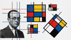 Theo van Doesburg: Pioneering De Stijl & the Evolution of Neo-PlasticismExplore the revolutionary De Stijl movement & Neo-Plasticism with our expert guide. Discover Piet Mondrian, Theo van Doesburg, and the last…
 Geometrik Soyutlamanın Öncü Eserleri: Sanat Tarihinin İzinde 🖼️🎨Geometrik Soyutlamanın 10 başyapıtını keşfedin! Mondrian, Malevich ve Kandinsky gibi sanatçıların ikonik eserleriyle modern sanatın derinli…