Understanding the Emotional Impact of Abstract Color
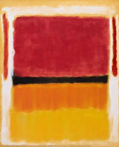 Violet, Black, Orange, Yellow on White and Red
Discover 'Violet, Black, Orange, Yellow on White and Red' (1949), an abstract color field painting by Mark Rothko. Bold geometric shapes, vivid contrasting hues, and emotional depth make it a striking addition to any modern art collection.
The power of color transcends mere aesthetics; it’s a primal language woven into the fabric of human experience. Before representation, before form took precedence, there was hue – evoking instinctual responses long predating conscious thought. When we consider abstract art, particularly works saturated with bold color, we enter a realm where emotional resonance is paramount. Artists like Mark Rothko didn't seek to depict *what* we see, but rather *how* we feel. His monumental canvases, often featuring layered rectangles of violet, black, orange, and yellow – as exemplified in his 1949 masterpiece – aren’t landscapes or portraits; they are invitations to introspection, portals into the subconscious. The sheer scale of these works envelops the viewer, demanding a visceral reaction. A deep crimson can ignite passion and energy, while cool blues and greens foster tranquility and contemplation. Understanding this inherent emotional weight is the first step in successfully integrating abstract color into an interior space. It’s not simply about choosing colors you like; it's about orchestrating an atmosphere, crafting a mood that resonates with the intended function of the room and the sensibilities of those who inhabit it.
The Principles of Saturated Color Palettes: Harmony & Contrast
Color-blocking is thought of as the exploration of taking colors that are opposites on the color wheel and pairing them together to make complementary color combinations. It is commonly associated in fashion as a trend that originated from the artwor...
Creating a harmonious saturated color palette isn’t arbitrary. It requires a delicate balance between opposing forces – harmony and contrast. The foundation lies in understanding the color wheel, a visual representation of relationships between hues. Complementary colors—those opposite each other on the wheel (e.g., red and green, blue and orange)—offer maximum impact when juxtaposed, creating a dynamic tension that energizes a space. However, relying solely on complements can be overwhelming; subtlety is key. Analogous color schemes – utilizing hues adjacent to one another (e.g., blues, violets, and greens) – provide a more soothing effect, fostering a sense of unity and calm. The concept of ‘color-blocking’, popularized in fashion but rooted in the geometric simplicity of artists like Piet Mondrian, demonstrates this principle beautifully. It’s about confident pairings, often utilizing bold geometric shapes to define areas within a room. Beyond the wheel itself, consider value – the lightness or darkness of a color – and saturation – its intensity. A muted palette with high value contrast can be just as impactful as one brimming with vibrant hues. The interplay between these elements dictates the overall mood; a high-saturation, low-value scheme feels playful and energetic, while a low-saturation, high-value scheme evokes sophistication and restraint.
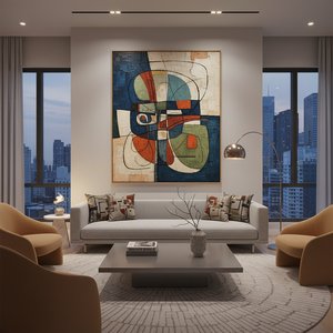
Scaling Abstract Art for Interior Spaces: Proportion & Placement
The impact of abstract art is inextricably linked to its scale. A small, timid painting can easily be lost in a large room, while an oversized piece can overwhelm a smaller space. The key lies in proportion – ensuring the artwork’s dimensions complement the surrounding architecture and furnishings. Consider the height of ceilings, the length of walls, and the overall footprint of the room. As a general guideline, larger rooms can accommodate more substantial pieces, allowing for greater visual impact. Placement is equally crucial. A single statement piece above a fireplace or sofa can serve as a focal point, anchoring the space and drawing the eye. However, don’t underestimate the power of gallery walls – curated collections of smaller works that create a dynamic narrative. When arranging multiple paintings, consider their color palettes and compositions; aim for visual balance and avoid overcrowding. The ‘rule of thirds’, borrowed from photography, can be applied here—positioning artwork slightly off-center to create a more engaging composition. Furthermore, think about the viewing distance. A highly detailed abstract painting demands closer inspection, while a larger, simpler piece can be appreciated from afar.
Integrating Abstract Art with Existing Décor Styles
 The Dynamic Dialogue: How Abstract Art Enhances Modern Interior Spaces
Discover how abstract art elevates modern interiors. Expert guidance for designers & homeowners. Explore styles, placement, & custom reproductions with .
Abstract art isn’t confined to specific interior design styles; its versatility allows it to seamlessly integrate into a wide range of aesthetics. In minimalist spaces, bold abstract paintings provide a welcome injection of color and personality, preventing the room from feeling sterile or cold. Conversely, in more traditional settings, abstract art can introduce a contemporary edge, creating an intriguing juxtaposition between old and new. The key is to find pieces that complement – not clash with – existing furnishings and architectural details. For example, a painting featuring warm earth tones can harmonize beautifully with natural wood finishes and neutral upholstery. In mid-century modern interiors, abstract expressionist works often feel particularly at home, echoing the era’s emphasis on organic forms and bold color palettes. Don't be afraid to experiment; sometimes, unexpected pairings yield the most striking results. A vibrant Rothko reproduction can add a touch of drama to a Scandinavian-inspired space, while a more subdued Kandinsky painting can complement the clean lines of contemporary furniture.
Layering Texture and Light to Enhance Abstract Paintings
Abstract paintings aren’t isolated entities; they exist within a broader context – interacting with light, texture, and surrounding materials. The way light falls upon a canvas dramatically alters its appearance, influencing color perception and highlighting subtle details. Consider the direction of natural light and supplement it with artificial lighting to create a desired effect. Spotlights can accentuate specific areas of a painting, while ambient lighting can create a softer, more diffused glow. Texture plays an equally important role. The rough surface of a canvas adds depth and dimension, contrasting beautifully with smooth walls or polished furniture. Incorporating textured fabrics – velvet, linen, wool – further enhances the tactile experience, creating a richer, more immersive environment. Furthermore, consider the surrounding materials; wood, metal, glass—each interacts with light differently, influencing the overall mood of the space. A painting placed against a dark wall will appear more vibrant than one hung on a lighter background. The goal is to create a cohesive sensory experience, where all elements work in harmony to enhance the artwork’s impact.
Curating a Cohesive Collection: Building an Abstract Art Narrative
A single striking abstract painting can transform a space, but a curated collection elevates it to another level. Building a cohesive narrative requires thoughtful consideration of color palettes, compositions, and artistic styles. Start by identifying a common thread – perhaps a shared use of color, a particular movement (e.g., Abstract Expressionism), or a specific emotional resonance. Don’t be afraid to mix and match; contrasting styles can create an intriguing dialogue, adding depth and complexity to the collection. Consider the scale and proportion of each piece, ensuring visual balance and avoiding overcrowding. The arrangement is crucial – experiment with different layouts until you find one that feels harmonious and engaging. Think about the flow of the space; guide the viewer’s eye through the collection, creating a sense of movement and discovery. Ultimately, a curated abstract art collection should reflect your personal sensibilities, telling a story that resonates with your unique taste and vision. OriginalUniqueArt.com offers an extensive library of museum-quality reproductions, allowing you to effortlessly build a collection that transforms your space into a gallery of inspiration.