The Foundations of Color: Perception, Theory & the Artist’s Palette
 Wikipedia: Color theory
Color theory, or more specifically traditional color theory, is a historical body of knowledge describing the behavior of colors — namely in color mixing, color contrast effects, color harmony, color schemes and color symbolism. Modern color theory i...
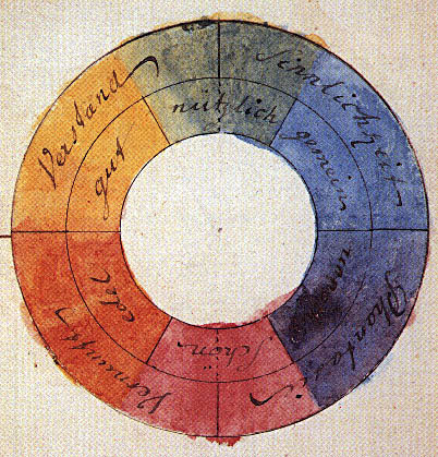
For the discerning collector, acquiring a work of art is rarely a spontaneous act; it's an engagement with history, emotion, and the very essence of human perception. Central to this experience is color – not merely as a visual element, but as a profound language capable of stirring deep resonance within us. But what underpins this power? The story begins not in the artist’s studio, but in the realm of physics and psychology. Our understanding of color isn't inherent; it’s constructed by the brain interpreting wavelengths of light reflected from surfaces. Sir Isaac Newton’s groundbreaking work revealed that white light is a composite of all colors, laying the foundation for what would become formal color theory. However, the leap from scientific observation to artistic application was pioneered by figures like Johann Wolfgang von Goethe, whose 1810 *Theory of Colors* explored the subjective emotional impact of hues – though initially met with skepticism, it foreshadowed a crucial shift in how artists approached their palettes. The development of the color wheel provided a framework for understanding relationships between colors—primary, secondary, and tertiary combinations—but ultimately, it is the artist’s intuitive grasp of these dynamics that breathes life into a canvas.
Emotional Landscapes: How Colors Evoke Mood and Psychological Responses
 Wikipedia: Color psychology
Color psychology is the study of colors and hues as a determinant of human behavior. Color influences perceptions that are not obvious, such as the taste of food. Colors have qualities that may cause certain emotions in people. How color influences i...
The influence of color extends far beyond aesthetics; it's deeply intertwined with our emotional states. Color psychology, as a field, investigates how hues impact human behavior and perceptions, even influencing seemingly unrelated senses like taste. Red, for instance, often associated with passion, energy, and urgency, physiologically increases heart rate and adrenaline levels. Conversely, blues and greens tend to evoke calmness, serenity, and feelings of stability. It’s crucial to remember that these associations aren't universal; they are shaped by cultural context, personal experiences, and even gender. While broad trends exist – a preference for blue being remarkably consistent across many demographics – the individual response is nuanced. Consider the works of Henri Matisse, whose bold complementary color schemes radiate joy and vitality, or Mark Rothko’s later pieces, where deep analogous tones envelop the viewer in contemplative introspection. These artists weren't simply choosing colors; they were orchestrating emotional experiences.
Historical Boldness: Examining Color's Role in Defining Art Movements
Expressionism is a modernist movement, initially in poetry and painting, originating in Northern Europe around the beginning of the 20th century. Its typical trait is to present the world solely from a subjective perspective, distorting it radically ...
Throughout art history, specific movements have been inextricably linked to particular color palettes and philosophies. The Impressionists, captivated by the fleeting effects of light, embraced a vibrant, broken-color technique, striving to capture the immediacy of perception. Their successors, the Neo-Impressionists like Seurat, applied scientific principles of color theory with meticulous precision, building images from carefully calibrated dots of pure color. However, it was the Expressionists who truly unleashed the emotional power of color. Artists such as Edvard Munch rejected representational accuracy in favor of subjective experience, distorting form and employing jarring, often non-naturalistic colors to convey inner turmoil and psychological states. This radical departure paved the way for abstract art, where color itself became the primary subject matter. The use of gold in Byzantine mosaics signified divinity, while Yves Klein’s patented International Klein Blue aimed to represent spiritual transcendence – each instance demonstrating how color carries profound symbolic weight.
Masters of Hue: Case Studies in Powerful Color Application
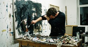
To truly appreciate the resonance of boldness, one must examine specific artists and their masterful use of color. Wassily Kandinsky, a pioneer of abstract art, believed that color possessed spiritual qualities, capable of directly affecting the soul. His 1925 painting “Yellow-Red-Blue” exemplifies this belief – dynamic forms are interwoven with vibrant hues, creating a composition that transcends mere representation and speaks to a deeper emotional realm. Paul Klee’s “Northern Village” showcases a different approach, employing geometric shapes and bold colors in a Neo-Surrealist style to evoke a sense of whimsical mystery. Cuno Amiet, influenced by Pont-Aven School and Expressionism, created striking self-portraits and landscapes characterized by intense color palettes. These artists weren't simply applying paint; they were conducting visual experiments, exploring the boundaries of perception and emotion. Even Augusto Garau’s abstract forms demonstrate a deep understanding of perceptual experiments and the interplay of colors.
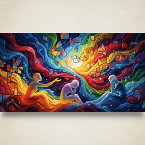
Beyond Representation: Abstract Expressionism and the Language of Pure Color
The advent of Abstract Expressionism marked a pivotal moment in art history, liberating color from its representational constraints. Artists like Rothko sought to evoke profound emotional responses through large-scale canvases dominated by luminous blocks of color. The brushstrokes themselves became expressive elements, conveying the artist’s inner state and inviting viewers into a direct dialogue with the work. This movement wasn't about depicting objects; it was about communicating feelings—anxiety, joy, contemplation—through the pure language of color and form. The absence of recognizable imagery forced viewers to engage directly with their own emotional responses, making Abstract Expressionism a deeply personal experience. The impact of this period continues to resonate in contemporary art, influencing generations of artists to explore the expressive potential of non-figurative forms.
Curating with Confidence: Selecting Color-Dominant Works for Your Collection
As a collector, understanding the psychological and historical weight of color empowers you to curate a space that reflects your values and aspirations. Consider the overall mood you wish to create – do you seek tranquility, energy, or contemplation? A collection dominated by cool blues and greens might foster a sense of calm, while warmer reds and oranges could inject vibrancy into a room. Don’t be afraid to explore harmonious combinations—complementary colors can create dynamic tension, while analogous colors offer soothing cohesion. At OriginalUniqueArt, we offer an extensive library of museum-quality reproductions, allowing you to bring the masterpieces of history into your home. Our team of art consultants is available to provide personalized guidance, helping you select works that resonate with your individual taste and create a collection that tells your story. Whether you’re drawn to the bold expressiveness of Kandinsky or the contemplative depths of Rothko, we are dedicated to sharing the transformative power of color with you.