The Science and Soul of Color: From Newton’s Prism to Goethe’s Emotion
 The Soul of Color: A Guide to Emotional Harmony in Impressionist Art
The Science of Sight: From Newton’s Prism to Goethe’s Emotion Chromatic Harmonies & Discord: A History of Color Theory in Art The Genesis of Color Understanding: From Newton to Goethe Wikipedia: Color theory Color theory, or more specifically traditi...
To truly appreciate the luminous magic of a masterpiece, one must first understand that color is far more than a mere visual property; it is a bridge between the physical world and the human spirit. The history of our understanding of light is a fascinating journey from the cold, objective measurements of physics to the deeply subjective realms of human feeling. In the 1660s, Sir Isaac Newton’s experiments with prisms revealed a scientific truth that forever altered our perception: white light is not pure, but a complex spectrum of hidden hues. This discovery provided the mathematical foundation for color as a quantifiable phenomenon—a matter of wavelengths and measurable physics.
However, for those of us who find ourselves moved to tears by a sun-drenched meadow or a twilight sky, Newton’s prism only tells half the story. The true soul of art lies in the transition from the objective to the subjective, a shift famously championed by Johann Wolfgang von Goethe. His 1810 Theory of Colours challenged the purely physical approach, arguing instead that color is inextricably linked to human perception and psychological affect. Goethe posited that colors possess an inherent emotional weight, suggesting that warm hues evoke activity and passion, while cool tones invite tranquility and depth. It is within this delicate tension between science and sensation that the greatest artists have found their most potent tools for expression.
The Warmth of Passion: Exploring Red, Orange, and Yellow in Masterworks
 White House
Captivating Rural Scene in Impressionist Style This enchanting landscape captures a serene countryside at sunset, rendered in the luminous and vibrant style of Impressionism. The scene features a quaint cluster of trees and rustic buildings, evoking ...
When we encounter the warm side of the color spectrum, we are often met with an immediate sense of vitality and heat. Reds, oranges, and yellows possess a forward-moving energy that commands the viewer's attention, pulling the eye toward the heart of the composition. In the hands of a master, these hues do more than represent fire or sunlight; they embody the very pulse of life. Consider the way a sunset is rendered in the Impressionist tradition, where the blending of pink, orange, and gold creates an almost palpable sense of warmth, evoking the fleeting beauty of twilight and the emotional glow of a day's end.
This warmth is not merely about temperature but about the intensity of human experience. In many classical works, the use of rich, warm tones serves to ground the viewer in a moment of joy or passion. Whether it is the sun-dappled gardens of Pierre-Auguste Renoir, which invite us to savor the simple pleasures of life, or the vibrant, energetic brushstrokes found in later movements, these colors act as an invitation to linger. They stimulate the senses and evoke a sense of intimacy, making the painted scene feel immediate, alive, and deeply connected to our own biological responses to light and heat.
The Serenity of Depth: How Cool Blues and Greens Shape Atmospheric Perspective
 The Water Lily Pond, Pink Harmony
Captivating Subject and Enchanting Atmosphere This exquisite impressionist masterpiece transports viewers to a tranquil water lily pond, where nature’s delicate beauty is captured in a harmonious balance of light and color. The scene centers around a...
In stark contrast to the energetic warmth of the sun, the cool spectrum—comprised of blues, greens, and violets—offers a sanctuary of stillness. These hues possess a receding quality, a visual characteristic that allows artists to create the illusion of vast, infinite space. This is the essence of atmospheric perspective: as objects move further into the distance, they tend to lose their warmth and take on the blue-tinted haze of the atmosphere. Through this technique, a painter can transform a flat canvas into a window overlooking a boundless horizon or a deep, mysterious forest.
The emotional resonance of these cool tones is one of profound tranquility and introspection. In Claude Monet’s iconic Water Lily Pond, the use of lush greens, soft purples, and blues creates a harmonious balance that invites meditative contemplation. The water lilies float in a world where the boundaries between light and liquid seem to dissolve, offering a peaceful garden retreat for the soul. These cool palettes do not demand attention with a shout; rather, they whisper, drawing the viewer into a state of quiet elegance and calm, reminding us of the beauty found in nature’s most silent, fleeting moments.
Chromatic Harmony and Discord: The Impressionist Revolution of Light and Hue
 frank vincent dumond
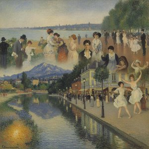
Frank Vincent Dumond: Bridging Barbizon and Impressionism Frank Vincent Dumond (1865-1951) stands as a fascinating confluence of artistic movements—a steadfast devotee of the Barbizon school’s earthy realism tempered by the burgeoning brilliance of I...
The late nineteenth century witnessed a radical departure from traditional academic realism, led by a generation of artists eager to capture the immediacy of modern life. The Impressionists revolutionized the use of color theory, moving away from the heavy, earth-toned shadows of the past toward a more prismatic approach. They understood that shadows are not merely black or brown, but are composed of reflected light and complementary colors. This era saw the birth of a new way of seeing, where broken brushstrokes and vibrant palettes were used to depict the transient effects of light and atmosphere.
This revolution was built upon the concept of chromatic harmony—the careful arrangement of colors to create a pleasing or emotionally resonant whole. Artists like Frank Vincent Dumond explored this through innovative teaching methods, such as "The Prismatic Palette," which encouraged the use of complementary hues to create vibrant visual effects. Yet, they also understood the power of discord; by placing unexpected colors in tension with one another, they could capture the flickering, unstable nature of light. This mastery of both harmony and vibration allowed the Impressionists to move beyond mere observation and into the realm of pure emotional resonance, capturing not just what the eye sees, quite simply, but how it feels to be present in a particular moment.
The Psychology of Palette: Using Color Theory to Transform Interior Spaces
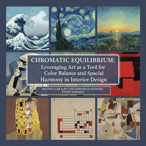 Chromatic Equilibrium: Leveraging Art as a Tool for Color Balance and Spatial Harmony in Interior Design
The Foundations of Chromatic Equilibrium: Understanding Color Theory & Psychology Harmonizing Spaces: A Guide to Utilizing Color Palettes in Interior Design Elevate your interior design projects with our expert guide to color palettes! Learn the psyc...
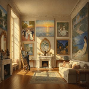
The principles that guide an artist’s brush are equally transformative when applied to the architecture of our daily lives. Understanding color psychology allows us to use art as a tool for achieving chromatic equilibrium within our homes and professional spaces. A room bathed in the soft, cool tones of a landscape reproduction can foster an environment of focus and serenity, ideal for libraries or bedrooms. Conversely, incorporating works with warm, energetic palettes can invigorate a dining room or a social lounge, stimulating conversation and appetite.
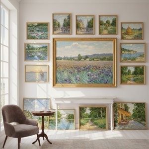
Achieving true spatial harmony requires more than just picking colors we like; it requires an understanding of how color influences perception and subtly reshapes ambiance. By leveraging the interplay between light and hue, one can use art to create depth in small rooms or to bring a sense of cohesion to large, open architectural plans. Whether through the use of multi-panel group sets that flow across a wide wall or a single, commanding masterpiece that serves as a focal point, the strategic application of color theory ensures that the art we choose does more than decorate—it breathes life into the very structure of our surroundings.
Mastering the Spectrum: Preserving the Vibrancy of Historical Reproductions
For the true enthusiast, the value of a masterpiece lies in its ability to transport us through time. However, the very pigments that provide such emotional depth are subject to the ravages of time and environment. To preserve the luminous magic of an Impressionist canvas or the rich textures of a Baroque portrait, one must respect the chemistry of art. High-quality reproductions, such as those we meticulously craft at OriginalUniqueArt.com, utilize professional-grade materials—including flexible gesso to prevent cracking and specific oils like safflower to ensure whites do not yellow over generations.
A true hand-painted oil reproduction is a labor of passion, where the artist’s brushstrokes provide a tactile depth that no digital print can replicate. Each layer of paint is finished with a protective coat of Damar varnish, shielding the work from dust, moisture, and atmospheric pollutants. When you bring a piece of history into your home, you are not just acquiring an image; you are preserving a legacy of color and light. Whether it is a custom commission that reimagines a personal memory in the style of Monet or a faithful reproduction of a Renoir masterpiece, our commitment to academic excellence ensures that the vibrancy of the original remains undimmed for decades to come.