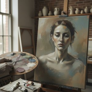
Introduction: The Allure of Subtlety – Beyond Bold Hues For centuries, art has captivated us with vibrant displays of color, yet a quieter revolution has been unfolding—a shift towards the nuanced beauty of muted palettes. These are not simply ‘soft’...
There is a particular strength found in what is not immediately shouted, but rather whispered through the subtle language of color. In an age often saturated with digital vibrancy and high-contrast imagery, we find ourselves increasingly drawn to the quietude of muted tones—colors softened, desaturated, and imbued with a depth that transcends simple visual appeal. These are not merely soft colors; they possess a resonance that lies in suggestion rather than proclamation. To observe a palette of sage, slate, or dusty rose is to encounter a deliberate restraint, an invitation to slow our breathing and notice the nuances that escape more boisterous compositions.
This aesthetic does not represent a lack of color, but rather a mastery of it. By blending pure hues with gray, brown, or their complements, an artist creates a grounded, sophisticated atmosphere. Such palettes allow the eye to rest, providing a sense of stability and permanence. When we encounter these tones, we are not witnessing a void, but a carefully constructed space where light and shadow can perform their most delicate work.
Atmospheric Resonance: The Legacy of American Tonalism
The Essence of Tonalism: Defining Atmosphere and Mood in Landscape Art Tonalism Tonalism was an artistic style that emerged in the 1880s.The movement was eventually eclipsed by Impressionism and European modernism. == French origins == The French Bar...
The roots of this fascination with subdued color lie deep within the nineteenth-century American landscape. During the period between 1880 and 1915, the movement known as Tonalism emerged, seeking to capture not merely the topography of a scene, but its very essence. Artists such as George Inness and James McNeill Whistler moved away from the precise realism of their predecessors, embracing instead an atmosphere of colored mist and shadow. They utilized a limited range of grays, browns, and blues to create works that felt less like records of a place and more like memories of a feeling.
Whistler’s approach, often associated with the philosophy of "art for art's sake," prioritized tonal balance and aesthetic harmony above all else. His work demonstrated that by dissolving hard edges into coastal mist or twilight shadows, an artist could evoke a sense of spiritual longing and quiet contemplation. This tradition established a precedent for using color as a vessel for mood, proving that the most profound emotional truths are often found in the transitions between light and dark rather than in the brilliance of the light itself.
Geometric Quietude: Braque and the Introspective Interior
A Contemplative Interior: Unveiling Braque’s ‘Interior with Palette’ Georges Braque's *Interior with Palette*, painted in 1942, offers a compelling glimpse into the artist’s mature style – a refined and introspective phase following his pivotal role ...
As we move into the twentieth century, the use of muted palettes took on new structural significance. In his 1942 work, Interior with Palette, Georges Braque demonstrates how a restrained color scheme can anchor a complex composition. Moving away from the radical fragmentation of his earlier Cubist collaborations with Picasso, Braque’s mature style utilizes more defined shapes and a sense of solidity. Here, the palette is dominated by muted greens and browns, creating a somber, contemplative mood that reflects the introspective nature of the subject.
The painting presents a domestic setting—chairs, a table, and potted plants—rendered with geometric simplification. The inclusion of the artist's palette serves as a quiet signal of the creative process itself, inviting us to observe a paused moment in the studio. In this work, the muted tones do not merely decorate the space; they define it, providing a sense of weight and permanence to the everyday objects depicted. It is a meditation on form and space, where the lack of jarring pigment allows the viewer to focus on the structural integrity of the room.
The Subtle Landscape: From Constable’s Influence to Modern Serenity
A Quiet Resonance: The World of Diana Low Diana Low is an artist whose work whispers rather than shouts, inviting contemplation and a deep connection to the natural world. Emerging from the vibrant art scene fostered by OriginalUniqueArt, she has quickly esta...
The lineage of this atmospheric approach can be traced back even further to the influence of the British landscape tradition. The meticulous detail and atmospheric studies of John Constable provided a foundation for later artists to explore the emotional weight of the natural world. This influence is clearly discernible in the work of contemporary painters like Diana Low, whose landscapes whisper rather than shout. Low focuses on capturing fleeting moments—the subtle shifts in light across an orchard or the quiet dignity of a wildflower—using a palette that often favors earthy tones and soft, light-drenched transitions.
This connection to tradition allows for a contemporary sensibility that remains grounded in observation. By filtering the lessons of the past through a modern lens, artists can create works that offer solace and reflection. Whether it is the way light filters through humidity or how shadows soften a distant treeline, the use of subdued color transforms a landscape from a mere topographical record into a psychological sanctuary, offering a much-needed respite from the visual noise of the modern world.
Shadow and Substance: The Psychological Depth of Desaturated Hues
Introduction: The Allure of Restrained Color There exists a particular power in what is *not* immediately shouted, but rather whispered through the subtle language of color. In an age saturated with bold statements and digital vibrancy, it’s perhaps ...
The psychology of desaturated colors is rooted in their ability to promote harmony and balance. High-saturation colors can often create a sense of visual tension or even unease if used without purpose. In contrast, muted tones act as the "quiet friend" in a crowded room; they do not need to demand attention to be effective. This is particularly evident in the way desaturated hues can establish hierarchy within a composition, allowing a single, brighter focal point to emerge with greater impact against a neutral, stable background.
This stability extends to the emotional response of the viewer. Muted colors are frequently associated with feelings of safety, familiarity, and tranquility. In design and fine art alike, these tones provide an anchor of calm. They allow for a more prolonged engagement with the work, as the eye is not constantly redirected by competing brights. Instead, the viewer is encouraged to wander through layers of dusk and shadow, discovering the subtle complexities of texture and tone that define the soul of the subject.
A Return to Harmony: Finding Visual Sanctuary in the Present Day
In our current era of digital saturation and high-contrast imagery, the return to a muted palette feels less like a trend and more like a necessity. We find ourselves seeking out artworks that offer an anchor of tranquility—pieces that provide a sense of permanence in an increasingly ephemeral world. Whether through the heavy, black contours and desaturated greens of modern pop art or the soft, feathery brushstrokes of American Impressionism, the use of restrained color continues to hold an enduring appeal.
These works remind us that strength does not always require a shout; often, it is found in the quietest whisper of a brushstroke. By embracing the power of subtlety, we can create spaces—both within our homes and within our minds—that are characterized by peace, reflection, and a profound connection to the enduring beauty of the natural world.
For those seeking to bring this sense of historical depth into their own collections, OriginalUniqueArt.com offers meticulously crafted oil reproductions of the world's most significant works. From the atmospheric landscapes of the Tonalists to the structured interiors of the modern masters, our artists use traditional techniques on 100% cotton canvas to ensure every brushstroke conveys the true spirit of the original.
Explore the profound legacy of Georges Braque, a master of Cubism. Discover how his technical craftsmanship and collaboration with Picasso redefined modern art through geometric form and fragmented reality. A sophisticated journey into the heart of 20th-century visual revolution.
Explore the captivating world of muted colors in art & design! Discover historical context, psychological effects, techniques, and inspiration for creating serene spaces. Elevate your aesthetic with OriginalUniqueArt.
Explore the captivating world of muted tones in art! Discover Tonalism's history, Whistler’s influence & how subtle color palettes evoke emotion. Find serene landscapes and expert advice for integrating these timeless pieces into your home with OriginalUniqueArt.
Discover the ethereal beauty of Tonalism. Explore how master artists use mist, soft light, and muted palettes to capture profound emotion and atmospheric mood in landscape painting. A deep dive into this quiet, introspective art movement for true connoisseurs.
OStudio-assistentOnline · reageert binnen een minuut
Hoi! Ik kan je helpen bij het kiezen van een kunstwerk, het volgen van een bestelling of het beantwoorden van vragen over de garantie. Waarmee kan ik je van dienst zijn?

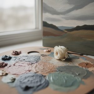 The Subdued Resonance: Exploring Emotional Depth & Artistic Nuance within Muted Color Palettes
 Tonalism Explained: Mastering Atmosphere, Mood, and the Art of Muted Light in Landscape Painting
 Interior with Palette
 Diana Low
 The Subdued Palette: Exploring Emotional Resonance & Aesthetic Impact in Muted Artworks