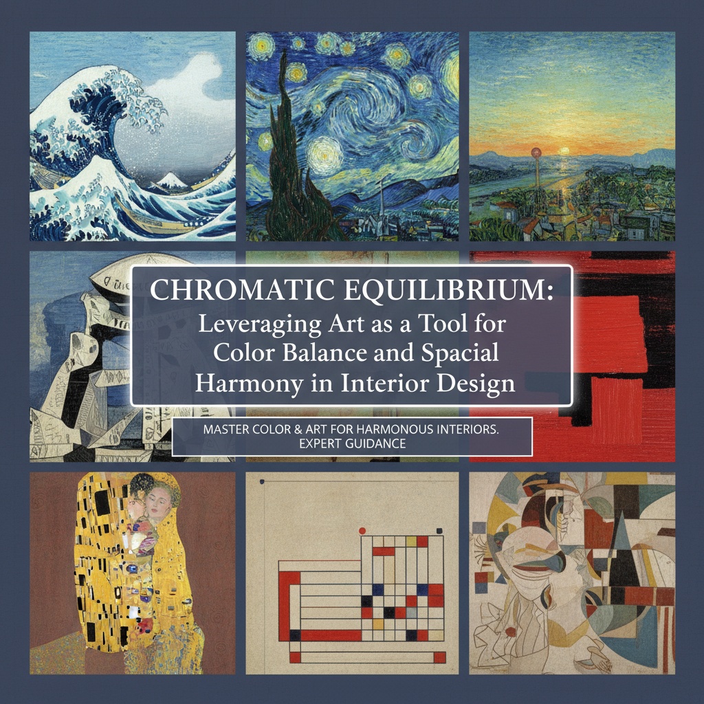
The Foundations of Chromatic Equilibrium: Understanding Color Theory & Psychology
 Harmonizing Spaces: A Guide to Utilizing Color Palettes in Interior Design
Elevate your interior design projects with our expert guide to color palettes! Learn the psychology of color & create harmonious spaces that impress clients. Essential tips for freelance decorators.
Color, more than a mere aesthetic choice, is the very breath of interior design—a potent force capable of evoking profound emotion, subtly influencing perception, and fundamentally reshaping the ambiance of a space. Yet, achieving true chromatic equilibrium – that elusive balance where hues coalesce into harmonious resonance – demands far more than simply selecting pleasing shades. It requires a deep immersion in color theory, an understanding of its historical roots, and a sensitive awareness of the psychological impact colors wield upon the human spirit.
The journey begins with the color wheel, a visual map born from centuries of observation and experimentation. From Newton’s prism dissecting white light into its spectral components to Goethe's explorations of subjective experience in his Theory of Colors (1810), artists and scientists alike have sought to codify the relationships between hues. Complementary schemes—opposites like crimson and emerald—offer dynamic tension, while analogous palettes—neighbors on the wheel such as azure and indigo—create soothing continuity. Triadic combinations, evenly spaced for vibrancy, and monochromatic explorations, variations of a single tone, each possess unique qualities. However, these are merely starting points.
The true mastery lies in grasping value – the lightness or darkness of a color. A room dominated by saturated hues can feel overwhelming; introducing varying values creates depth, shadow, and visual relief. Consider the chiaroscuro technique perfected during the Renaissance—the dramatic interplay of light and dark employed by masters like Caravaggio to sculpt form and guide the eye. This principle translates seamlessly into interior design: strategically placed darker tones ground a space, while lighter shades evoke airiness and spaciousness. Beyond this, understanding color temperature is crucial; warm hues (reds, oranges, yellows) advance visually, creating intimacy, while cool colors (blues, greens, purples) recede, fostering a sense of calm.
But color isn’t solely an objective phenomenon. Its psychological impact is deeply ingrained in our collective consciousness—a legacy shaped by cultural associations and individual experiences. Warm tones are often linked to energy, passion, and excitement, ideal for social spaces but potentially agitating in bedrooms or offices. Cool colors promote tranquility and focus, perfect for areas dedicated to rest and contemplation. However, these associations aren’t universal; a shade of blue revered in one culture might evoke melancholy in another. A successful design acknowledges this nuance, considering both the intended function of the space *and* the client's emotional response to specific hues.
Art as a Strategic Tool: Selecting Artwork for Palette Harmony
 Harmonizing Space & Soul: A Guide to Art Selection for Interiors
Elevate your space with art! Expert guidance on selecting the perfect pieces for emotional resonance & spatial harmony. Discover color palettes, bespoke commissions & lasting aesthetics. Transform your home today.
Once a foundational understanding of color theory is established, the selection of artwork transcends mere decoration; it becomes a powerful tool for introducing specific hues, balancing existing palettes, and creating focal points within a space. Art isn’t simply *on* the wall—it's an integral component of the room’s chromatic narrative.
When choosing art to complement an established interior, begin by analyzing the dominant colors already present. If a room features warm neutrals with terracotta and ochre accents, artwork incorporating analogous shades – burnt sienna or russet – will create a cohesive and harmonious feel. Conversely, if cool blues and grays prevail, introducing complementary hues—muted oranges or yellows—can provide vital contrast and prevent monotony. However, avoid overly literal matches; subtle variations in tone and saturation are key to creating depth and sophistication. A painting echoing the exact shade of a sofa cushion will appear flat and uninspired.
The style of artwork profoundly influences its impact on color balance. Impressionist paintings, with their emphasis on light and atmospheric effects—think Monet’s water lilies or Renoir’s sun-dappled scenes—can subtly introduce a range of hues that blend seamlessly into the surrounding environment. Pop Art, characterized by bold colors and graphic imagery—Warhol's iconic silkscreens, for example—offers a more direct approach to introducing vibrant accents. Renaissance art, often featuring rich jewel tones and dramatic contrasts—Botticelli’s Birth of Venus or Leonardo da Vinci’s masterful compositions—can ground a space and add a sense of gravitas.
Furthermore, consider the size and scale of the artwork in relation to the room. A large-scale painting can serve as a dominant focal point, dictating the overall color scheme. Smaller pieces, conversely, can be used to subtly introduce accents or complement existing décor. Utilizing art curation principles—grouping works by theme, style, or color palette—can further enhance spatial harmony and create a sense of intentionality.
Bespoke Commissions: Tailoring Art to Achieve Perfect Spatial Balance
 Wikipedia: Color psychology
Color psychology is the study of colors and hues as a determinant of human behavior. Color influences perceptions that are not obvious, such as the taste of food. Colors have qualities that may cause certain emotions in people. How color influences i...
Beyond selecting pre-existing artwork, commissioning bespoke pieces offers unparalleled control over color palette and spatial harmony. This approach allows designers to tailor art specifically to the unique needs of a project, ensuring a perfect integration with the existing interior—a level of customization unattainable through off-the-shelf options.
The benefits are manifold. Designers can specify exact hues, sizes, and styles, creating artwork that seamlessly complements the surrounding décor. This is particularly valuable when working with complex color schemes or unusual spatial constraints. Furthermore, commissioning art allows for the incorporation of personal elements—family portraits, meaningful imagery, abstract representations of cherished memories—adding a unique layer of emotional resonance to the space.
The process typically involves close collaboration with the artist, providing detailed briefs outlining the desired aesthetic, color palette, and subject matter. Digital mockups are often created before the painting begins, allowing for client approval and adjustments. This iterative process ensures that the final piece meets the designer's exact specifications. A skilled artist will not only execute the commission flawlessly but also offer valuable insights into color theory and spatial harmony, acting as a partner in realizing the design vision.
Warm vs. Cool Tones: Manipulating Mood and Perception with Color
The interplay between warm and cool colors is fundamental to creating balanced and inviting spaces. Understanding how these hues affect mood and perception allows designers to strategically manipulate the ambiance of a room, transforming it from an energizing social hub to a serene sanctuary.
Warm colors – reds, oranges, and yellows – evoke energy, passion, and excitement. They are ideal for social areas such as living rooms, dining rooms, and entertainment spaces, where they encourage interaction and create a sense of vibrancy. However, overuse can be overwhelming; balance warm hues with cooler tones to prevent the space from feeling chaotic or claustrophobic. A touch of cool gray or blue can temper the intensity, creating a more sophisticated and inviting atmosphere.
Cool colors – blues, greens, and purples – promote calmness, relaxation, and tranquility. They are perfect for bedrooms, offices, and meditation spaces, where they foster a sense of serenity and focus. However, excessive use can feel cold or sterile; introduce warmer accents to prevent the space from feeling impersonal. A splash of ochre or terracotta can inject warmth and personality into a cool-toned room.
The strategic layering of warm and cool colors is key to achieving chromatic equilibrium. For example, pairing a deep blue wall with terracotta accents creates a sophisticated contrast that balances energy and tranquility. Similarly, incorporating pops of yellow into a predominantly green room adds vibrancy without disrupting the overall sense of calm. This delicate balance—a dance between opposing forces—is what elevates a space from merely decorated to truly harmonious.
The Power of Neutrals: Building Foundations for Vibrant Interiors
Neutrals often serve as the foundation upon which more vibrant hues are built, but their impact extends far beyond mere background support; they play a crucial role in shaping perception and creating a sense of balance. They are the silent partners in the chromatic conversation, providing a canvas for bolder colors to shine.
Neutrals – whites, grays, beiges, browns, and tans – provide a versatile backdrop that allows other colors to take center stage. They create a sense of spaciousness and airiness, making rooms feel larger and more open. However, they are not devoid of personality; subtle variations in tone and texture can significantly impact the overall ambiance. A stark white wall will evoke a different feeling than one painted with a warm cream or soft gray.
White symbolizes purity and openness but can feel sterile or cold if overused. Pairing white with warm textures – such as wood accents, woven fabrics, or soft lighting – creates a more inviting atmosphere. Gray conveys sophistication and balance, serving as a neutral base that allows for bold accent colors to stand out without overwhelming the space. Browns and tans evoke warmth and earthiness, creating a sense of grounding and stability.
The strategic use of neutrals also influences how other colors are perceived. A bright red couch will appear more vibrant against a gray wall than against a white one. Similarly, a muted blue painting will feel more calming when placed against a warm beige backdrop. Neutrals aren’t simply the absence of color; they are active participants in the chromatic dialogue, shaping and enhancing the impact of every hue within the space.


