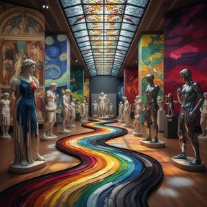
The Foundations of Color Psychology: A Historical Perspective
 Wikipedia: Color theory
Color theory, or more specifically traditional color theory, is a historical body of knowledge describing the behavior of colors, namely in color mixing, color contrast effects, color harmony, color schemes and color symbolism. Modern color theory is...
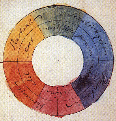
From the earliest cave paintings, where ochre and charcoal served not merely as depiction but as ritualistic expression, color has been inextricably linked to human emotion and understanding. While we often speak of color today in terms of wavelengths and pigment composition, its power extends far beyond the scientific realm. Aristotle’s observations on color – though rooted in a pre-scientific worldview – laid early groundwork for associating hues with qualities like warmth and coolness. However, it was within the vibrant intellectual currents of the 18th century that formal color theory began to take shape, largely as a response to Isaac Newton's groundbreaking work on light. Newton’s prism experiments revealed white light to be a composite of all colors, challenging established notions of inherent color properties and sparking debate about perception versus reality. This period saw artists and thinkers grapple with the subjective experience of color, moving beyond simple representation towards an exploration of its psychological effects.
The Nāṭya Shāstra, an ancient Indian treatise on performing arts dating back to around 200 BCE, offers a fascinating parallel development. It identified four primary colors – black, blue, yellow, and red – not as fundamental visual elements but as forces influencing emotional states within dramatic performance. This functional approach highlights color’s long-standing role in manipulating mood and conveying narrative intent. The contributions of al-Kindi and Ibn al-Haytham further refined understanding of light's impact on color perception, demonstrating that color wasn’t simply *in* objects but a product of interaction between light, object, and observer. These early investigations, spanning continents and disciplines, established the foundation for centuries of artistic experimentation and theoretical inquiry.
Warm vs. Cool Tones: Evoking Emotion in Painting
 The Chromatic Spectrum of Feeling: Exploring Color & Emotion in Art History
Explore the fascinating relationship between color and emotion in art history. Discover how master artists used color to evoke feelings & cultural meanings, plus the psychology behind it all.
The dichotomy of warm and cool colors forms a cornerstone of color psychology, influencing how we perceive space, depth, and emotional resonance within an artwork. Warm hues – reds, oranges, and yellows – inherently possess an energetic quality, often associated with passion, excitement, and even aggression. They advance visually, drawing the eye and creating a sense of intimacy or immediacy. Conversely, cool colors – blues, greens, and purples – evoke feelings of calm, serenity, and introspection. They recede into space, fostering a sense of distance and tranquility. However, this isn’t simply a matter of inherent properties; cultural context plays a significant role.
Consider the masterful use of warm tones in many Renaissance paintings to depict divine light or passionate emotion. The fiery reds of martyrdom scenes, for example, weren't merely descriptive but served to amplify the intensity of religious fervor. Conversely, the cool blues and greens often employed in landscapes created a sense of peaceful contemplation. Artists aren’t simply *using* color; they are strategically deploying its emotional weight to guide the viewer’s experience. The interplay between warm and cool tones – their juxtaposition or harmonious blending – is crucial for establishing visual balance and conveying nuanced meaning.
Paul Klee's Chromatic Explorations: Beyond Representation
 Crucifers und Spiral Flowers
Few artists delved as deeply into the theoretical underpinnings of color as Paul Klee. Rejecting purely representational approaches, Klee sought to unlock the inherent expressive potential of color itself. His paintings are often described as visual music, where colors function not as descriptions of objects but as independent entities capable of evoking specific emotional states. Works like Crucifers und Spiral Flowers (1933) exemplify this approach – abstract forms bathed in vibrant hues that resonate with a sense of playful energy and underlying structure.
Klee’s fascination extended to Goethe's Theory of Colours, which emphasized the subjective experience of color and its connection to human perception. He developed his own complex system of color notation, meticulously analyzing the psychological effects of different combinations and harmonies. His landscapes, such as Landscape at Sunset, are not depictions of specific places but rather explorations of chromatic relationships – a delicate balance between warmth and coolness, transparency and opacity. Klee’s work demonstrates that color can be a language unto itself, capable of conveying complex ideas and emotions without relying on traditional representational forms.
Matisse and the Fauves: Liberating Color from Form
 Still Life with sleeper
Henri Matisse
Henri Matisse and the Fauvist movement revolutionized painting in the early 20th century by liberating color from its descriptive function. Rejecting Impressionistic subtlety, the Fauves embraced bold, arbitrary colors – often applied directly from the tube – to create intensely expressive compositions. Still Life with Sleeper (1909) is a prime example of this radical approach; the vibrant hues are not intended to mimic reality but rather to convey a sense of emotional intensity and subjective experience.
Matisse’s famous declaration that he wanted his paintings to be “a calm, restful place” reflects a desire to create purely aesthetic experiences through color. The Fauves weren't simply interested in *what* they were painting but *how* they were painting it – the emotional impact of their chromatic choices took precedence over accurate representation. This rejection of academic conventions paved the way for subsequent movements like Expressionism and Abstract Expressionism, where color became a primary vehicle for conveying inner states and subjective realities.
Color Harmony & Discord: Building Visual Tension and Balance
The skillful manipulation of color harmony and discord is essential for creating compelling visual narratives. Complementary colors – those opposite each other on the color wheel (e.g., red and green, blue and orange) – create a sense of vibrancy and tension when juxtaposed. Analogous colors – those adjacent to each other (e.g., blues, greens, and violets) – foster harmony and tranquility. Triadic color schemes – involving three equally spaced colors – offer a dynamic balance between contrast and cohesion.
However, the most impactful use of color often involves breaking these established rules. A deliberate clash of discordant hues can create a sense of unease or disruption, drawing attention to specific elements within an artwork. Artists like Picasso masterfully employed this technique during his Blue Period, using monochromatic palettes to amplify feelings of sorrow and isolation. The key lies in understanding the psychological impact of each color and strategically deploying it to achieve a desired emotional effect. Ultimately, color harmony isn’t simply about pleasing aesthetics; it's about creating visual tension and balance that resonates with the viewer on a deeper level.
The Enduring Legacy of Color: Impact on Contemporary Art
The exploration of color continues to be a central theme in contemporary art. From Mark Rothko’s immersive color field paintings, designed to evoke profound emotional responses, to the vibrant abstractions of Gerhard Richter, artists continue to push the boundaries of chromatic expression. The legacy of Klee and Matisse – their emphasis on subjective experience and the inherent power of color – remains profoundly influential.
Today, OriginalUniqueArt.com offers a unique opportunity to explore these masterpieces firsthand through high-quality reproductions. Whether you’re drawn to the playful energy of Klee’s abstract forms or the bold intensity of Matisse’s Fauvist compositions, our handmade oil paintings and museum-quality prints allow you to experience the emotional resonance of color in your own space. We invite you to delve deeper into the world of art, discover the stories behind the palettes, and unlock the transformative power of chromatic expression.