Introduction: The Allure of Restrained Color
There exists a particular power in what is *not* immediately shouted, but rather whispered through the subtle language of color. In an age saturated with bold statements and digital vibrancy, it’s perhaps unsurprising that we find ourselves increasingly drawn to the quietude of muted tones – colors softened, subdued, and imbued with a depth that transcends simple visual appeal. This isn't merely a trend; it represents a return to fundamental principles of emotional resonance in art, a seeking of harmony and introspection within the canvas and, by extension, within our own spaces. The allure lies not in what is seen at first glance, but in the lingering impression, the evocative atmosphere that these restrained palettes create.
A Historical Perspective: Tonalism & the Rise of Muted Hues
Tonalism was an artistic style that emerged in the 1880s when American artists began to paint landscape forms with an overall tone of colored atmosphere or mist. Between 1880 and 1915, dark, neutral hues such as gray, brown or blue, often dominated c...
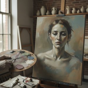
The deliberate embrace of muted color wasn’t born overnight. Its roots lie deeply embedded within 19th-century artistic movements, most notably in Tonalism. Emerging as a reaction against the grand narratives and meticulous realism prevalent at the time, Tonalism sought to capture not the precise *representation* of nature, but its very *essence*. Artists like George Inness and, perhaps most famously, James Abbott McNeill Whistler, pioneered this approach. Whistler’s “The Coast of Brittany (also known as Alone with the Tide)” exemplifies this beautifully – a serene oil painting where solitary figures are almost dissolved into the coastal mist, rendered in a palette of grays, blues, and browns that prioritize atmosphere over detail. This wasn't simply about depicting a scene; it was about evoking a feeling, a mood, a sense of solitude and contemplation. Whistler’s philosophy of “art for art’s sake” championed the importance of tonal balance and aesthetic harmony above all else, influencing a generation to explore the expressive potential of limited color ranges.
The Psychology of Subdued Colors: Evoking Mood and Atmosphere
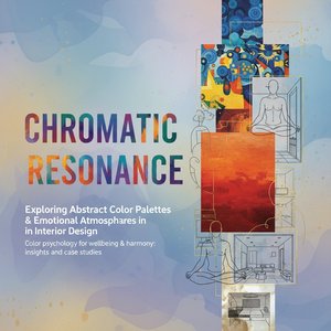
 The Emotional Palette: How Color Influences Mood & Meaning in Art
Explore the powerful connection between color & emotion in art history. Discover how master artists used color to evoke feelings and learn to select artwork that enhances your space.
But why do these muted tones resonate so deeply with us? The answer lies in the fascinating realm of color psychology. Bright, saturated colors tend to be stimulating, demanding attention. They evoke energy, excitement, even anxiety. Muted colors, conversely, are inherently calming. By reducing saturation, we lessen the visual impact, allowing the eye – and the mind – to rest. Soft grays promote a sense of tranquility and sophistication, while muted blues often convey peace and serenity. Earthy tones like ochre and umber ground us, connecting us to nature and fostering feelings of stability. The power lies in their subtlety; they don’t *tell* you how to feel, but rather *invite* you to experience a particular emotion. Consider the impact of John Singer Sargent's “Venetian Bead Stringers” (1882). While not strictly Tonalist, its masterful use of subtle light and muted tones creates an intimate domestic scene that feels both elegant and deeply personal – a testament to the power of restrained color in capturing nuanced emotion.
Mastering Muted Palettes: Techniques for Artists & Interior Design
Achieving a truly effective muted palette isn’t simply about choosing “soft” colors. It requires understanding how colors interact and how to manipulate their saturation. The most common technique involves mixing a color with its complementary hue – red with green, blue with orange, yellow with purple. This doesn't necessarily mean creating brown; rather, it’s about subtly neutralizing the vibrancy of each shade. Another effective method is incorporating earthy tones like raw umber or burnt sienna to ground your palette and add depth. For artists, layering glazes – thin washes of color – allows for a gradual build-up of tone and texture, creating a sense of atmospheric perspective. In interior design, the key is balance. Pairing muted walls with brighter accents can create a dynamic yet harmonious space. Conversely, an entirely muted scheme fosters a sense of calm and sophistication. The goal is to avoid harsh contrasts and prioritize a cohesive visual experience.
Iconic Examples: Exploring Works by Whistler, Sargent & Beyond
Beyond Whistler and Sargent, numerous artists have masterfully employed muted palettes throughout history. Consider the works of the Barbizon School painters – Jean-Baptiste-Camille Corot’s landscapes, for example, are renowned for their hazy atmosphere and delicate tonal gradations. Even later movements like Impressionism, while often associated with vibrant color, frequently utilized muted tones to capture the fleeting effects of light and shadow. “The Little Red House” by Whistler, part of his “Symphony in White” series, demonstrates how even a seemingly simple subject can be transformed through the careful application of limited color ranges. These examples highlight that muted colors aren’t about lacking vibrancy; they're about harnessing it with intention and restraint. They are not simply *what* is painted but *how* it is painted – the brushstrokes, the layering, the subtle shifts in tone that create a sense of depth and atmosphere.
Integrating Muted Tones into Your Space: A Contemporary Approach
 Harmonizing Spaces: A Guide to Utilizing Color Palettes in Interior Design
Elevate your interior design projects with our expert guide to color palettes! Learn the psychology of color & create harmonious spaces that impress clients. Essential tips for freelance decorators.
Today, the appeal of muted tones continues to grow. In an increasingly chaotic world, we crave spaces that offer respite and tranquility. Integrating these colors into your home is surprisingly versatile. From soft sage greens in bedrooms to warm grays in living areas, the possibilities are endless. Consider layering textures – linen curtains, wool rugs, natural wood furniture – to add depth and visual interest. Artwork plays a crucial role; selecting paintings with complementary muted palettes can tie an entire room together. At OriginalUniqueArt.com, we offer a vast collection of reproductions, allowing you to bring the serenity of Tonalist masterpieces or the intimate elegance of Sargent’s portraits into your own home. Whether you're seeking a complete transformation or simply adding subtle accents, remember that the key is intention – choosing colors that evoke the emotions and atmosphere you desire. Explore our curated collections, consult with our art experts for personalized guidance, and discover the transformative power of the subdued palette.